Newly Discovered Prototype: 1965 Washington Redskins

Last week, I received an email from contributor Leo Strawn. To sum up, Leo stated that he was interacting with a man who wanted verify the story on the 1964 Redskins prototype helmet he had just purchased. The story goes that during the middle of the 1964 season, the Redskins created his prototype helmet with the spear logo but waited until 1965 to adopt it. Mr. Strawn then contacted me to see if I had seen anything in my research that could confirm the man's story. I answered that I had not, but that I would do some digging and see if I could find something. I did.

During the 1964 season the Redskins wore their single-feather helmet for the 7th straight season after having begun its use in 1958. I found no mention in the Washington Post backing up the man's claim of the spear-helmet turning up during the 1964 season.

I expanded the search and began searching January through May, 1965. JACKPOT!

A Washington Post article from March 20, 1965, stated...

"The Redskins decided yesterday to change their helmet insigne with an Indian headdress on both sides instead of the single feather on top. Also considered was the Indian head emblem of the club, wearing the headdress."

This 'smoking gun' clearly illustrates that the change wasn't decided until 'yesterday' (March 19, 1965) rather than at some point during the 1964 season.

But that wasn't all. The article included a photo of a man wearing the 'headdress' prototype. However, that prototype never saw the field.

Two additional articles from July 25 and July 29 paint a somewhat altered picture. The July 25 article states...

"Paul Dube of Arlington reports that he and a friend have written to the Redskins to protest the proposed change of the helmet insignia from a feather on top to an arrow on the side."

At some point between March and July, the Redskins scrapped the 'headdress' logo and changed to an 'arrow' on the side - what we now refer to as the 'spear' logo. 

The July 29 article (written in the form of a 'letter to the editor' stated...

"Note to Redskin chief Ed Bennett Williams: Alan Goldstein, a college student who lives in Wheaton, is heartbroken over the elimination of the symbol...Alan writes that he was watching TV and saw pictures of a Redskin scrimmage and knew immediately that something was wrong...It seems the feather on the helmet is no more..."The insignia (the feather) has become a symbol to us Redskin fans," writes Goldstein. "It doesn't seem like the Redskins without it. I have talked to several other fans and they agree. You don't see the Rams changing their helmets. I think that in view of the way the fans have supported the Redskins through the past lean years, the Redskins can do us one small favor and give us our symbol on the helmet back. Thank you."

There's a lot to digest here. Even back in the 60s, fans didn't like change for the sake of change. Also, the sense of entitlement was strong, as well. Basically, 'you guys stunk but we still supported you,' which was followed by "give us OUR symbol back." (The Redskins had not had a winning season since 1955 and that span also included back-to-back 1-win seasons in 1960-61.)

After all, "You don't see the Rams changing their helmets." I wonder how modern Rams fans would feel about this gentleman's argument in 2020.

Using the newspaper photo from March 20, I put together a color image of the helmet using the same darker shade of burgundy from the 1964 helmets.


I have seen photos of many NFL helmet prototypes. There was Paul Brown with a table full of Bengal prototypes including a primitive version of the striped helmet that would eventually be modernized into their current helmet that began use back in 1981. There was the photo of Tex Schramm holding the infamous Cowboys' 'boot logo' helmet. The Jaguars were originally to have silver helmets with a leaping Jaguar logo. That design got nixed due to a solid resemblance to the Jaguar automobile logo. The Texans were to originally have had a white version of their current helmet when they began in 2002. There was also the infamous 49ers' 'one-day' helmet that was so offensive to Niners fans that the team scrapped it completely after a single day. Somehow, this Redskin prototype was lost to the ages...until we stumbled across it and brought it back out into the light.

Bill Schaefer


"We Are Sparta!" or "Occam's Razor Meets the GUD: Case Number 1,311"

For those not familiar with the the principle of Occam's Razor, let me explain it in the simplest terms possible. No pun intended.

Occam's Razor basically states that when you are trying to solve a problem or explain an occurrence, generally speaking, the simplest explanation is most likely the correct one.

Today we make the case for just such an issue.

For the 10 years that GUD has been operational (Really? 10 years?), we have labored under the assumption that the Portsmouth Spartans (later the Detroit Lions) had team colors of purple and yellow. All available resources stated it as being so. That is until a contributor brought this to our attention...

In the book Home & Away: The Rise and Fall of Professional Football on the Banks of the Ohio by Carl M. Becker, it was noted when discussing the Spartans of 1930 that "The Spartan management ordered new uniforms, purple jerseys with black stripes on the front and white numerals on the back, black pants made of an airplane cloth with a purple knit insert on the back. Socks and headgear would remain the same."

Historically relevant, the same resource outlines that, as a non-League team in 1929, the Spartans had worn blue and white uniforms in 1929 before switching to purple for the 1930 season.

Based on this revelation, we redesigned our representation for the Spartans with the help of this photo, the only game photo for the 1930 Spartans that we have located at this point.

11/2/30 - PORT @ GB

If you have your eagle eyes with you, you should be able to spot the Spartan just left of center facing you with the black "V" high on his chest. Other Spartans of note in this photo are the two at left including #21 and another just below the 'V Spartan' fully displaying the black pants and purple inserts (butt-stripes) down the backs of his legs. This was enough to construct the new 1930 Spartan image for GUD. A more pastel-shade of purple was needed to adequately represent the amount of contrast next to the 'black' seen in this photo. 


We were happy to add this image and everything was just 'peachy.' But didn't I mention that Portsmouth was purple and yellow? Well, for years now, we have been referring to this 1932 Spartan team photo. At that time, most team photos were taken during the preseason wearing the previous year's uniforms. Remember the 1934 team photo of the Pittsburgh Pirates (Steelers) wearing their 'bumble-bee/prison stripe' jerseys? Even the Steelers, themselves, assumed those were the de facto 1934 uniforms for that very reason despite the verified truth that they only appeared in a single 1933 game and not one game of the 1934 season.

1932 Portsmouth Spartans team photo
But 'YIKES!" how about those stripes? For the 1931-33 seasons, we had not come across a single photo of these striped jerseys being worn in a game. And seeing these striped jerseys next to the darker (obviously purple) jerseys, the assumption was made that these must be yellow jerseys. Were they practice jerseys? Possibly. Were they college jerseys retained by players from their alma mater? Not likely. So we continued our assumption that these yellow jerseys were simply for practice purposes. Ample contrast with purple would have helped for split-squad practices.

But then something happened. I noticed something in this photo.

11/1/31 - PORT @ NYG
Note the two yellow circles. The Giants never wore anything resembling these stripes so these players must be Spartans. In fact, you could make the argument that even the right arm of Spartan #10 (back to the camera) seems to indicate stripes, as well. Yet all other photos from this game show no stripes. Spartan players can be identified by having no numbers on their chest (the Giants did) and large numbers on their backs, much larger than those of the Giants.


But then I actually started to read the articles for this game. As you can see, some of the game was played in bright sunlight. However, near halftime, the skies opened and torrential rains hit the Polo Grounds for much of the second half. Jerseys would get wet. Jerseys would get caked with Polo Ground mud. Why not supply players that needed them most with a dry, second jersey to wear for the rest of the game? This would explain why some players may have the striped jerseys in that first photo and the rest do not.

One question still remained. Would it be acceptable for the Spartans to wear a mix of purple jerseys and yellow jerseys? We have evidence that the Brooklyn Dodgers of 1933 wore 3 different styles of red and white jerseys in a single game but those were at least the same color and still two years into the future.

No. Something else was going on here. Additionally, we know that the Spartans brought the striped jerseys from Ohio to New York. How, you ask? Spartan promotional photos were taken the day before the game inside the Polo Grounds.


So what's going on? The explanation is completely 'Occam's Razor.' The striped jerseys aren't yellow.

Remember those 1930 Spartan uniforms? Well, our own Larry Schmitt recently uncovered this photo of Spartan Glenn Presnell in 1930. It cinched for us that we had nailed the 1930 design (except for the fact that Presnell opted not to wear the black pants).


Soon after, there was an 'ah-ha' moment. Looking back at the team photo that included 7 players in striped jerseys, I noticed that another 9 players were wearing presumably a darker, more violet shade of purple on their newer 1931 jerseys. A violet purple shows darker on 1930s black-and-white photography in the same way that red and blue were dark and nearly indistinguishable from each other.  Even more attention-getting was the seventh player in the bottom row - Ray Davis. He appeared to be wearing the same 1930 jersey as shown in the Presnell photo and the photo from the 1930 Portsmouth/Green Bay game. More importantly, his jersey appears to be the exact same color as Maury Bodenger's striped jersey immediately to his left (camera's right). 

We had been wrong to assume that the striped jersey was yellow simply because we were told that team colors were purple and yellow and because it showed in the Polo Grounds practice promo photo as being lighter than the violet purple jersey. These striped jerseys were, in fact, the same lighter shade of purple as the 1930 jerseys.

This would better rationalize Portsmouth's use of the striped jerseys in the 1931 rain/mud game in New York. While they may not have been the same purple, at least they were purple - purple enough to contrast with the red and blue of the Giants without causing confusion.

The simplest explanation is usually the correct one. Occam's Razor.

We will continue seeking further proof, perhaps through a jersey auction one of the striped jerseys will appear and further confirm (or refute) our theory. But, after all, the original idea that the striped jersey was yellow was just a theory, as well. Now we have some better evidence and, hopefully, a better theory to work with until proven otherwise.


Bill Schaefer
Gridiron Uniform Database

When Is A Logo Not A Logo?

I'm going to start this entry with a shameless plug. Three weeks ago, I was tinkering with MS PAINT (GUD's graphics program of choice) and I figured out a way to create a metallic effect for helmets so that they didn't look like they were just grey or light brown. Since I had created the effect for the new 2019 Jets' metallic green helmets, I figured I could pull off the same treatment for other gold and silver metallic helmets. After much trial and error, I was even able to create a 'glitter' effect for teams that used helmet paint with all of those little, tiny sparkles in them that, well, 'sparkle' when the light hits just right. Every team requiring such details has been edited in such a way that I hope it more accurately displays the metallic appearance of those helmets that require it. Here is an example.

12/31/67 - HOU @ OAK
Notice how we can show the Oilers' metallic silver as having a bit of blue tint to them as opposed to the more pure silver of the Raiders' helmets. More importantly, we can make the Oilers' helmets look better than simply being solid grey as to which we were previously limited.

Why bring this up other than, as I said, to shamelessly plug the metallic helmet versions? Well, as in the case with so much around here, one thing usually leads us to something else entirely in a totally unintended circumstance. Case in point, while looking for color photos that would help me perform the above mentioned updates of metallic helmets, our Larry Schmitt noticed something that had gone unnoticed...a mystery number font worn by the Vikings in 1966-67 featuring extremely thin numbers that was inter-mixed with their normally worn number font.

10/30/66 - SF @ MINN
For comparison, here is Fran Tarkenton in a more customary Vikings' jersey that same season.

11/27/66 - GB @ MINN
To further demonstrate how things happen, Larry took it upon himself to investigate the surrounding years to see what other seasons in which this font may have appeared. While checking out 1969, easy to validate due to the "NFL 50" patches worn around the League, Larry spotted another unusual font.

11/9/69 - CLE @ MINN
This font stood out because whether Vikings were wearing their typical Pro-Block font or even the newly discovered 'skinny font,' having a sans serif font was unheard of. As it turns out, this new sans serif font was only worn by a small number of players during a limited few games late in the 1969 season.

But I do not want to distance myself too far from the original purpose here. Rounding up photos of every Vikings game from 1966-69 made me realize...the helmet logo we were using was completely inaccurate and unacceptable for our 'just get it right' mantra around these parts.  Here is the single-bar helmet we have been using to represent the first 6 seasons of Viking football.

Using this universally accepted logo that can be found nearly anywhere on the internet, this has been appearing as our 'go-to' helmet logo for the entirety of 1961-2006 for the Vikings. However, here is an actual photo from the team's first season.

11/19/61 - DET @ MINN (Getty)
Setting aside the obvious color discrepancy of the helmet shell (which has been adjusted for throughout their entire team history, as well), what else do your eyes notice about the comparison of the two logos? I notice the size of the horn at it's base. It is as large as the facial opening of Tarkenton's helmet. I notice the gold ring. The ring on the helmet goes from about 7 o'clock counter clock-wise up to about 1 o'clock. The digital logo we had been using goes from maybe 8 o'clock to 2 o'clock. Edits needed made. Additionally, look at the length of the horn. It is much larger and wraps completely around to the back of the helmet. This would make seeing the entire logo from a side view almost impossible. This also needed adjusted. So I went about making these changes - enlarging & elongating the horn and rotating the gold ring.

But then I came across this photo.

10/23/66 - MINN@ BALT (Getty)

Not only does it show the horns running all the way back to the center ridge of the helmet, but the top of the horn is nearly flat with very little curve upward. This is also, actually, the case in the 1961 photo above. The linemen have their heads facing at a down-angle. If we were to rotate their faces to a horizontal plane, these horns would also appear just as flat as in the above 1966 photo, allowing for the rear curvature of the helmets. 


So after first adjusting about 20 years-worth of helmet logos, I set about re-working them all with this new, additional refinement - essentially doubling my workload. But as I proceeded through, I began to wonder...if the horns are nearly flat on the helmet, why do all of the available graphics show an up-turned tip of the horn?

The answer would arrive in 1976. First, a view of 1975 still showing the nearly-flat helmet horn.

12/28/75 - DAL @ MINN (Getty)
Now take a look at 1976. Note the up-turn of Tarkenton's horn tip. This is a wonderful photo because it also displays the back of Chuck Foreman's helmet showing not only the up-turned horn tips but also the fact that the horns have been shortened a bit and no longer extend all of the way to the center ridge line of the helmet.

12/11/76 - MINN @ MIA (Getty)
Here is the upward turn in 1977.

9/18/77 - DAL @ MINN (Getty)

This would become the version of the horn that would be used up through the completion of the 2005 season.

There is one other tidbit related to this Vikings' crisis. Between 2007 and 2011, after redesigning their entire uniform in 2006, the Vikings wore throwback uniforms for select games those seasons. Apparently honoring the past, the horns for 2007 mimicked, in smaller form, the original, flatter version of the horns. However, in 2008, the up-turned version of the horn was utilized. The Vikings returned to the flattened version for each season between 2009 and 2011.


So I broach the question again. When is a logo not a logo?

The Chiefs can answer this. Their helmet logo has lower tip of the "C" angled while all of their commercial and merchandising logos have a horizontally-flattened end on the "C."


The Chargers can answer this. Their commercial and merchandising logo has always been much stouter than the bolts that actually adorned their helmets for most of their 60-plus seasons.

Now the Vikings' 'stubby horn' can be added to this infamous list of inadequacy.


Bill Schaefer

* Note - A few photos have turned up alerting us tho the fact that 1975 was a mixture of both the flattened horn and the upturned horn. Gifs have since been created for 1975 reflecting the fact that the 2 helmet logos were both being worn throughout the season. - B.S. 6/20/20


New Uniforms of 2020

In addition to all teams (other than the Bears) reverting to the NFL Shield at the bottoms of their V-collars, seven teams have made 'significant' changes to their uniform for the coming 2020 season.

As the graphics artist for the GUD, I usually have to look at uniform reveals through a different eye. "You mean I gotta draw THAT?!?"

Additionally, where a team has shown what combinations of jersey, pants, and socks they plan on wearing during the season, I like to be prepared.  I assemble every possible combination eliminating the need to miss Sunday football because someone decided to put together a strange new pairing that no one expected and I need to assemble it.
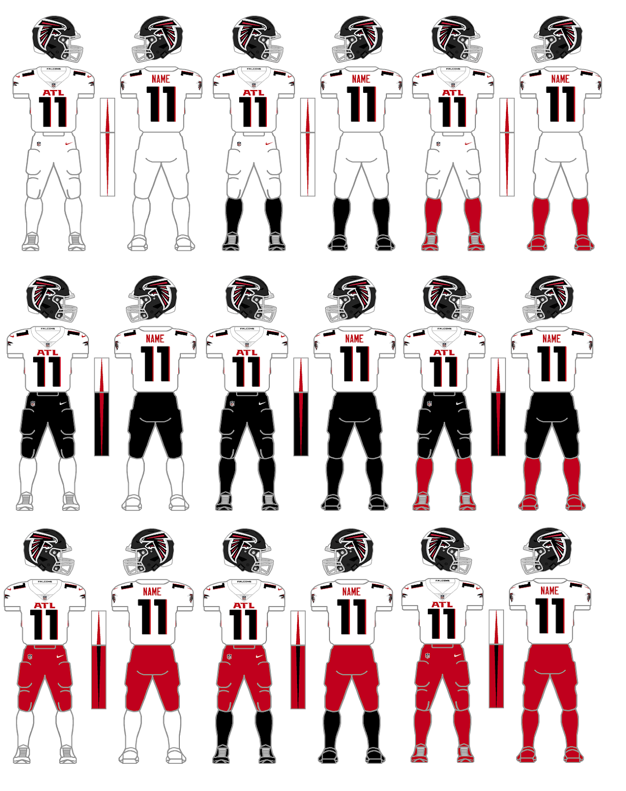
Atlanta Falcons
White Jersey combos
This is a great place to start because this needs to be said and it's best to do it right off the bat. Teams need to stop matching socks and cleats. In their uni-release, only a single red-pants combination was proffered - white jersey, red pants/socks/cleats - found above in the lower right corner. I don't like any of these red pants combinations. The foremost reasons are the fact that the pants stripe and jersey side panel stripe conflict with each other and the red pants completely conflict with the black helmet when having only white in between. I'm not a fan of all-white uniforms either but the black socks and red socks combos with the white jerseys and pants in the top row would work for me as long as the Falcons wore white shoes. I'm not really a fan of any of the black pants combos in the middle row.
Bottom line: Don't match pants, socks, and cleats. Contrast is needed.

Black Jersey combos
As for the black jersey combos, let's start by eliminating all three of the white socks combos down the left side as well as the bottom right corner again with red pants, socks, and cleats. All four of these are simply bad looks.
My favorites are the two black jersey and white pants combos with the colored socks - again assuming the Falcons go with white cleats. The all-black in the center is passable but my favorite is in the middle of the bottom row - black jersey, red pants, black socks and cleats.

We knew that the Falcons were likely keeping their 'throwback' uniform although they were forced to use it with the new matte-black helmet. Not really a big deal.
However, as 'the art talent' here at GUD, let me tell you...there are two things I can't stand - sublimation patterns and gradients. Here is the first "You gotta be kidding me" of the new season. The really bad news is that I kinda like the gradient combo. I just hope that it doesn't create a trend of more teams going with this kind of look.

Overall, I don't mind what Atlanta did. With the exception of the gradient uniform, they really went minimalist and that's OK. The matte black helmet doesn't bother me although I do think the over-sized helmet logo is comically big and after all, isn't just a tip of the cap from the Falcons to their divisional-rival Buccaneers saying "We like what you did with that big flag on your helmet. Take a look at our big bird!" The one thing I really wish they'd correct is the big ATL on the chest. The over-sized numbers would look better if they didn't have to be squeezed into view along with the big, honkin' "ATL."

Cleveland Browns
White Jersey combos
Cleveland ownership listened to their long-suffering fans and got rid of one of the great uniform monstrosities ever perpetuated in the League ranking right their with the 2014-19 Bucs, 2013-17 Jaguars, and the 2002-10 Bills. A little known fact about Browns uniforms is that the Browns tend to match socks with jerseys. However, every once in a while, the Browns would throw a curve ball at us and wear brown socks while wearing white jerseys. It could happen so I planned on being ready. The two combos to the left are likely what we will see for most Cleveland road games this season. One thing I don't care for is that the Brown pants need a white stripe between the two orange stripes. I know these are essentially their Color Rush pants from past seasons. but to be worn as part of a normal rotation with these new uniforms, they need the white stripe.

Brown Jersey combos
I just mentioned the brown pants being last year's Color Rush pants and missing the white middle stripe. To top that off, it appears the Browns kept the all-brown Color Rush combo but removed all stripes. Basically, the Browns said we need two sets of brown pants. The Browns love their brown pants apparently, but does everyone out there remember what Deadpool said about the brown pants? My apologies for the brief, graphic violence but I couldn't resist. Children get your parent's permission first...https://www.youtube.com/watch?v=KKC0jN-GfhA.

After they released their new uniforms, the Browns announced that they got some negative feedback from fans because they did not include options with orange pants. Congrats to the Browns. They gave their fans what they wanted to see with these retro new uniforms. The lack of orange pants was an oversight. The team admitted the error, and stated that they'd find a way to get the orange pants. Kudos. These looks are the Cardiac Kids that I remember from when I was a youngster. There's something just so right about these two looks. I hope we get them frequently this year.

Indianapolis Colts

The most notable change that the Colts are making is the re-shaping of their horseshoe as seen above. Other less notable changes include changing the Nike 'swooshes' on their white jerseys (and likely their white pants, too) from blue to black. Why? The Colts added a logo to the inside of their collars that may or may not have been plagiarized from an Indiana high school team (but I'll let the courts decide that). The Colts also returned to a number font used in their early days. However, because of our use of the number 11, the change won't be noticeable since the ones will be the same for both the new and old number fonts.

Los Angeles Chargers
White Jersey combos
Go ahead, I dare you to find something wrong with these uniforms. Nit-pickers could say something like "There are no TV numbers." Or "the bolts on the pants don't have enough zig-zags." These people need to get a life. I admit that I am getting tired of the italicized number fonts and would have preferred a nice, old-fashioned block font, but I digress. Hmm. I guess I was able to find a 'negative.'

Powder Blue Jersey combos
Personally, I think the Chargers should do something like only wearing the yellow pants either for all of their day games or for all of their night games, some kind of gimmick like that.

Alternate Blues combos

I like the all-royal but it seems superfluous with the all-navy. I really hope the Chargers actually wear white shoes with the all-navy combo. White helmets and white shoes would book-end the uniform nicely. I wonder of the Chargers field-tested the navy uniform with the numbers hollowed-out, as well. Probably made the numbers too difficult to read though.

One other thing...if the NFL ever does do away with the 'One-helmet Rule,' in the words of my daughter, I think this would look 'sick' for night games...

Los Angeles Rams
Bone & Blue jersey combos
The Rams became the last team to unveil their new uniforms. I believe that these blue and bone jersey combos must be evaluated together as one group.

First, let me say that I have no problem with the helmet. Over the years, many fans have been bothered by the fact that the Rams' helmets always had a navy shell that clashed with the royal of the their usual uniforms. That has been corrected with a brilliant, metallic, royal blue shell. The logo is new and different. It's not great. It's just different and I'm sure we'll get used to it. At least they didn't use the gradient coloring on the helmet logo!

Honestly, the jerseys are my biggest problem with these uniforms. The glossy piping of the numbers would have looked better as just regular fabric. This was too big of an attempt to be 'glitzy.' The fold-over-the-back-of-the-collar logo tags are gimmicky. The jerseys would have looked better if they just slapped the logos right on the collar - inside and out. The contrasting look of the tag on the bone jersey is superior to the blue-on-blue tag on the royal jersey. That one would have looked better had it been a yellow tag. The collarbone 'patch' and the peculiar zig-zag stitching limited to just a small portion in the upper right corner is just stupid.

But my biggest peeve for these jerseys is actually the 'sleeves.' The blue jerseys have the Ram horns. The bone jerseys have some kind of wave or shark fin. Why would you not simply put the Ram horns on the bone jerseys also? That makes no sense.

And you already know my feelings about gradients. My question is why not have two blue jerseys. One would have the gradient numbers to be worn with the gradient-striped pants as a Color Rush combo. Another blue jersey without gradient numbers could be worn with the yellow pants. The gradient numbers look unusually out of place when worn with the yellow pants.

New England Patriots
OK. I'm taking bets. I'm willing to bet that this is the last time that an NFL team has a new uniform reveal and only reveals two combinations.

I like what they did. I like the red-blue-red stripes on the white jersey. But at the same time I still agree with those that say its too much red in a blue-oriented jersey. A blue-red-blue stripe pattern probably would have been better.

Like the Browns, the Patriots left the door open to possibly add white or silver pants in the future. I got one for you. What about red pants? Those could be a worthwhile option with the white jerseys.

Tampa Bay Buccaneers
The Bucs pulled a 'Browns' and simply went back to something that works. They never should have moved away from this design in the first place. While keeping a large helmet logo, the Bucs still reduced the logo considerably. Now, instead of being 'freakishly large,' now they have a logo that's just 'big.' The Bucs also ditched the bling-bling chrome grill. Good. Grills are for cars and patios, not football helmets. I would like to see the new Color Rush uniform worn with some red socks and white cleats. 

So who will be getting changes for next season, in 2021? Cardinals? Bengals? Broncos? Eagles? I guess we'll have to wait. Hopefully there will only be two more months before we start thinking about preseason games.

Bill Schaefer
GUD

It's a 'Burgh-Thing...I Hope You'll Understand

Fresh off the tails of my blog last week about pearly-white helmets, we now have a fast turn-around into our next entry...and it wasn't planned at all.

I received an email from Leo Strawn alerting me to something we've overlooked up until this point. After reading Leo's information and doing a quick bit of research, I've been able to lay down some parameters and make the required alterations.

Any football fan will recognize the shapes seen here, but very few will know the geometric name for the 3 figures located on the right side of Steelers' helmets. They are called hypocycloids. The design comes from the Pittsburgh steel industry, most notably U.S. Steel, based in the Pittsburgh area.

You will notice that the three hypocycloids are yellow, red, and blue. But how many of you knew that wasn't always the case?

The year was 1962. The Steelers had been wearing plain yellow helmets since making the move from leather to plastic in 1950. A black center stripe was added in 1953. They even added side numbers to the helmet off-and-on beginning in 1957.

On November 18, 1962, in the middle of their season for a home game against the Washington Redskins, the Steelers added a large round logo to the right side of their helmets and it looked like this...
1962
An additional little nugget of information was dropped by our friend Leo. The yellow, orange, and blue colors you see here each have a significance with the steel industry. Yellow represents the burning coal, orange signifies the color of iron ore, and blue is the color for the scrap steel. 

Now, we know that this photo can only be from 1962. Why? Because for the annual Bert Bell Playoff Bowl (a.k.a. the "Second Place Bowl" or the "Loser's Bowl") which pitted the season's divisional runners-up against each other in Miami, the Steelers switched things up a bit and wore black-shelled helmets with the same logo on it. Thus was birthed the iconic look the the Steelers still use to this day. The Steelers never wore yellow helmets again (until they were worn with the 2007-11 Steeler throwback uniforms).
1/6/63 - PITT v DET @ Miami, FL
So what happened to the orange? Why are the Steelers' helmets yellow, red, and blue? I set out to uncover what happened.

The original logo was rather large, said "Steel" and had yellow, orange, and blue hypocycloids as we've already established. The following year, 1963, the logo was altered to include the team name "Steelers" instead of "Steel" in a very thin font. The size of the logo became a little smaller, but the three colors remained the same. The logo remained unchanged from 1963-67.
10/3/65 - NYG @ PITT
12/18/66 - PITT @ ATL
In 1968, the logo shrunk a little more. The orange hypocycloid was colored a bit closer towards red. The "Steelers" word mark continued to be in thin lettering. This style continued through 1977.
9/15/68 - NYG @ PITT
1970 - Terry Bradshaw & Terry Hanratty
1977 - Terry Bradshaw
In 1978, the middle hypocycloid moved even further toward red on the color spectrum. The logo size shrunk just a bit more and the "Steelers" wordmark remained in the same thin font. This version of the helmet logo remained unchanged through 1990.
1978 - Jack Lambert
1989 - Mike Mularky
1990 - Rod Woodson
One last, small change occurred in 1991. No, it wasn't anything to do with the hypocycloids. The Steelers made the wordmark's font bolder.
1991 - Donald Evans
1994 - Neil O'Donnell

I'm sorry to say that I have to admit I'd seen before the 1962 photo above with the yellow helmet and its logo. I saw it. I just never noticed it. Huge thank you again to Leo Strawn for pointing out this little bit of GUD-clean-up that needed tending.

Bill Schaefer
GUD


Twitter

Blog Archive