Last week, I set off on a journey hypothesizing if each of the current teams were playing, right now, in the era of long sleeve jerseys and leather helmets. After establishing some ground rules guidelines that I'd follow during the process, I began by displaying the teams of the NFC North.
This week, as promised, I present my renditions of the NFC East.
The NFC EAST
DALLAS – This was one of my
favorites to do, mainly because of my frustrations with Dallas’ current combos and their
inconsistencies. When Dallas first began they were royal blue and
white. I went with that but added silver/grey pants to make them less
Colts-like. I used the same stripe pattern from their current home white
jerseys minus the useless black outlines. Large 1-color block numbers work now
and would work then. Then an epiphany struck. What if Jerry Jones was the owner
back then? He would have made a way for his team to stand out. Therefore, I
made Dallas the
only team to sport logos. I put a small star in the middle of each sleeve
stripe. I went a bit further after that. If you’ll notice the helmet, I added 5
white stripes to the blue helmet. When seen from above, this would appear as a
5-pointed asterisk (*) or star. Dallas
may have become one of those teams (like the Eagles of the 40s) that bounced
back and forth between the two jerseys all season.
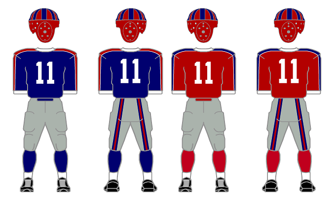
NY GIANTS – Grey pants? Check. Blue and red versions of the
same jersey? Check and Check. Red and blue helmet to go with both combinations?
Check.
PHILADELPHIA
– The silver wing and stripes on the green helmet reminds me of the era’s
2-tone helmets. My favorite Eagles design has always been the late-70s to the early-80s design with the sleeve stripes.
Having full sleeves was the perfect canvas to recreate those awesome
stripes. Nobody did sleeve stripes like Philly did.
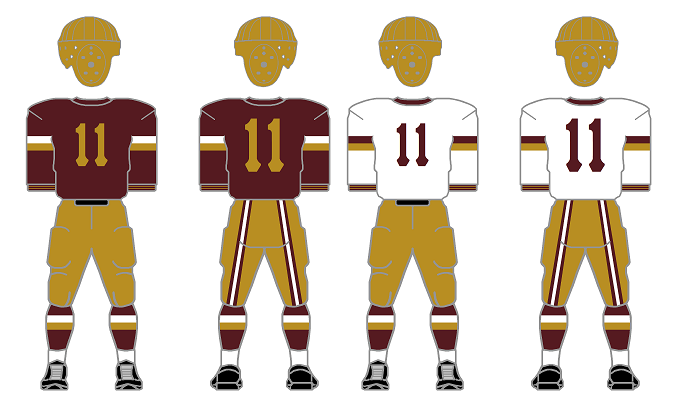
WASHINGTON – If Minnesota was my
favorite, these come in a close second. I like the look of the darker burgundy
paired with the Vegas-gold from the late 40s through the 60s. The sleeve and
sock stripes are the 80s style but in the new/old colors. I loved the thin
stripes in the cuffs from the mid-30s and added them here. I dig the Pittsburgh
Pirates number font the Skins wore from the late-40s to the early-50s. A very
cool look.
Next week, I will continue with the NFC West. Stay Tuned...
Bill Schaefer


No comments:
Post a Comment