 |
| 12/31/67 - HOU @ OAK |
Notice how we can show the Oilers' metallic silver as having a bit of blue tint to them as opposed to the more pure silver of the Raiders' helmets. More importantly, we can make the Oilers' helmets look better than simply being solid grey as to which we were previously limited.
Why bring this up other than, as I said, to shamelessly plug the metallic helmet versions? Well, as in the case with so much around here, one thing usually leads us to something else entirely in a totally unintended circumstance. Case in point, while looking for color photos that would help me perform the above mentioned updates of metallic helmets, our Larry Schmitt noticed something that had gone unnoticed...a mystery number font worn by the Vikings in 1966-67 featuring extremely thin numbers that was inter-mixed with their normally worn number font.
 |
| 10/30/66 - SF @ MINN |
 |
| 11/27/66 - GB @ MINN |
To further demonstrate how things happen, Larry took it upon himself to investigate the surrounding years to see what other seasons in which this font may have appeared. While checking out 1969, easy to validate due to the "NFL 50" patches worn around the League, Larry spotted another unusual font.
 |
| 11/9/69 - CLE @ MINN |
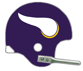
But I do not want to distance myself too far from the original purpose here. Rounding up photos of every Vikings game from 1966-69 made me realize...the helmet logo we were using was completely inaccurate and unacceptable for our 'just get it right' mantra around these parts. Here is the single-bar helmet we have been using to represent the first 6 seasons of Viking football.
Using this universally accepted logo that can be found nearly anywhere on the internet, this has been appearing as our 'go-to' helmet logo for the entirety of 1961-2006 for the Vikings. However, here is an actual photo from the team's first season.
 |
| 11/19/61 - DET @ MINN (Getty) |
But then I came across this photo.
 |
| 10/23/66 - MINN@ BALT (Getty) |
Not only does it show the horns running all the way back to the center ridge of the helmet, but the top of the horn is nearly flat with very little curve upward. This is also, actually, the case in the 1961 photo above. The linemen have their heads facing at a down-angle. If we were to rotate their faces to a horizontal plane, these horns would also appear just as flat as in the above 1966 photo, allowing for the rear curvature of the helmets.
So after first adjusting about 20 years-worth of helmet logos, I set about re-working them all with this new, additional refinement - essentially doubling my workload. But as I proceeded through, I began to wonder...if the horns are nearly flat on the helmet, why do all of the available graphics show an up-turned tip of the horn?
The answer would arrive in 1976. First, a view of 1975 still showing the nearly-flat helmet horn.
 |
| 12/28/75 - DAL @ MINN (Getty) |
 |
| 9/18/77 - DAL @ MINN (Getty) |
This would become the version of the horn that would be used up through the completion of the 2005 season.
There is one other tidbit related to this Vikings' crisis. Between 2007 and 2011, after redesigning their entire uniform in 2006, the Vikings wore throwback uniforms for select games those seasons. Apparently honoring the past, the horns for 2007 mimicked, in smaller form, the original, flatter version of the horns. However, in 2008, the up-turned version of the horn was utilized. The Vikings returned to the flattened version for each season between 2009 and 2011.
So I broach the question again. When is a logo not a logo?
The Chiefs can answer this. Their helmet logo has lower tip of the "C" angled while all of their commercial and merchandising logos have a horizontally-flattened end on the "C."
* Note - A few photos have turned up alerting us tho the fact that 1975 was a mixture of both the flattened horn and the upturned horn. Gifs have since been created for 1975 reflecting the fact that the 2 helmet logos were both being worn throughout the season. - B.S. 6/20/20
The Chiefs can answer this. Their helmet logo has lower tip of the "C" angled while all of their commercial and merchandising logos have a horizontally-flattened end on the "C."
The Chargers can answer this. Their commercial and merchandising logo has always been much stouter than the bolts that actually adorned their helmets for most of their 60-plus seasons.
Now the Vikings' 'stubby horn' can be added to this infamous list of inadequacy.
Bill Schaefer


No comments:
Post a Comment