


Time to review what was worn for Week 3 by the 32 teams of the National Football League.
#16. Jets-Dolphins: Jets in green/white. Dolphins in white/white. All I'll say about this one is a heckuva lot of white. A very blah look for a very blah game.

#14. Jaguars-Colts: Jags in white/white. Colts in blue/white. Not much to report here. Jax with the all white look, the Colts in the familiar blue jerseys. I don't know what could have been done to spice this one up.
#13. Falcons-Chargers: Falcons in red/white, Chargers in white/white. OK, this look on the Bolts was good last week, bit this week, not so much. Chargers would have looked much better with the navy pants that would have offset the red and white of the Falcons. But not to be. So, down it goes.
#12. Eagles-Cardinals: Birds of a feather. Eagles in white/green and Cardinals in black/white. Big Red goes the blackbirds route with the black alternate. Not sure I understand why the Cardinals use this alternate, but there it is. And it really doesn't go that badly with the Eagles as opponents, but frankly, the red would have gone a lot better.

#11. 49ers-Vikings: Niners in white/gold and the Vikings in purple/white. This is a nice matchup. The Vikes in purple just looks right and the Niners keeping it conservative with dashes of the brilliant red. Eye appealing.
#10. Rams-Bears: Rams in white/blue with the Bears in navy/white. I like me some dark pants and the Rams do just that. But if they still had and wore their gold pants, this might be one of the better matchups for the week. Still it's way better than an all-white look. Bears always look good in navy.
#9. Patriots-Ravens: NE in white/navy, BAL in purple/white. Was some talk of the Ravens in all black, but that didn't happen and that's a good thing. With the Ravens in white pants, it blends well with the Pats' color scheme. Well done.
#8. Lions-Titans: Lions in Honolulu Blue/silver and Tennessee in white/Columbia blue. This game gives me the blues (ha ha), Lions in Honolulu and Titans in Columbia and Navy. So if you like a lotta blue, this will fill your need. And I happen to like blue. So this will go up a few pegs on the TimmyB'ometer.
#7. Packers-Seahawks: The game that ended in a furor. Pack in white/green, Hawks in navy/navy. Maybe it would have been nice to see the Seahawks in white pants, but I really like this look and it pairs off well with the Packers in the white and yellow. No controversy from this end!

#5. Texans-Broncos: Houston in white/navy and Denver in orange/white. This is a nice mtachup, and the main reason is that the Broncos look so right in their orange jerseys. Still grumpy that the Texans wear their navy socks instead of the reds that they put on the shelf several years ago. But this is a goody.
#4. Bills-Browns: Bills in blue/white and the Browns in white/white. The battle of Lake Erie. Or the battle of I-90. Whatever. I just love this Bills uni. And it pairs off nicely with the orange and brown trim on the Browns.

#2. Buccaneers-Cowboys: Bucs in red/pewter and Cowboys in white/mint. Always have like the Bucs' red jerseys and the white pants make the whole combo pop. Alas, the pants stay pewter as the Cowboys stay in traditional home white. Still, it works.
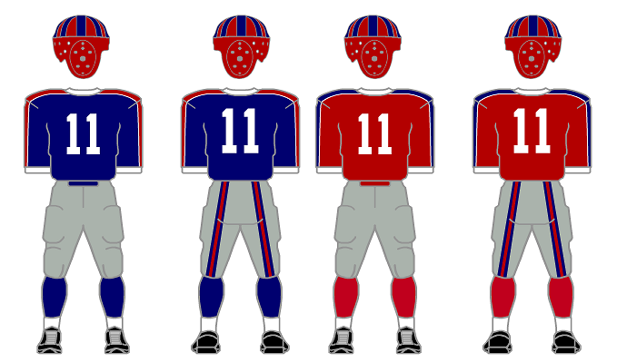
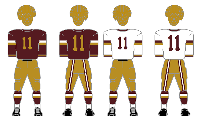
#1. Bengals-Redskins: Bengals in white/black and Redskins in burgundy/yellow. Aaah, this is so good. A load of color, orange, white, black, burgundy, yellow. Sorta autumn-like. A dang good matchup!!


