1 - 2 - 3


All but one of the first weekend of preseason games are in the books.  The Jets and Texans will wrap up the first week of games on ESPN tonight.

Cam Newton (1), in some opinions, outplayed starter Jimmy Clausen (2) in the Panthers game against the Giants Saturday night.  Should Newton become the starter, and Clausen the backup, along with third-stringer Derek Anderson (3), would this be the first time in NFL history that a teams quarterbacks were numbered, in order, 1-2-3?  The numerical simplicity of it would rival the early Yankees, when they first gave out numbers based on the batter's spot in the lineup.  (i.e. Babe Ruth was 3, Lou Gehrig 4, etc.)

Would this truly be a first?    Let's play a game, take a team (any team through NFL history) with three QBs, and take the starter's number x3 and add it to the #2 QB's number x2 and the #3 QBs number....In this example the 2011 Panthers (if Newton is starter and Clausen is backup) would be = (1 x 3) + (2 x 2) + 3 = 10 (the lowest total you could have)  Let's try to find the next lowest total.....  Here's a few examples:

2006 Buccaneers: Chris Simms (2), Bruce Gradkowski (7), Tim Rattay (13) = (2 x 3) + (7 x 2) + 13 = 33

1996 Vikings: Warren Moon (1), Brad Johnson (14), Jay Walker (6) = (1 x 3) + (14 x 2) + 6 = 37

1998 Seahawks: Warren Moon (1), Jon Kitna (7), John Friesz (17) = (1 x 3) + (7 x 2) + 17 = 34

1994 Falcons: Jeff George (1), Bobby Hebert (3), Perry Klein (7) = (1 x 3) + (3 x 2) + 7 = 16

That 16 is going to be tough to beat - and who was Perry Klein, anyway?

~ ~ ~

In other games this weekend, we got to see the debut of the Bills new unis.  While still disappointed that they apparently won't be wearing nice bright royal blue pants with the unis this year...  (Does that still leave open the possibility they may add them in 2012 or beyond?) ...I have to say I liked the widening stripe on the helmet.  As our Tim Brulia said about the Bills new uniforms in action: "Too much white for me. And the helmet stripes look like they flare in the back, but only at the last minute."

 
Tim also pointed out another anomaly -- the Cleveland Browns wore brown at home, even though we had heard earlier this off-season that they planned to go white-at-home this year.  Did they change their mind, or is it simply a case of doing the opposite in the preseason -- in the past they've worn white at home in the preseason when wearing brown during the season, and earlier this summer we uncovered the 1986 Browns wore brown at home only in the preseason, while only wearing white the rest of the year.  So my guess is in the preseason may be the only time we see the Browns in brown.

We told you recently of the Myra Kraft patch the Patriots are wearing.  Here now, courtesy of a tweet from Sportscenter, is a preliminary look at some other patches and decals we'll get to see in the 2011 season:


~ ~ ~


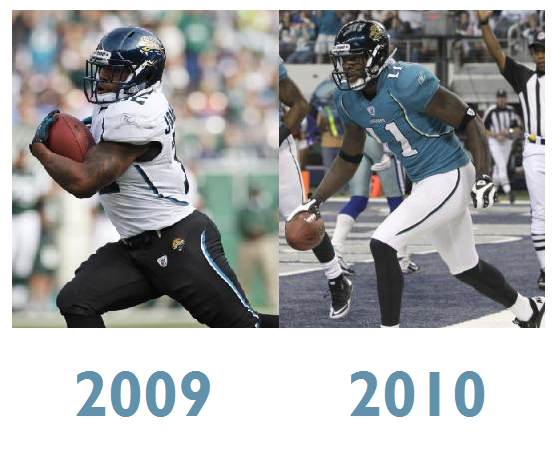
Another discovery was made over the weekend, and that was a change to the Jaguars pants' stripe.  When they introduced the new re-design in 2009, they had a curved pants stripe, and we just noticed while watching part of the Jaguars-Patriots game the other night, that the line was straight and went all the way to the waist.  It turns out they have had the straight line since the beginning of last season.  You can follow along with all sorts of discoveries like that in our forum, as well as help our Bill Schaefer, who is currently tackling some 1950s NFL uniform mysteries.

Stay turned to the Gridiron Uniform Database Blog, where in the near future we will be recounting another batch of updates based on our historian Tim Brulia's recent Library of Congress research trip, as well as other updates as we get ready for the 2011 season.

Are You Ready For Some Football?


We are back from our summer vacation here late on a Friday afternoon, and while there will be much time later to go over many new and exciting things that have been going here at the Gridiron Uniform Database, including part two of our historian Tim Brulia's Library of Congress research, we first wanted to catch up with everyone with a short abbreviated entry as the NFL kicks off the preseason.  Tim followed up on his work from last month with an in-depth scrubbing of the 1945-48 database images, and we will shortly be bringing you the results of that research.

I caught up with Tim last Saturday in Washington, DC and learned quite a bit about the process that goes into his research before it goes down to Florida where our graphical engineer Bill Schaefer turns it into the great images you see in our database.

So stay tuned here at the website for these and other database updates in the coming days.

~ ~ ~

In the meantime, the most important matter of business is that the 2011 NFL Preseason kicked off last night.  While a few short weeks ago we didn't even know if there would be a season, all of that labor animosity was set aside Thursday as the Eagles-Ravens, Cowboys-Broncos, Jaguars-Patriots, Cardinals-Raiders and of course the Seahawks-Chargers nationally on ESPN kicked off the season on the field.

Our first look at a uniform variation also occurred in the New England game, as we saw the memorial patch for Myra Kraft that the Patriots debuted last night, as worn in the picture above by Wes Welker.  I'm sure Bill is working as we speak to add that to the Patriots 2011 uni graphics as we prepare to open up a new season in the database when Week 1 kicks off early next month.

The Bills will be wearing their new uniforms for the first time Saturday night, and as mentioned at Uni Watch the other day, we are all anxious to see how the fifth-year captains will be recognized as the Captain's Patches that teams have been wearing since 2007 only have room for four stars.   While much was made over new Viking Donovan McNabb getting #5 from punter Chris Kluwe in Minnesota, I heard on Washington radio while on my trip that QB John Beck has switched from #3 to #12 (followed by an inane half-hour of sports talk radio where local DC jocks discussed how with all of the great #12 QBs in NFL history the 'Skins had never had a great #12.  These same guys were discussing their playoff chances in the NFC East and how "great" the Redskins would be in 2011 with Beck & Grossman at QB, while not seeming to grasp how an ESPN.com poll could show that 48% of respondents thought the Redskins were the worst team in the NFL, easily defeating the Bills, Bengals and Panthers.) Also last night Vince Young wore #9 in his first appearance for the Eagles, ostensibly to honor the late Steve McNair, but also probably because DeSean Jackson didn't want to give it up, although since he had been holding out up until recently, maybe he just didn't get a chance to ask him for it yet.

So as we get ready for the 2011 season here at the Gridiron Uniform Database, let us know if you spot any other uniform changes, as you watch the rest of the games this weekend.  Speaking of which, I get to watch my Buccaneers live on national TV on FOX tonight in a couple hours.  Whether you will be watching the Bucs-Chiefs game or your favorite team locally, I hope you enjoy tonight's (or tomorrow or Monday's) game and enjoy the fact that our "long national nightmare" is over and for each of the next twenty-six or so weekends we'll have football until we again plunge into that great abyss that is known as the off-season once again.

Best NFL Uniform Tournament, Part 5

Well, we've been sort of on vacation around here at the Gridiron Uniform Database Blog, but here are the entries to vote of for Part 5 of the Best NFL Uniform of All Time tournament.

This has been written up in advance, so Part 4 results aren't available yet, but go ahead and vote on Part 5:

Matchup #25: 1998 Arizona Cardinals vs. 2004 Indianapolis Colts.  This matchup features the red-over-white basic uniform combo the Cardinals wore from their early years in St. Louis all the way through their redesign after the 2004 season.  The Colts' basic home white variation is also a classic -- it is the same uniform they have worn since 1957 from the Johnny Unitas era through the Peyton Manning era.  Vote here.

Matchup #26: 1999 Denver Broncos vs 2001 Jacksonville Jaguars.  The classic example of a redesign helping the fortunes of a team, the Broncos switched to this set in John Elway's final two years and won two Super Bowls and have kept it ever since.  The Jaguars eschewed this uniform set after the 2008 season, and this original teal-over-white combo represents the 1995-2007 era.  Vote here.

Matchup #27: 1984 San Francisco 49ers vs 1967 Pittsburgh Steelers.  The classic Joe Montana era 49er design represents the 1980 to 1993 time period, while the Steelers' "batman" design, arguably a fan favorite, was short-lived, only appearing from 1966 through 1968.  Vote here.

Matchup #28: 1991 Atlanta Falcons vs 1987 Houston Oilers.  The Falcons ushered in the Jerry Glanville-Deion Sanders era by changing to a predominately black design and left two tickets for Elvis at Will Call.  The Oilers, who had many different combos throughout their first two decades, stuck with the basic Oiler Luv Ya Blue combo from 1979 until leaving for Tennessee after 1996, even keeping this design for two years (although they only wore white in 1998) as the Tennessee Oilers.  Vote here.

Matchup #29: 1991 Washington Redskins vs 1964 Oakland Raiders.  This Redskins' white-over-maroon is another classic, having worn it from 1979 through the present, it has seen multiple Super Bowls under Joe Gibbs with three different quarterbacks: Theismann, Williams and Rypien.  The Raiders in 1963-64 and again in 1970 used silver numbers with black outlines on their road whites, a design they resurrected for their 2009 throwbacks.  Vote here.

Matchup #30: 1947 Chicago Rockets (AAFC) vs 1993 New York Giants.  The Rockets - a team that only played three years in a defunct league, wore yellow pants in only the middle year, while donning white pants in 1946 and 1948.  This red-over-yellow combo represents the Rockets' entire existence, however.  The Giants, who dropped the blue pants after the 1978 season, went only mono-white whenever wearing their white jersey, which lasted until the next resign in 2000.  Phil Simms, Lawrence Taylor and company won two Super Bowls during this era, however, an injured Simms was replaced by Jeff Hostetler in one of them.  Vote here.

Matchup #31: 1964 Cleveland Browns vs 1987 New Orleans Saints.  The classic white-over-white period this uniform covers is from the removal of numbers from the helmets after the 1960 season, through the adoption of the orange pants in 1975.  While they worn similar combos at other times in their existence, the 1961-74 era of Jim Brown and a 1964 NFL Championship is represented here.  They will face the Bobby Hebert era Saints, the black-over-gold uniform combo with the state of Louisiana on the sleeve.  They wore this set from 1986-1995, changing from white pants to gold in '86, and replacing the Louisiana logo with the Fleur-de-Lis in 1996.  Vote here.

Matchup #32:  2009 Houston Texans vs 1985 Chicago Bears.  The Texans, which began wearing a "battle-red" third jersey in their second season in 2003, adopted red pants as well for this mono-red look which they have worn annually since 2007.  The Bears had one of the best seasons in NFL history in 1985, and this uniform, their classic navy-over-white home look represents the same combo they've worn at home since the fifties, with the exception of throwbacks, an attempt at a mono-navy combo, and a handful of White At Home™ appearances since 2005.  Vote here.

Bill Tweaks The Jaguars

Today at the Gridiron Uniform Database, our Bill Schaefer once again turns a team's uniform designs on its' collective head with a complete overhaul.  This time, it's the Jacksonville Jaguars.

~ ~ ~

Like last week with the Dolphins, I know that any time I set out to make one of these uniform tweaks I know that I am probably going to rankle some of that team’s faithful.  I know that but again, please bear with me.

In 1995, teal was the trendy color.  San Jose Sharks.  Florida Marlins. Charlotte Hornets.  All of them incorporated teal.  Even the Jags’ expansion partner, Carolina Panthers, used a light Carolina blue that is chromatically very close to teal.  My opinion is that teal makes a very good secondary color, just not a good primary one.  My first job was demoting the importance of teal.  I still retained it as a secondary color.

What to use for a primary color?  Similar to choosing a dolphin grey, I chose the Jaguars’ own shade of gold.  Keeping the same helmet logo, I placed it on a gold helmet with a simple black central stripe and kept the black facemask.

When I was a kid, I was fascinated by the change Cincinnati made away from their Cleveland-clone uniforms to the revolutionary ones with the tiger stripes.  I decided to use that Bengals concept but in a much more toned down version.  I first thought of adding jaguar spots on the shoulders or the entire jersey. Sanity took hold as my design began to resemble this item to the right.

I settled on the collar and cuffs.  The rest of the jersey was made gold in the style of the Saints’ “one and done” 2002 alternate (left), but I stayed away from the black pants/black socks ‘leotard’ look.  I added four sets of thin shoulder/sleeve stripes utilizing the teal.  Why four?  To my recollection I’ve not seen a jersey with 4 stripes. Two, three, or five?  Yes.  Four?  No.  I also added something new to the numbers – stripes INSIDE the numbers.

Again, similar to Cincinnati and New Orleans (1999), I used basic black pants with a gold stripe panel of jaguar spots.  I didn’t want to use black socks as this would make the uniform look too much like New Orleans so I went with plain gold socks.  I also added a jaguar-spotted belt for good measure.


Would something like this design ever get used?  I doubt it.  It’s just the artistic version of someone who’s assembled thousands of uniform combinations and would like to fix what’s broke.

~ ~ ~

Thanks Bill for this new concept -- it's not any worse than what they're wearing now, and I kinda like the leopard print side pant panels.  Maybe for a third alternate I'd add a black jersey with gold pants -- these two jerseys look kinda light.  Of course knowing the Jags, then they'd probably also wear mono-black and mono-gold.  I hope you get a better response to this one than last week.  

There will be no blog update Friday, but hopefully we'll be back Saturday with Tim Brulia's weekly column -- no idea what Tim will be opining about this week, but I'm sure, like all of his columns, it will be good.

In the mean time, voting continues on the fourth group of uniforms in our Best NFL Uniform of All Time contest, plus be sure to join in all the uniform debate fun in our forum.

Best NFL Uniform Tournament, Part 4

Today we bring you another installment of the Best NFL Uniform Tournament.  Every week or so, here at the Gridiron Uniform Database we are bringing you head-to-head matchups of NFL uniforms to vote on and the winners will compete in a bracket-style tournament to determine the Best NFL Uniform of all time.  Here are last weeks eight winners:

The 1967 Packers (green) defeated the 1992 Bills (blue) by a runaway 108 votes to 17 (86%).  The 1955 Rams defeated the 1991 Chiefs 59 to 43 (58%), the 1987 Broncos (white) defeated the 1998 Ravens (purple/white) by a 84-22 margin (79%), and the 1975 Saints (white) defeated the 1995 Jets 64 to 51 (56%).   The 1981 Chargers (blue/yellow) defeated the 2002 Panthers (alt. blue) 82 to 28 (75%) and the 1987 Seahawks (blue) defeated the 2000 Giants (white/gray) by a 60 to 51 margin (54%), while the 1992 Cowboys defeated the 2005 Texans (blue) by 61 votes to 44 (58%) and the 1971 Redskins (92 to 17, 84%) easily defeated the 2009 Bengals (all variations).

Now it is time to bring you another group of uniform matchups to vote on:


Here is Group #4:

Matchup #17: The 1985 Green Bay Packers (white uniforms) vs the 1935 Chicago Cardinals (blue).  For a few years in the 1980's, the Packers' slightly changed their uniforms, adding a player number detail on the pants strip and also the "G" helmet logo on the jersey sleeve stripe.  This is the uniform worn by Lynn Dickey, Paul Ott Carruth, and a bunch of other forgotten players on forgotten teams that filled the years between the Vince Lombardi and Brett Favre era, rarely making the playoffs, in fact from 1973-1991, only in the expanded 1982 season did the Pack qualify for the postseason.  They adopted the G and the pants number in 1984, and in 88, the number was gone and in 89 so was the "G".  For the Cardinals, from the 1930s into the 1950s, along with their red uniforms, they also had a blue combo, to wear when they didn't want to clash with other reddish- looking teams, like the Redskins, and the...uh, well Giants and Dodgers...  In 1935 and 36 they wore these diagonal stripes on their pants, they 36 variation on gray pants, but these 1935 unis were khaki.

Matchup #18:  The 1975 Cincinnati Bengals (black) vs the 1999 St. Louis Rams (blue).  For the Bengals, this was the classic 70s look of Ken Anderson and Isaac Curtis, years before the adopted the Bengal tiger strips, the Bengals were a non-descript team using the same colors (and same initials) of their founder's original club, the Cleveland Browns.  (Or was Cleveland using Brown's color.)  At any rate, in the early years of the Bengals franchise, the chief difference between the two clubs was the word "Bengals" written on the helmet.  Oh, and they used black instead of brown to go with the orange.  For the Rams, the uniforms that they debuted in 1973 in Los Angeles pretty much stayed unchanged until 1999.  The team appeared in 7 NFC Championships from 1974 through 1989 (although they only won one of them and went to Super Bowl XIV), and had a fairly successful run in these unis only to fall on hard times in the 1990s and move to St. Louis.  A resurgence with the amazing 1999 season with Kurt Warner the "Greatest Show on Turf" and their unbelievable run to a Super Bowl XXXIV championship was the swan song for these uniforms, however, as they ditched them after the season.

Matchup #19:  The 2003 Seattle Seahawks (white/blue) vs 1949 Los Angeles Dons (blue/red).  The Seahawks, after their redesign for the 2002 season, generally wear the white pants with the white top for the mono-white look, however this uniform combo does get worn from time-to-time.  It is matched-up against one of the most colorful, if not forgotten uniforms of all-time, the AAFC's L.A. Dons.  When the NFL absorbed a handful of AAFC teams into it's league, they took Baltimore (which failed) along with San Francisco and Cleveland.  While it has been debated that the league should have taken a more stable ownership group in Buffalo instead of Baltimore, it is ironic that it was due to the success of the Cleveland Browns that the NFL's Rams moved to L.A., had the Rams not been in L.A., the Dons may have been more successful and joined the NFL as a west coast compadre of the 49ers.

Matchup #20:  The 2009 Miami Dolphins (orange alts) vs 1988 San Diego Chargers (white).  The Dolphins, long a team of aqua and white and orange trim, adopted a third jersey color for the first time in 2003 when they added an orange top.  They wore it rarely in '03 and '04 and brought it back again in '09 and '10.  The Chargers, having ditched the yellow pants after the 1984 season, ditched the yellow lightning bolt of the helmet after the 1987 season, and brought in one of the most disliked uniform sets in franchise history when they debuted the white lightning bolt for the 1988 season.

Matchup #21:  1968 New York Jets (white) vs 2006 Tennessee Titans (all variations).  The Jets classic look of the Joe Namath era, the uniform we think of when we think of the landmark Super Bowl III guaranteed victory that put the AFL on the map, is a classic white-over-white look that the Jets tried to go back to when they redesigned their image for the 1998 season.  The new Jets' look, however, isn't an exact replica of the classic age of the Namath, Don Maynard and Weeb Ewbank Jets.  The Titans, like the modern-day Bengals, are another of these teams that mixes-and-matches multiple uniform tops and pants to have a plethora combinations to choose from.  With navy, light blue and white, in both jersey and pant, they theoretically have nine different combos they could wear.  Add in a second pair of socks or shoes (or even helmets) and teams like this could exponentially increase the combinations.  While the Titans haven't worn all nine different possible combos in a season, they have come close.  This entry covers the entire Titans 1999-to-the-present uniform set.

Matchup #22:  1985 New England Patriots (white-red) vs 1948 Baltimore Colts (green).  When we think of classic Colts-Patriots rivalry, we're thinking Brady vs Manning, and not this matchup.  The Patriots adopted the shoulder hoops in 1984, and this uni-combo, which saw them wear red pants in 1984-88 and 1990 through '92, became only the second Wild Card team to make it to the Super Bowl when they won the 1985 AFC Championship and faced the Bears in Super Bowl XX.  These Baltimore Colts are not the forerunners of the modern-day Indianapolis team, this AAFC team only lasted one season in the NFL.  These Colts, who wore green uniforms, began life as the Miami Seahawks, and folded after 1950.  However the name Colts in Baltimore began with these guys, and Baltimore fans were attached to the name enough that when they got a 1953 expansion team, they used the same name.  Although that team left in 1984, when Baltimore had a CFL franchise in the early 1990s, they tried to use the name, although legal issues prevented it's official adoption (they were called the Baltimore CFLers), and when the NFL returned in 1996, although another city had been allowed to keep their Colt identity, Baltimore didn't get the same treatment and be to take Cleveland's "Browns" name -- they had to settle for a new Raven identity.  But long-time Baltimore's football identity began with these original AAFC Colts in 1946.

Matchup #23:  1997 Tampa Bay Buccaneers (red-white) vs 1966 Kansas City Chiefs (white).  When the Buccaneers changed uniforms in 1997, their primary home outfit was the red-over-pewter.  But they debuted a red-over-white primetime set on September 21 and won a TNT Sunday Nitro matchup over the Dolphins to go to 4-0 and announce their arrival on the national stage.  Over the past decade they have only wore this set occasionally, but they have a surprisingly good W-L record while wearing red-over-white.  The Chiefs, who have pretty much had the same uniform throughout their existence, have worn red pants with the white jersey in 1968 through 1988 and again since 2000.  The Chiefs, who have never gone mono-red, have pretty much been consistent with either white-over-red or mono-white for their road set, although since 2006 they have worn both looks at times.  Before adopting the red-pants in 1968, however, the Chiefs were exclusively a white-pant team, and they wore this look to the first Super Bowl against the Packers.

Matchup #24:  1990 Philadelphia Eagles (white-gray) vs 1979 Detroit Lions (blue-gray).  The Eagles adopted a new look in 1985 and wore it for a decade, this is the primary road uniform of those years, which ran from the end of the Ron Jaworski era, and the entire Randall Cunningham and Buddy Ryan era. While they never made it to the NFC Championship in this time period, they did make it to the playoffs in five of the last eight years of this uniform set.  The iconic image that one thinks of when they think of this era, perhaps, is Cunningham avoiding a sack on a Monday Night in 1988 against the Giants.  The Lions, before they adopted the lighter honolulu blue in 1982, wore a darker uniform color.  This shade of blue had been worn by Detroit since the Bobby Layne years, but in 1979 belonged to a team that had only seen one playoff appearance from 1958 to 1981.

Well, those are the matchups, and here you can vote:


Matchup #17
1985 Packers
1935 Cardinals


Matchup #18
1975 Bengals
1999 Rams


Matchup #19
2003 Seahawks
1949 Dons


Matchup #20
2009 Dolphins
1988 Chargers


Matchup #21
1968 Jets
2006 Titans


Matchup #22
1985 Patriots
1948 Colts


Matchup #23
1997 Buccaneers
1966 Chiefs


Matchup #24
1990 Eagles
1979 Lions


~ ~ ~


The Throwback Helmet Evolution

When the NFL celebrated its 75th anniversary in 1994, many of the teams wore throwback uniforms.  A few weeks back here at the Gridiron Uniform Database, we discussed how the Jets and Bills throwback helmets (right) weren't even the correct color.  Today our resident historian Tim Brulia takes a league-wide look at all the throwback helmets that NFL teams wore that in the throwback games that year:

~ ~ ~

The throwback: an attempt to honor past teams by wearing previous years' uniforms that had since been retired.  A rather common thing in all sports in North America today, but a rather novel idea in 1993 and 1994. Let's go back, actually to 1969, when the National Football League celebrated it's 50th season of existence.

Throwbacks in 1969 weren't even a thought in the minds of the NFL. The only outward signs of celebration was a commemorative patch on the shoulders and sleeves of players and officials and a lavish coffee table book, "The First 50 Years.". The commemorative patch was simply the NFL shield with the stars and football in the blue field of the shield replaced by a wide white "50."

In 1984, the original eight teams of the AFL celebrated their 25th season of operation. They too, simply utilized a commemorative patch worn on the left collarbone area of the jersey, as on Dan Fouts' jersey in this picture to the left. Well, the Raiders were the usual contrarians, (right) wearing their patch on the left hip of their pants. Other teams were also starting to commemorate their histories by wearing patches for milestone seasons or anniversaries.

The idea of wearing a throwback uniform to commemorate a special anniversary or event apparently started with baseball's Chicago White Sox in 1990 when they broke out a 1917 vintage uniform for a game against Milwaukee, which was to celebrate their final season at old Comiskey Park. It was very popular, but I digress.
11/21/93 Bengals at Jets
1968 Jets helmet
On November 21, 1993, the Jets celebrated the 25th season anniversary of their landmark victory in Super Bowl III by wearing a uniform that hearkened back to that historical win against the Baltimore Colts. The jersey was similar to, but not exactly, the Super Bowl III jersey, while the pants and socks were close to the exact duplicate. The helmet?? Well, that's a different story altogether. As you can see, the 1968 helmet was white with two green stripes and a football shaped logo on the sides. The throwback helmet only resembled the logo. The helmet was green, like the 1993 helmet and was stripeless. The Jets simply took the current helmet and peeled of the logos and put on the '68 vintage logos and added a white outline to show the shape of the logo. This was the first intended usage of a throwback uniform in NFL history.

The following year, in 1994, the NFL celebrated not just their 75th season with a commemorative patch and this time a lavish coffee table book with accompanying video ("75 Seasons"), but they also decided to cash in on the party by having as many teams as possible wear throwback uniforms. In fact, Week 3 would see all, or almost all, of the teams wear throwbacks. While some teams really got into the spirit of the program with their jerseys and pants and even socks, some barely made any notable changes to their unis. But I will focus on the toughest uniform article to accurately throwback, the helmet. Here listed is each team and how accurately they "threw back" the helmet:

~ ~ ~

Cardinals: Fair. Simply removed their decals to create a plain white helmet.
Falcons: Pass. Changed their helmet color from black to red with proper stripes and logo.
Bills: Fail. Changed only the logo from the charging blue buffalo to a standing WHITE buffalo. Meant to show the 1962-73 logo.
Bears: Fair. Simply removed the C's to create a plain navy helmet.
Bengals: Pass. Took off the tiger stripes and put on the generic "Bengals" in use from 1968-80.
Browns: Zero. No changes. To anything
Cowboys: Zero. No changes. 
Broncos: Pass. Changed their helmet color from blue to orange with proper logo and stripes.
Lions: Fair. Simply removed all logos and stripes to create a plain silver helmet.
Packers: Fair. Simply removed all G's and stripes to create a plain yellow helmet.
Oilers: Pass. Changed their helmet color from white to columbia blue with proper logo and stripe.
Colts: Zero. No changes.
Chiefs: Exempt. No changes, but really, nothing to change to for KC era.
Raiders: Fail. Though change was made from the current logo to the 1963 logo, they inaccurately made the shield white as opposed to silver.
Rams: Zero/Fair. No changes, but era duplicated wore same style helmet.
Dolphins: Pass. Changed to Dolphin "half out of sunburst" logo.
Vikings: Exempt. No real change to helmet design since inception.
Patriots: Pass. Changed their helmet color from silver to white with proper logo and stripes.
Saints: Zero/Fail. No changes.
Giants: Pass. Took off GIANTS logo, replaced with "ny" logo AND added accurate front/back rounded helmet numbers.
1994: Eagles vs. Packers
Jets: Fail. Took off current logo, added two white stripes and 1965-77 era logo with a white outline. Except for logo, an inverse design.
Eagles: Pass. Removed wings from helmet and made helmet to resemble 1942-1950, 1952 silver shell/green sided design.
Steelers: Fair. Simply removed decals, numbers and stripe to create a plain black helmet.
Chargers: Pass. Changed their helmet color from navy to white with proper logo and numbers.
49ers: Zero. No changes.
Seahawks: Exempt. No change to helmet design since inception.
Buccaneers: Exempt: No real change to helmet design since inception.
Redskins: Fair. Simply removed the logos and stripes to create a plain burgundy helmet.


~ ~ ~

In 2010 the Colts wore this helmet;
in 1994 they just wore their usual one
Why the haphazardness with the helmets? It's obvious some teams made shortcuts on logos to save money. Helmets are far and away the most expensive piece of equipment on a football uniform. In addition, to lessen head injuries, more attempt is made to custom fit helmets to the head as much as possible, which probably results in more of a "breaking in" phase than other equipment. So, even with all of the money coming in from various sources, some teams simply wanted to cut costs as much as possible. Other teams, like the Falcons, Chargers, Patriots, Oilers were not as averse to dropping loot for another full set of helmets to break in.
As this was the aegis of throwback uniforms, some teams went all out for the throwbacks, getting everything as close to accurate as possible, others made a half-a--ed effort, getting some of the specifics, but paying no attention to detail. The Bills were notable offenders here. Some, while having the ability to make a few changes, chose not to (Colts and Browns), while others made jersey and pants changes that were accurate, but bailed on changing the helmet (49ers, Saints). And then other, because there were minimal changes to the unis up to that time, really made no changes at all (Buccaneers).
All in all, 1994 signaled the move to throwbacks as an alternate or third uniform for good. Teams that wear throwbacks today are much more accurate, accounting for cuts and materials changes from the specific period to how unis are worn today. Proof of this was the accuracy of the 2009 AFL Legacy unis to era they attempted to duplicate. As with anything, you learn from your mistakes and strive to improve. Take a look at the Bills as an example. What was a lame effort in 1994 where they didn't even get the helmet color correct, has evolved into the fabled throwbacks that they have worn in recent years.

Who said "you can never look back?" (Ed. note: I think it was Don Henley.)

~ ~ ~

Thanks, Tim.  I'm sure this will not be the last time we look at the 1994 throwbacks.  Readers, what do you think of this topic?  Should the teams have taken more care in 1994 to have more accurate helmets, or do they get a pass since no one cared about throwbacks back then like they do today?

We'll be back tomorrow with another group of uniforms to vote on in the Best NFL Uniform of All-Time Tournament and later in the week Bill Schaefer will have some more tweaks to complement the Dolphins that everyone like so much.  In the mean time, take part in our forums and join the discussion, and also check out the latest database changes

Bill Tweaks The Dolphins


We are back today after a few days off from the blog, as we took some time to revamp the database update displays.  You will now see a link above that says Database Changes, and if you go there you will be able to see corrections that we've made to the database based on your contributions.  If you go to these pages, you will see a desrciption of the changes, as well as the NEW and OLD images.  One thing you can do is open the two images side-by-side in new tabs (if you're using Firefox -- I don't know if IE has tabs) and click back-and-forth between the two images and see the changes.  If you'll go to Update #13 I challenge you to describe in the blog comments the changes in the 1933-39 & 46 Bears.  This is how detailed and detail oriented our website is, specifically the attention to detail that Bill Schaefer has used in our graphics.  When you see how minute these changes are, you'll see just how serious we take this stuff.  The first person in today's blog comments who accurately describes the change in the 1933-39 & 49 Bears images will win a Kit Kat bar.  Bill and Tim, you're not eligible.

Please continue to join in on the fun debating our database images in our forum.  The Best NFL Uniform Tournament of All Time is taking a week off, but you can still vote on Week 3 matchups if you haven't done so already.  We'll be back next Monday with another round of voting.

Today our Bill Schaefer follows up on his monochromatic white article from last week with a Miami Dolphins tweak:
 ~ ~ ~

Any time I set out to make one of these uniform tweaks I know that I am probably going to rankle some of that team’s faithful.  I know that, but bear with me.


I stated in my last entry my nearly complete and total disdain of mono-white. While there were a few exceptions, most mono-whites fall into a negative perception in my eyes.  One that has always bothered me is the Miami Dolphins.  


I understand the reasoning behind wearing the mono-whites at home as it helps to reflect the sun and heat of South Florida.  I also understand the team colors they use and why.  The aqua is, of course, representative of water while the orange represents the Sun. No problem.  I kept both of these for tradition’s sake.  But why not enhance the use of…say…dolphins?  Performing a Google Image Search on bottlenose dolphins, I came across these 2 photos.


The argument has been made that bears aren’t navy and orange; lions aren’t blue and silver; eagles aren’t green, etc.  I don’t dispute that.  However, cardinals are, well…cardinal red so there is a precedent. I’m just suggesting that another color be brought into the Dolphins’ repertoire – grey.


I may be one of the few who actually liked the silver jerseys that New England wore a few times in the past decade but eventually dropped.  This is partially what I based Miami’s new combos on.


I started by redoing the helmet.  Although the helmet logo has been updated and modernized, does it really need the Sun?  I say no.  Does anyone really think “Miami, brrrrrrr?  We’d better show the Sun so people know it’s hot, sunny, and humid here.” I found a Sun-less alternate logo that I think works much better.  I used a dark grey directly from the crown of a dolphin’s head in the earlier photos for the helmet shell.  I made the dolphin in the logo a slightly darker grey than the helmet just for contrast. The aqua and orange are still used for central helmet stripes with a central orange, flanked by the helmet’s grey as a spacer, and followed by thin stripes of the aqua.  I kept the aqua facemask.


Moving to the jersey, I didn’t want to use the same grey as for the helmet for 2 reasons.  First, if the jerseys were that dark of a shade of grey, they’d never get worn and we’d still be stuck watching Dolphins home games with them wearing white jerseys.  Secondly, looking at the dolphin photos, you can see that, as you look from the top of their heads and their dorsal fins down towards their underbellies, the grey actually lightens several shades.  I’ve made the jersey (and pants) into a lighter shade of grey than the helmet. 


I incorporated some orange and aqua northwestern striping on the sleeves.  I also placed identical thin striping down the legs and on the socks.  I always liked the sharpness and simplicity of the thin pants striping on the old Cardinals and Eagles pants. 


Would this ever get used?  I doubt it.  It’s just the artistic version of someone who’s assembled thousands of uniform combinations and would like to fix what he considers broken.  Next week, the Jaguars.

That Funny Ravens Logo (Red, Yellow and Black aren't their colors, are they?)


A few days ago at that other site, there was a discussion of the possible misuse of the colors grey and blue on the Texas state patch on the MLB Rangers' sleeves.  I agree that the lighting and shading is possibly depicted wrong, and while I realize that the limitations of embroidery may have limited the use of colors to just those four as people brought up in the comments over there, another problem I have is the length of the flag in relation to it's height.  If you unfurl it, I believe you have a flag that is over three-times as wide as it is high.  And I'm not even getting into the gray gradations they added to the 2-Dimensional star, but I'm sure there are regulations about flags and what you can do as far as three-dimensionally representing a two-dimensional flag.


At any rate, in these above images, the lower right is a variation of another way you could depict the flag.  It would require a second shade of darker red, but if you use the brownish-gray instead of the blue for the shadow part and then shade it as I have, you have a version perhaps more palatable to those so interested in detail.  I'm sure, however, when the Rangers' adopted this patch in 2000 (yes they've had it for over a decade, and we're just noticing it now) they worked up a few different variations, and the team brass chose what they did.

What does this discussion of an MLB patch have to do with football uniforms, our focus here at The Gridiron Uniform Database?  Well, as we are discussing state flags, along with the Rangers' use of their state flag, baseball's Orioles and football's Ravens have also used the Maryland state flag within team logos.  But what do these items from the Maryland flag that are in the Orioles and Ravens' logos mean?

The Maryland State Flag

Many readers of this website, in discussing football uniform color issues, have brought up heraldry, as in our discussion of the tincture of Or, the color gold (not yellow), etc.  So today let's take a look at this Ravens' secondary logo and its' heraldric elements.  As you can see when you look at the Maryland state flag, the Orioles use the actual representation of the flag, within an orange circle with their team name, yet the Ravens' is not quite the same.  But what do these quarters of the flag represent?

The Crossland Banner
The Maryland state flag design is based on the coat of arms of George Calvert, the English politican who was the 1st Baron of Baltimore, and basically the "founder" of colonial Maryland.  The yellow and black pattern was from arms granted to him by royal patent -- the vertical striped pattern representing a palisades that he "courageously stormed in battle," while the red and white cross bottony pattern is derived from the Crossland banner that belonged to the family of Calvert's mother.  (Later, during the Civil War when Marylanders who supported the Confederacy didn't want to use the Maryland flag because their state supported the Union, used the Crossland banner, whose red and white colors were seen as secession colors.)

The Grenville Armorial in the
house of Stowe shows a very
extravagant use of marshallling
-- it contains 719 quarterings.

In heraldry, marshalling is when you "cross" two flags in this manner, as in a union of a husband and wife's families, one way to do it is by putting one of the flags in the 1st and 4th quadrants, and the other in the 2nd and 3rd quadrants.  There are a few different ways to "cross" in successive generations, depending on which European traditions you are following, i.e. French nobility, British nobility, Spanish nobility, Germanic nobility, etc.  In some traditions, if you were crossing a four-field arms with another four-field arms, you would simply choose two of the four fields and cross them, in other traditions you would "quarter" the quartering, and then have eight fields.  In this method, after a few generations you would have a very confusing set of arms.


The state of Maryland flag, therefore, was the Calvert family colors "crossed" with the Crossland colors.  The Orioles use this exact pattern within their logo, but the Ravens' logo isn't quite the same.  It is the Maryland flag, which the Orioles use, but then it is "crossed" with the "B" and "R" of the Ravens' logo.  This of course, isn't actually heraldry, but just use of heraldric elements in a sports logo.  The University of Maryland Terrapins also have used elements of the Maryland state flag in their logos.


Philadelphia's City Flag
Are there any other NFL examples of teams using either heraldry or state or local insignia besides the Ravens?  We know that the Eagles used Philadelphia's city flag colors early in their existence.  (You know, before they tried out the grey/black in 1941.)  They "threw-back" to these colors in 2007, and currently the womens soccer team, the Philadelphia Independence, is reviving these colors in their new team's logo.

Speaking of women's soccer, good luck to the Women's World Cup team today in the final against Japan, but also good luck to Phil Mickelson, who just shot a 5-under par 30 on the front nine in the final round of the British Open to tie for the lead.  We know a lot of people "over there" are rooting for Darren Clarke, but a lot of people over here are rooting for Lefty.


"I love me some baby blue and yellow"

Researching at the Library of Congress, Part I

Today our research historian Tim Brulia brings us his research from his recent trip to the Library of Congress in Washington.

~ ~ ~


Over the last several years, I have done some research at the Library of Congress (LOC) in Washington, D.C. The LOC consists of several buildings; The Thomas Jefferson Building, the James Madison Building and the John Adams Building. The building I hit, the Madison Building, houses an extremely extensive newspaper microfilm collection.


This past Saturday (July 9th), I made my journey from my abode in Enola, PA to the LOC. I drive from Enola to the Shady Grove Metro Station parking lot, where I board the Metro to the Capitol South stop. My mission: to extensively review the newspapers from 1941-1944 to make sure I have gathered as much information as possible on all of the teams, keying in on newspaper photographs from the microfilmed images. The photos will also help to assist our graphic engineer Bill Schaefer with his massive project of sizing up the game by game uniform match-up. I am armed with just a few neccessities for the trip; a mechanical pencil, my trusty composition book and my LOC reading ID card. No laptop, tablet or flash drives, just my 20th century equipment.

The newspaper reading room is large, but not overwhelming. The staff are courteous, friendly and helpful. The ritual consists of signing in and finding a microfilm reader. Once I anchor myself in position, I then go to work. The LOC has the New York Times, Chicago Tribune, Philadelphia Inquirer and Washington Post available for free access. The other newspapers I must request from the LOC staff. For the 1941-44 era, these would include the Cleveland Plain Dealer, Detroit Free Press, Pittsburgh Post-Gazette and the Milwaukee Journal (for Green Bay). Fortunately, I have on-line access to the NY Times and Milwaukee Journal and I have already used the Pennsylvania State Library for the Philly and Pittsbugh newspapers. When the staff retrieves my requested order, they bring the reels right to my work station. Excellent service!

As I go through the microfilm, I have already laid out a bit of a game plan. In my composition book, I have already logged in each season, team by team, the home schedules for each team. If I come across a photograph for the game I need, I note what the colors are for both teams that include helmet color, jersey color, pants color and sock colors. Anything unusual I see, I then try to do a quick glance in the game's write-up if any mention is made of the odd finding. If so, I jot it down. If not, I will make a note of the oddity I spotted myself. The hours for Saturdays at the LOC are from 8:30 AM to 5:00 PM. I work straight through the day without a lunch break, only pausing for nature's call or a quick sip from the water fountain.

Annnnnd, here's what I found that Bill needed to fix to bring a little more acccuracy to the database:


1941:
Dodgers: Remove the lower serif on the 1's on the front only.
Rams: Change pants to what was worn in 1940 (saw a pic from 10/5 game vs Bears in the 10/6/41 Plain Dealer, and compared to the Bears white pants, they were definitelty still yellow). Stay with the blue helmet (though I'm not 100% certain on the helmet color, it seems to match up with the jersey colors).
Eagles: Add a dark blue top with straight silver pants combo. They wore this for the 11/30 home game with the Bears and the 12/7 away game with the Redskins.

1942:
Dodgers: Remove the lower serif on the 1's on the front only. Change color of khaki pants to white.
Rams: Change helmet to yellow (it definitely seems lighter than 1941's). Change pants to the 1940 yellow version.
Eagles: Remove the all green combo.
  
1943:
Dodgers: White shoulders should be squared off. Thicken the sock red stripes by a pixel each and bring them a tad closer together. Add red rear stripes on the red combo. Remove the bottom serif on the front 1 only on the blue jersey only.

1944:
Yanks: On white jersey add forearm stripes (only team I've ever seen wear forearm stripes) of thin green/medium gold/thin green. Wore this jersey 10/22 at Philly.
Tigers: Add a combo with pants same color as the jersey.
Rams: Change socks on the blue combo to blue with 3 yellow stripes. Saw no signs of "patch" on sleeve(s).
Packers: Add white jersey combo with yellow shoulders and numerals (worn at Cleveland on 11/12).
Eagles: Add the white jersey/silver pants combo with two sleeve stripes (worn at Boston 9/26 and 10/8 vs Skins at home)
Redskins: Add combo with jersey that looks like the 1938 gold numbered jersey (without) sleeve patches. They wore this jersey at least twice, 10/8 at Philly and 10/15 at Boston.

I did finish my mission with about an hour to spare, so I took a scenic drive in the Maryland countryside to get off the sometimes crazy interstate traffic.

My next sojourn to the LOC is scheduled for August 6th, where I will seek out the 1945-1948 era of NFL Uniforms. I will report back to you with those findings then.

~ ~ ~

Thanks, Tim, we'll look forward to your next trip and further updates.

Twitter

Blog Archive