Week 4 2015 Weekly Uniform Rankings

by Tim Brulia


15) Chargers-Browns: SD in white/navy, CLE in brown/white. Again with the nearly unreadable orange numbers on the brown jerseys! Chargers looking good in white over navy, but the Browns, maybe in orange socks, could have done this one a little justice.

14) Ravens-Steelers: BAL in white/white, PIT in black/yellow. The Ravens choose to go all white with the Steelers in customary black over yellow. Not very often do I like the Ravens in all white, but in this case, it's a good choice. Steers away from too much black here.

13) Chiefs-Bengals: KC in white/red, CIN in alternate orange/white. Not the best game for the Bengals to wear orange in. One simple change would have perked this one up a bit: black socks on the Bengals. Would have lessened the impact of too much of a warm color thing.

12) Raiders-Bears: This is good, but not thrilling. Silver, navy, black and orange are nice colors to play with, but at times, it can be a little dull. And that's what I feel here. I know, I know, traditional based unis that have lasted for decades, but my bones are stiff on this encounter.

11) Panthers-Buccaneers: CAR in alternate carolina blue/silver, TB in white/white. I think the Bucs could've better off with the pewter pants. As it is, the Panthers always look sharp in those pale blue tops.

10) Lions-Seahawks: DET in white/silver, SEA in navy/navy. This is a good matchup, Shades of blue work nicely together, along with silver and gray and touches of neon green and black. But something is missing for me and I can't put a finger on it.

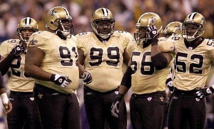
9) Cowboys-Saints: DAL in blue/silver, NO in white/gold. Cowboys in the better but seldom worn combo in their arsenal. Playing off the white over gold look of the Saints and the Saints would have better here had they worn black pants to steer slightly clear of the metallic fringe. The Cowboys in dark does score a few rungs higher.

8) Rams-Cardinals: STL in white/navy, ARI in alternate black/white. This one - for some reason - resonates with me, and it really should do nothing of the sort. The Cardinals truly are dressed in BFBS (black for black's sake) tops, but somehow, I feel they really look good when paired with the Rams in white over dark blue. I'm not going to try and explain this one away, but I happen to like it!

7) Jaguars-Colts: JAX in white/black, IND in blue/white. A nice matchup with traditional and post-modern. Colts blue blends real well against the white over black with teal and gold highlights. Thumbs up,

6) Packers-49ers: GB in white/yellow, SF in red/gold. Very pleasant, the difference between yellow and gold is displayed here in perfect fashion. Add brilliant red jerseys and white jerseys with the perfect mix of green and yellow trim and you have yourself a football game dressed right.

5) Texans-Falcons: HOU in white/navy, ATL in red/white. Falcons in the always smart red over white and gets a little boost from the Texans in the white over navy with red numbers. Modern day apparel and colors done right.

4) Giants-Bills: NYG in white/gray, BUF in blue/white. When you have two teams wearing virtually identical colors, this is where design plays a vital role. And the Giants gray pants act as a vital buffer. Plus minimal blue trim on the white based get-up against the blue jerseyed Bills and this is a pleasant view for the eyes.

3) Vikings-Broncos: MIN in white/purple, DEN in orange/white. Purple pants vs. orange jerseys is the look for me. Not so trendy colors on a football uniform and done the right wa make for a smartly-dressed matchup. One of this week's better ones.

2) Jets-Dolphins: NYJ in white/green, MIA in aqua/white. The first London affair this season and the two white lidded squads do well with the color selection. Dolphins going with aqua as the home side with the Jets choosing green trousers. Brilliant!. One thing, though. The TV cameras give off the palest hue of aqua for the jerseys, at least it seems that way to me!

1) Eagles-Redskins: PHI in white/green, WSH in burgundy/yellow. Oh, so nice to see the Eagles break out the green pants for the first time in 2015. And against a perfect color foil in the burgundy clad Redskins! Just a beautiful sight, green, burgundy, black, yellow and silver combining for a perfect fall uni encounter.


That'll do er for Week 4. Be back next week. Ctach you then!

Week 3 2015 Weekly Uniform Rankings

by Tim Brulia


16) Eagles-Jets: PHI in green/white, NYJ in white/white. While it's nice to see the Eagles in green for the first time this season, it is truly horrible to see the Jets in a literal white from head to toe capacity. The Jets decided to go with white cleats and it just doesn't work for me. Ew.

15) Titans-Colts: TEN in white/navy, IND in blue/white. Thee's not much more that could be done here. Various shades of blue with only a touch of red to break up a bit of a color monopoly/monotony.

14) Bears-Seahawks: CHI in white/navy, SEA in navy/navy. Way too much navy gravy here. I would have loved the Seahawks in gray pants in this one. Orange, lime green and a dash of gray help, but only a little.

13) Jaguars-Patiots: JAX in white/black, NE in navy/silver. This one just does not get my love. I think the Jags in all white would have boosted my metabolism, but it holds its own. Not much else to say.

12) Raiders-Browns: OAK in white/silver, CLE in brown/brown. Traditionalists continue to cringe over the Browns remake this season. I am not, but until the Browns do something about the hard-to-see orange numbers on the brown jersey, their (brown jersey) matchups will score low. Playing the Raiders in their dull white over silver doesn't help matters here.

11) Bills-Dolphins: BUF in blue/white, MIA in white/white. Hearken back to the 1992 AFC Championship Game. Bills in red helmets, Dolphins in aqua pants. A wonderful display of color. Both now replaced by white. Sigh. Next, please.
1992 AFC Championship game matchup.

10) Bengals-Ravens: CIN in white/black, BAL in purple/white. Socks can be crucial. And here, it is. This is a nice enough matchup, but IF the Bengals had been wise and break out their orange socks instead of the black hose, a major vault of the rankings would this one go. Nah. And too bad. This is colorful enough, but not as good as it could have been.

9) Broncos-Lions: DEN in white/white, DET in honolulu blue/silver. While the Lions unis are great as a standalone, the Broncos in all white is helped some by the Lions' grace. Y'know, I'd like to see the Broncs pull off white over navy. True, the side panels would be a mis-match (navy then orange), but it would perk things up a bit for a lacklusterish uni.

8) Buccaneers-Texans: TB in white/pewter, HOU in navy/white. Bucs, one thing. You have red socks in your arsenal. Use them!! The pewter dominated accessories take away from a potentially very colorful uni. Texans in the respectful navy over white combo with a little red saves this one a tad.

7) Saints-Panthers: NO in black/gold, CAR in white/white. The Saints deserve a hug for keeping the all black look shelved. Gives a bit of a sparkle with the gold pants against a somewhat black dominated trim of the Panthers with the sweet carolina blues.

6) 49ers-Cardinals: SF in white/gold, ARI in red/white. The unis may have changed through the years, but the basics of this one goes back over 50 years. An abundance of red, kept from overflowing by the Cards white pants. The 49er gold are a good accent to this encounter.

5) Chargers-Vikings: SD in white/navy, MIN in purple/white. Love the contasts. white helmet/purple helmet. White jersey/purple jersey. Navy pants/purple pants. Nice helmet logos, and good modern 21st Century graphics. I like it.

4) Redskins-Giants: WSH in white/yellow, NYG in blue/white. We were told at the beginning of the season that the NFL was "encouraging" teams to go color vs. color for Thursday Night Football. This would have been an ideal matchup for such an occasion. Alas, the Redskins decided to forego what could have been a glorious burgundy vs. blue game. Still, this wasn't all that bad. The Giants decided to rock their white pants for the first time this season. I like the white pants with the blue jerseys. Gives off a clean, sharp vibe and goes well against the white and yellow and burgundy lid.

3) Steelers-Rams: PIT in white/yellow, STL in navy/white. The Rams make the right move to go with white pants against the traditional white over yellow Steelers garb. It makes the entire upper body of the Rams shine bright. A well above average matchup.

2) Falcons-Cowboys: ATL in red/white, DAL in white/mint. I can't describe my enjoyment of the Falcons in a black helmet, red jersey and white pants and red socks. I just dig it. And it seems to blend very well with the Cowboys fifty shades of blue outfit.

1) Chiefs-Packers: KC in white/red, GB in green/yellow. This just looks glorious. Two of the better unis getting together for a Monday night. Perhaps a bit of yellow dominance, but with red and green to dominate, what's not to like here? Boffo!

That's all for this week. Back atcha for Week 4 next time. Bye!

Week 2 2015 Uniform Matchup Rankings

by Tim Brulia


We are in the groove. Time for the Week 2 rankings.

16) Patriots-Bills: NE in navy/silver, BUF in white/white. Oh, Bills. If you're going WAH, please wear the blue pants. That combo looks so sharp that it hurts. But alas. All white against the standard navy over white of the Patriots. Not that thrilling for my distinguished eyes.

15) Falcons-Giants: ATL in white/white, NYG in blue/gray. We saw this very same combo last year and I wasn't all that thrilled and I'm not again this season. The blue is cool, the gray compliments well, but there's just something with the Falcon whites that seems to be missing something when they face the G-Men.

14) Ravens-Raiders: BAL in white/black, OAK in black/silver. Meh, I don't know what coud have made this one any better. Ravens in all white? Not really. This is when a purple pants dare by the Ravens would have made for a stunning and sweet surprise. But I guess, it is what it is. They still say that, don't they?

13) Titans-Browns: TEN in navy/white, CLE in white/white. The Browns, perhaps ducking for cover after last week's unusual combo, pull of their most conservative look of the new duds unveiled earlier in the year. The orange numbers are a nice break from all those years in brown numbers. Matched up against the Titans most conservative look in their wardrobe, and when you think about what possibly could have been...

12) Cardinals-Bears: ARI (I guess that's what they're using as the Cardinals place abbreviation instead of ARZ) in white/white, CHI in navy/white. Remember about 10 years ago when the Bears stunned the uni geek world by opening the home season in WAH (white at home)? That might been a nice touch here. But tradition rules today. It's still a smart looking matchup, though I would have preferred the Red in red pants.

11) Seahawks-Packers: SEA in white/white, GB in green/yellow. Three options for the Seahawks in this one. I they went second best. The all whites are probably better than white over navy in this case, but I think white over gray would have been the best choice. Of course, the Packers can do almost no wrong in their customary green over yellow gems.

10) 49ers-Steelers: SF in white/gold, PIT in black/yellow. After those yucky black things from last week, the Niners return to earth with the more familiar white over gold. The Steelers in the trusty black over yellow aids and comforts the enemy colors to a degree.

9) Broncos-Chiefs: DEN in white/white, KC in red/red. A now and then all red look from the Chiefs. I like this a lot, but I do think the white socks as opposed to the red that was worn might be a slight improvement. Broncos in standard white on white with all the navy trimmings and a taste of orange slice.

8) Cowboys-Eagles: DAL in navy/silver, PHI in white/white. The Cowboys in their best uni should have shot this one up the tree. But no. The Eagles insisted on all white instead of the dark green trousers. Still, any excuse to get the Cowboys in these bad boys as opposed to the all too familiar white is a bonus.

7) Chargers-Bengals: SD in navy/white, CIN in white/white. Bengals with a rare turn at WAH, and when they go all white, they lately have rocked the orange socks, and that's the right move. We can scream all we want for the Chargers to wear powder blue full time, but the navys here really aren't that bad. Better matchup than expected.

6) Dolphins-Jaguars: MIA in aqua/white, JAX in white/white. The Dolphins in one of the NFL's better uni combos, the magical aqua jerseys over white. The Jags with all white togs makes it a nice visual from these eyes. Maybe some more Dolphins orange would have made things better. But I'll take this.

5) Buccaneers-Saints: TB in red/pewter, NO in white/black. In can't really complain about this one. It is so good to see the Bucs in red, even with all the other crazy stuff going on with this uni. Saints, as far as I'm concerned, play it right with the black pants. But yeah, either a nice gold stripe down to side and/or some funky gold socks would give this combo the rightful pizzazz it needs.

4) Texans-Panthers: HOU in navy/white, CAR in white/white. Right now, I am liking this matchup. A good array of colors done right. Navy, pale blue, black, silver and a dash of red is a good modern look without needless bell & whistles.

3) Jets-Colts: NYJ in white/green, IND in blue/white. The only two teams in the NFL without a secondary color pull off their best possible look in this one. White obviously stands out here, but the execution of the spartan color schemes is what stands out for me. If the Jets had gone with the all white look, I would have twitched in boredom. Thanks, Jets. And thanks Colts, for staying blue.

2) Lions-Vikings: DET in white/silver, MIN in purple/white. One of those classic NFC North uni matchups. This one just doesn't get weary at all. The silvers, purples, yellows, honolulu blues and the obligatory black trim is a marvelous blend.

1) Rams-Redskins: STL in white/navy, WSH in burgundy/yellow. Let's toss the Redskins mish-mash striping elements aside. This is a pretty darn good get together, color-wise. No white pants, no double yellow/gold pants pairings. Just a perfect amount of navy, burgundy, yellow and gold done right. I dig this one, baby,


More to come next week. See you then!


Week 1 2015 Weekly Uniform Rankings

by Tim Brulia

Hi-Ho! Timmy B back atcha for another season of the vitally important and historically significant weekly uniform rankings! By the way, my opinions do not in any way reflect the opinions of my partners in crime, Rob Holecko or Bill Schaefer, or anyone else involved with the GUD.

Let's go.

73,358) Vikings-49ers: MIN in white/white, SF in black/black. OK, first, the Vikes. Nice helmet, wish you would have worn the purple pants. Now, the Niners. I don't know if I've been more disappointed with a uniform than this. All black is so tired. All black with red NOB's and numbers and NO trim is terrible. An eyesore, nearly impossible to see the numbers from the scrimmage TV cameras. Identification is the key element in a football jersey. This is why you have huge honking numbers on the front and back. gold or white outlines on the numbers would have been a monster plus. At least the Nike logo was in gold. The pants? Pointless. I would have kept the gold pants here.

15) Seahawks-Rams: SEA in white/navy, STL in navy/navy. A little more gray on the Seahawks would have been a big improvement on this navy laden lineup. Or perhaps, the Rams in white pants. One and/or the other would have been a help here.

14) Browns-Jets: CLE in brown/orange, NYJ in white/green. Wow. What color! Now, who's carrying the ball for the Browns? Can't tell? Join the club! Twice before in Browns history (1946 and 1984), the Browns decided to wear orange numbers on brown jerseys, with at least at least a full white outline. Twice before those very seasons ended, the Browns ended up switching to white numbers because fans and media alike complaining that they couldn't see the numbers. It appears that history may be repeating itself. On top of that, the Browns made a surprising decision to wear orange socks with the brown/orange combo, which really looked out of place. But at least it was different. Oh, the Jets? They wore the white over green combo. But the green seems to be more olive drab than ever. Still, preferred to the all white-whitey-white-white combo. One of the more bizarre matchups that I've ever seen.

13) Dolphins-Redskins: MIA in white/white, WSH in burgundy/yellow. A Redskin WAH (white at home) combo would have forced aqua tops on the Dolphins, which would have created a way more colorful matchup. But alas, it appears that the Dolphins will yet again play in all white this season. Disappointing. But the Redskins in burgundy does save the day. Sorta.

12) Eagles-Falcons: PHI in white/white, ATL in red/white. Man, if the Eagles had rocked the green pants here, this matchup could have medaled. But the Birds stay close to the vest with the all white look. Falcons, whose red uni seems so much better than their white ones, perk this matchup in a spunky way.

11) Titans-Buccaneers: TEN in navy/white, TB in white/white. Would have kinda liked the Bucs to go with pewter pants and red socks. Would have made for a lively matchup. But, they go with their most "conservative" look again a navy over white Titan team. The result is eye pleasing if not eye candy.

10) Saints-Cardinals: NO in white/gold, ARZ in red/white. I guess as the season progresses, the Saints will eventually break out the black pants and the Cardinals will unleash the red pants. But not today. Not saying both in dark trousers, but at least one in dark bottoms would have brought this game up the list a few notches.

9) Colts-Bills: IND in blue/white, BUF in throwback white/white. Bills coach Rex Ryan digs the WAH look early in the season. The Bills cooperated by wearing the not quite exact throwback to celebrate the 1964-65 AFL Championship team. From this end, the Bills could've done better with the blue throwbacks from this era. It was an OK matchup, but not the best.


8) Ravens-Broncos: BAL in white/black, DEN in orange/white. The Ravens do the right thing in wearing the black pants. And while the Broncos orange continues to groove my eyes, I just can't evoke a pure thrill here. Maybe sometime soon, the Ravens need to expose the purple a bit more.

7) Giants-Cowboys: NYG in blue/gray, DAL in white/mint. A very, very familiar look for these twice yearly opponents. Does it get boring? Every now and then, sure. But this week, the comfort of familiarity is soothing. Just that breath of Giants red makes it worth the mundane.

6) Chiefs-Texans: KC in red/white, HOU in white/white. The Texans are making a tradition of starting the home season in white over white, then going to the more normal white and navy contrasts. The Chiefs brilliant red jerseys add some needed color to the proceedings.

5) Bengals-Raiders: CIN in white/white, OAK in black/silver. Bengals do well to go with orange socks instead of black and make orange a great off-set color against the standard black over silver of the Raiders. The result of this little maneuver is a fairly appealing matchup.

4) Packers-Bears: GB in white/yellow, CHI in throwback navy/white. The Bears do like this throwback, and they should. It's about as accurate as it gets (save for the NOB and modern sleeve cut). Bouncing off the reliable Packer togs, the twosomes pair up nicely.

3) Lions-Chargers: Like the Texans, the Chargers seem to be making this all in white opener their little new tradition. And against the Lions in their prominent honolulu blue and silver, it works. Navy trim, yellow and powder blue bolts and navy socks compliment this matchup better than one would expect. One bit of disappointment, the Lions using the William Clay Ford s a permanent memorial,


2) Steelers-Patriots: PIT in white/yellow, NE in navy/silver. The kickoff to the 2015 featured familiar hue that do contrast nicely. Black, white, yellow, navy and a glint of red. Sharp, though predictable. Included was a commemorative championship patch for the Pats and it was a plus.

1) Panthers-Jaguars: CAR in carolina blue/silver, JAX in white/white. This has surprising eye appeal for me. I've always loved the light blue Panther jerseys and have thought these should be the main dark jersey for them. And for some reason the Jaguars helmet with gold on back and matte black on front works well here. Glad they kept the black slacks in the shelves.

So, we are under way for 2015. Keep your eye on the blog! And enjoy Week 2!!

New for 2015

The 2015 Season is HERE!!

With that in mind, as always, there are some changes in the mix for the coming season. We will review them as best we can.

Falcons:
The Falcons are celebrating their 50th season While they have created a logo to celebrate, we did not see this as a patch in the preseason. If this does not see action in the regular season, consider this moot.


Ravens:
The Ravens in celebration of their 20th season in Baltimore will wear this patch.


Browns:
Of course the Browns unveiled a near total overhaul of their uniforms back in April. Rumor has it the coaches are not pleased with the orange numbers on the brown jerseys because of the difficulty in picking up numbers on game film. Duh. Could we see a mid-season switcheroo to white numbers on the brown tops? Stay tuned.


Lions:
Are the Lions going to make the WCF memorial patch a permanent thing? They wore the William Clay Ford patch in the preseason. Keep an eye out for this.


Packers:
The Pack ditched the 1929-31 "fauxback" for this ode to 1937-48 influenced navy gem.


Dolphins:
The 'Fins are breaking out this 1966 throwback homage for a Monday nighter later in the season. Like the Falcons, Miami is also offering a 50th season celebration patch, that is color coordinated with the jersey being worn.


Giants:
A memorial helmet decal for Frank Gifford and a memorial patch for Ann Mara (unavailable as of this blog) is in the offing.


Eagles:
A memorial helmet decal for Hall of Famer Chuck Bednarik is being worn.


49ers:
As noted early in the offseason, the Niners are going to breakout a black alternate jersey with red trimmings. As well, a helmet decal to honor Bob St. Clair's passing is being worn.


Buccaneers:
The Bucs are saluting their 40th season as a franchise with this patch.


And on a league-wide basis, the NFL featured a "Heads Up" decal worn on all helmets in the preseason and will feature the now standard Breast Cancer Awareness pink ribbon decal for Weeks 4, 5 and 6 and display the Salute to Service camouflage stickers to be worn for Weeks 9, 10 and 11.


We will continue to post the weekly matchups and perform the GUD's unofficial weekly uniform rankings as the season progresses.

Keep it here and be sure to check out updates on our Facebook and Twitter pages as always.


"Old Is New Again" or "What in Sam Hill is a 'Clash' Jersey?" - Part II

Time to move on to the NFC...

As mentioned in Part I, Philadelphia, Carolina, San Francisco, Arizona, and Seattle each already have their 3 jerseys - white and two colors.

Dallas is the lone candidate from the NFC to join the Colts, Jets, and Raiders without a clash jersey. Why, you ask? They already possess a navy jersey and a white jersey. What are they going to do? Invent some new shade of blue or silver that again manages not to match any existing shade of either that they already use? No, navy and white are enough.

The rest of the NFC? Well, here we go.

GIANTS:
Reaching back into their history and pulling out the red jerseys again in their second reincarnation since they were reintroduced back back in 2004-07.

EAGLES:
As with the Ravens, I'm not sure how much contrast benefit the black jerseys provide versus the midnight green jerseys, but here they are anyways. Perhaps a silver (or is it 'charcoal'?) version instead?

REDSKINS:
Am I the only person in the universe who a) dislikes the Redskins' yellow pants? b) links those yellow pants to the decline of the Redskins' performance? and c) really misses the burgundy pants and white socks? I had to revive the latter to pair with this clash jersey.

BEARS:
A ready-made clash jersey in orange for the Monsters of the Midway.

LIONS:
Black was not an option as a clash jersey as it would be an omnipresent reminder to all Lions fans of the Millen Era. Instead we go with a silver jersey and bring back the blue pants from 1998. The stripes on those pants needed to be re-ordered to keep grey always bordering the black stripes. I originally planned to do away with the black altogether but the intent of the project is not to make a radical alteration to the entire uniform scheme, so the black remained.

PACKERS:
As a Bears fan, it pains me to say this but of all of the clash jersey combos I've assembled, I think this Packers combo is the best. I started with the white jersey template and simply reverse the yellow and white. I removed the middle sleeve stripe leaving only the two outer green stripes. Doing so made this jersey into a fine replica of the early 1950s. Reversing the yellow and green in the pants and adding a contrasting yellow belt accentuates the look. In order to break up the green a bit I changed the socks to yellow and added 2 green stripes identical to those on the sleeves. Why do those green pants look so good?

VIKINGS:
Another yellow clash jersey. Nothing remarkable here. Just a yellow version of the white jersey.

FALCONS:
Atlanta reclaims the black version of their red primary off of the scrap heap.

PANTHERS:
A ready-made triumvirate.

SAINTS:
The gold jersey returns!
BUCCANEERS:
Fixing this hot mess was not the goal. Creating a usable clash jersey was.

CARDINALS:
Not the most original or sensible clash jersey but it does the job.

RAMS:
Whether the team stays in the Gateway City or bolts for the City of Angels, this clash will contrast well with either the current modern set if the team stays or with a throwback look the team may opt for upon its return to California. This clash has us feeling like its 1956!

49ERS:
While the jury is still out on this concoction, you cannot dispute that clash it does. I do admit that I like the gold swooshes on the black background, though.

SEAHAWKS:
Could have been worse. There could have been an 'action green' jersey thrown into the mix instead.

Hope you enjoy folks!
The season starts for real this week!

Bill Schaefer

Twitter

Blog Archive