Showing posts with label Browns. Show all posts

New Uniforms for 2023: An Impartial Ranking

 As we approach kickoff for the 2023 Hall of Fame Game in Canton and the official start to the 2023 Preseason, let us take a few moments to review the new uniforms and helmets that we will be seeing throughout the season.

I have ranked the 13 new uniform additions by team, whether it be a single new helmet or a completely new uniform. Additions that were used last year like the Pat Patriot throwback helmet/uniform in New England or the return of the red helmet in Atlanta are not included.

Here we go.

#13 - INDIANAPOLIS COLTS


Nothing about what the Colts did makes sense. They have a regular blue jersey. They have a blue throwback jersey. Why do they need a third blue jersey? From a distance, the pattern in the new blue jerseys will likely be hard to detect. The black outlines around the white numbers will be hard to notice due to being against the aforementioned blue. And this doesn't even take into account how ridiculous these jerseys will look if the Colts also add 'Captain' patches onto the other side opposite the alternate logo placed on the left collarbone.


As for the black helmet, we likely should have seen this coming as a few years ago the Colts changed the color of the Nike swooshes on their white jerseys from blue to 'anvil black.' So does that mean anvil black is now a Colts color?

The Fix: The Colts should have just kept it simple and only added a dark-royal-bordering-on-navy helmet to pair with the blue throwbacks. When you overthink, this is what happens.

Grade: F


#11 (tie) - DENVER BRONCOS

There's a tie for the  #11/#12 spots. Denver comes first alphabetically so I'll explain them first.

A white helmet. That's it. To be paired with Color Rush / Throwback-styled orange jersey and orange pants. 


Why? What does Denver gain from this? They aren't going to have lucrative merchandising increase for a new helmet. The Color Rush costume hasn't changed (the helmet logo has minutely) since it came to be in 2016.

What's worse? In the reveal video, one Bronco is wearing the all-orange costume with orange socks, too. A second Bronco is wearing white socks paired with the all-orange. It doesn't seem like the team even knows what it's going to do with them.

The Fix: Denver has had the same Color Rush uniform since 2016. Alter it by replacing the navy blue with light royal blue trim. Add a light royal blue helmet in the same style. Add appropriate stripes to the socks. Boom.

Grade: D+


#11 (tie) - DETROIT LIONS

A new blue helmet is added for the sole purpose of pairing it with the awful all-grey Color Rush uniform.


I'll ask again...Why? The short answer is that the all-grey uniform didn't match with the normal Detroit silver helmet. I can understand that. But then you create a blue helmet to rectify that one problem and you don't even bother to correctly match the blues of the helmet and jersey? At least it matches the blue of the anniversary patch the Lions will be wearing this year.

The Fix: Detroit's heart was in the right place and their intentions were good. Fix the helmet's shade of blue to match. This oversight reminds me of when the Vikings brought out their current look and their helmets bore a shade of purple that looked like the paint guy at Home Depot put in a little too much red and way too much white when trying to match colors resulting in a lighter, redder shade of purple. It's an easy fix. Admit it. Fix it. Boom.

Grade: D+ (can go to a C if they fix the blue)


#10 - HOUSTON TEXANS

This change may well have slipped under the radar. Select teams are not only adopting Nike's new FUSE template for their jerseys this season, but a small percentage are also using a modified version of the FUSE that has a straight seam across the upper chest rather than the more visible V-shaped seam. Houston is one of those teams. Incorporating that modified FUSE has enabled Houston to 'flip their horns.' Since their inception, the Texans' shoulder stripes (horns) have narrowed to a point directed away from the body. These new horns curl ever so slightly towards the center of the torso instead.


Was this change needed? No. Will it change how we view the Texans' uniforms in a bubble? No.

The Fix: This was a change that wasn't needed. For good or for bad, there's nothing to really fix. It's just...different.

Garde: C-


#9 - CAROLINA PANTHERS

The Panthers' changes were two-fold. 

They altered the hoop-stripes. The only problem is that there are still going to be variations of how those stripes look due to the tailoring of jerseys for players of different positions. This is the same problem Carolina has had for a while.


The second change was in tweaking the shade of blue. Honestly, if no announcement had been made, you'd have been hard pressed to find someone in Bank of America Stadium that said "Gee. Their blue sure looks different this year."

So they altered the hoop-stripes but still have wide variations in how they will look. They changed the shade of blue and almost no one will notice.

The Fix: Find a way to tailor these stripes so that they appear the same on all player positions. Worse comes to worse, change them to look the same as the Colts' hoop stripes. Vary the width of the stripes rather than having all three the same as the Colts do.

Grade: C


#8 - ARIZONA CARDINALS

The uniforms that the Cardinals have worn for the past 18 seasons were dated and bad. Not a good combination. This is a change that needed to happen sooner rather than later and that's why I have them rated one notch above Carolina.

Is there something that will make your eyes pop out of your head and go WOW!?! No.


An overdone uniform was replaced by a minimalist uniform. It's addition by subtraction. They're not great by any stretch, but they're an improvement. I think we all can agree on that.

The Fix: Remove the obnoxiously large wordmark on the chest of the red jersey or simply replace it with 'CARDINALS' in smaller type similar to what is on the sleeves of the other two jerseys. 

I still maintain that Arizona missed the boat by using silver instead of copper. Arizona is the Copper State and a dark copper would have made for a much better trim color. The silver that is used will be hard to see against the white next to it. 

The other fix will be to mix-and-match within reason. The reveal only included mono-everything: white, red, and black. Hopefully, like Washington who did the same thing at their reveal a year ago, they won't be afraid to mix things up.

Grade: C (C+ if they mix-and-match)


#7 - CLEVELAND BROWNS

Two years ago, the Browns celebrated their 75th Anniversary by introducing an all-white throwback to their very first season - 1946. However, due to the One-Helmet Rule, the Browns had to use their regular orange helmets with modified features to pair with them. Now, with the OHR discontinued, Cleveland introduces a white helmet to pair with the throwbacks.


While the 1946 leather helmet was plain white, the Browns have added stripes and a browns facemask. Despite the stripes, the white helmet is a wonderful nod to the team's history despite technically not being totally accurate.


The Fix: Honestly the stripes shouldn't be there if the Browns were attempting to construct honest throwbacks to 1946. But someone probably had to be THAT GUY in the room that said "I know its supposed to be plain white but it's just TOO plain. Add some stripes." These are the Browns. The 'No-Logo-On-The-Helmet' Browns. Plain is in their DNA and they love it. Lose the stripes.

Grade: B


#6 - NEW YORK JETS

The Jets surprised the football world by unveiling throwback uniforms from the 1980s. The correct helmet logo is placed on the current metallic green helmet. No biggie. The uniform is a great representation of the look the throwback is mimicking. Jets fans will like it. 


The Fix: The only question I have is why is this franchise all of a sudden so averse to wearing green jerseys or pants? After the 2022 Preseason last year, the Jets wore green jerseys and pants together once and green pants below white jerseys once. That's it. Two games. Every other game was a combination of white or black pants and jerseys. I get that in the first half of the 1980s, the Jets wore white at home most of that time. However, with an infusion of green desperately needed, why not use the green throwback jersey instead?

Grade: B


#5 - SEATTLE SEAHAWKS

These throwbacks look phenomenal. The blue pops. The green is bright. The silver helmets sparkle. So why are the Seahawks only #5 for me?

It really isn't their fault. Due to modern jersey tailoring, sleeves nowadays probably only have about 40% of the area to work with compared to the jerseys they are trying to duplicate. For me, part of the appeal for the Seahawks' jerseys were how the stripes exiting behind the bird-head logo, continued all the way around the sleeve, and back around to the beak again. It was a brilliant effect, but, due to the minimal amount of space to work with, the current design can't offer that. 


The same can be said with the helmet logo. Due to modern helmets and their design, the facemask and chinstrap snaps force many helmet logos onto the back half of the helmet for several teams. This is one of those cases. One Twitter follower said he thought he was looking at a 1970s football card of DK Metcalf because he was positioned facing the camera (below) and the logo could not be seen. He honestly thought they had forgotten to add the logo to DK's helmet or that, as in cards from the 1970s, it had been airbrushed off. The result is that the amount of helmet logo that can be applied to this throwback's helmet is greatly reduced.


The Fix: Unfortunately, there isn't one. We are limited by the times. That incudes Nike's inability to reproduce the shiny silver pants that we should be getting with these uniforms. The Seahawks did well with what they had. They did a great job replicating a classic look that fans all over will love. No one will say "That's a terrible looking uniform."

Grade: B+


#4 - PHILADELPHIA EAGLES

Finally, kelly green has come back to Philadelphia. The thing I like the most about these uniforms is how the Eagles didn't have to use some sort of gimmick to get the correct logo to fit onto the sleeves. No abbreviated stripes. No reduced size. Just right.


The pants have the correct striping and are pretty close to the shade of grey/silver. The only regret here is that Nike could not replicate the sheen of those original pants (See "Big Jerome" below). It also seems like the helmet is lighter green than the jersey instead of being darker than the jersey. The helmet is significantly lighter overall compared to its predecessor. The sock stripes also appear to have thinned somewhat.


The Fix: The only thing I'd tamper with here is to darken the green of the helmets. Unfortunately, it's highly unlikely that Nike is capable of fixing the pants otherwise they'd have already done it for the reveal. Oh, and where the heck are the black shoes? Black shoes are a must for these.

Grade: A-


#3 - MINNESOTA VIKINGS

Let me start by saying that I'm not a Vikings fan. Their new throwback uniform goes back to their original look from 1961 and the first half of that decade, which is new ground for a Vikings throwback. Truthfully, everything about this uniform is 'spot-on.' Except for one detail. The helmet.
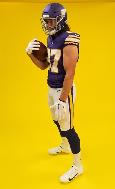

Why, if you are putting so much effort to get the look just right, do you make perfect versions of the jersey & the pants, but then drop the ball on the helmet? And here's the kicker...the Vikings are actually using a second helmet shell of a different color than their regular shade of purple. They had a chance to use the era-accurate glossy dark purple helmet shell. Instead, they opted for a lighter, matte purple than what was called for.


The Fix: If these throwbacks stick around, which I would guess they would, next year's throwback helmet will likely get fixed. I feel safe in that assumption. Why? Because the Vikings have done this before. 


As I stated in discussing Detroit's new helmet, when the Vikings debuted their current uniform set in 2014, the helmet didn't match. It was much too light. And it was highly noticeable on TV, to boot. Unfortunately, it took until 2019 for the Vikes to fix their purple helmets. But the point is, they did. This fix won't take as long. And like Philadelphia, these uniforms absolutely require black shoes, as well.

Grade: A-


#2 - TAMPA BAY BUCCANEERS

Bucco Bruce and the creamsicle orange jerseys have returned. Nike went the extra mile and made these versions a more vibrant shade of orange than their 2012 efforts which were much paler by comparison. Even the red trim really jumps out at you. These were extremely well done and historically accurate.


The Fix: Nothing. But there is one thing to look for as far as being historically accurate. On the back of the helmets where the striping ends, the Bucs have always cut off the bottom corner of the red stripes' outer edges. It's a quirky little detail that I will be looking for. For some reason, the Bucs' reveal didn't include photos of the backs of the helmets.


GRADE: A


#1 - TENNESSEE TITANS

Sorry to disappoint, Bucs fans, but these are just a little bit better. And it's funny but no one will look at these uniforms and call them Titans' throwbacks. These are OILERS uniforms.

Why are they better? Accuracy and attention to detail. The number fonts are a perfect match. The bold red outline goes BANG when you see them. But the best part of all is how they purposely mismatched the blues. Normally, this would be a problem but not here. Historically, these Oilers' blue jersey uniforms were done using two similar, but separate, shades of blue. 


The jersey's blue needs to match the blue pants stripe. It does. The blue of the socks is slightly darker and matches the blue in the helmet logo and stripe. They do. You had to be aware of this ahead of time to plan the outcome the way it needed to be. They did. And it's magnificent.

The Fix: Are you kidding??? One thing, Titans. PLEASE do not have players disrespect one of the greatest uniforms ever by wearing plain white socks instead of, or overtop of, the actual uniform's socks. PLEASE!

Grade: A+


That wraps it up, folks. One thing is certain, in a League dominated by darker colored jerseys, the majority of these throwbacks bring us back to a day when vibrant, colorful uniforms adorned our TVs every Fall weekend. That is a very good thing.


Bill Schaefer


New Uniforms of 2020

In addition to all teams (other than the Bears) reverting to the NFL Shield at the bottoms of their V-collars, seven teams have made 'significant' changes to their uniform for the coming 2020 season.

As the graphics artist for the GUD, I usually have to look at uniform reveals through a different eye. "You mean I gotta draw THAT?!?"

Additionally, where a team has shown what combinations of jersey, pants, and socks they plan on wearing during the season, I like to be prepared.  I assemble every possible combination eliminating the need to miss Sunday football because someone decided to put together a strange new pairing that no one expected and I need to assemble it.

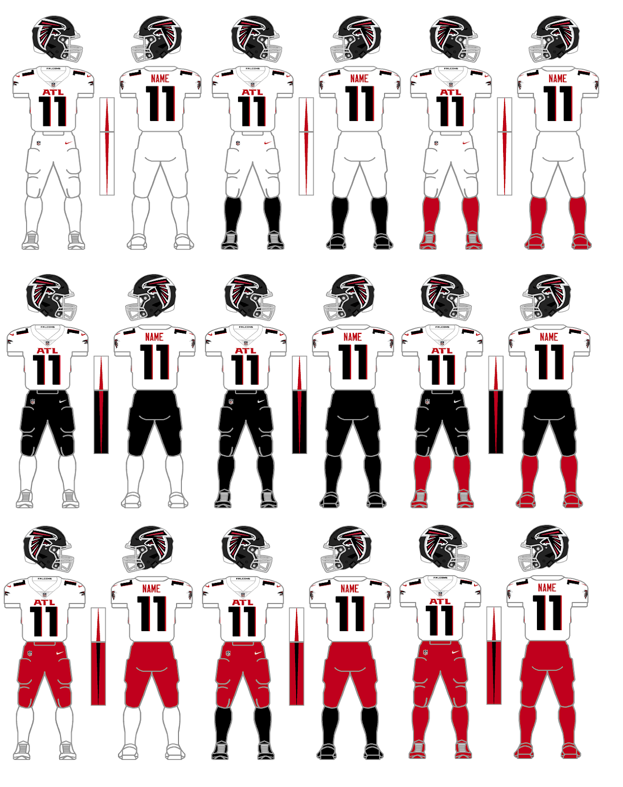
Atlanta Falcons
White Jersey combos
This is a great place to start because this needs to be said and it's best to do it right off the bat. Teams need to stop matching socks and cleats. In their uni-release, only a single red-pants combination was proffered - white jersey, red pants/socks/cleats - found above in the lower right corner. I don't like any of these red pants combinations. The foremost reasons are the fact that the pants stripe and jersey side panel stripe conflict with each other and the red pants completely conflict with the black helmet when having only white in between. I'm not a fan of all-white uniforms either but the black socks and red socks combos with the white jerseys and pants in the top row would work for me as long as the Falcons wore white shoes. I'm not really a fan of any of the black pants combos in the middle row.
Bottom line: Don't match pants, socks, and cleats. Contrast is needed.

Black Jersey combos
As for the black jersey combos, let's start by eliminating all three of the white socks combos down the left side as well as the bottom right corner again with red pants, socks, and cleats. All four of these are simply bad looks.
My favorites are the two black jersey and white pants combos with the colored socks - again assuming the Falcons go with white cleats. The all-black in the center is passable but my favorite is in the middle of the bottom row - black jersey, red pants, black socks and cleats.

We knew that the Falcons were likely keeping their 'throwback' uniform although they were forced to use it with the new matte-black helmet. Not really a big deal.
However, as 'the art talent' here at GUD, let me tell you...there are two things I can't stand - sublimation patterns and gradients. Here is the first "You gotta be kidding me" of the new season. The really bad news is that I kinda like the gradient combo. I just hope that it doesn't create a trend of more teams going with this kind of look.

Overall, I don't mind what Atlanta did. With the exception of the gradient uniform, they really went minimalist and that's OK. The matte black helmet doesn't bother me although I do think the over-sized helmet logo is comically big and after all, isn't just a tip of the cap from the Falcons to their divisional-rival Buccaneers saying "We like what you did with that big flag on your helmet. Take a look at our big bird!" The one thing I really wish they'd correct is the big ATL on the chest. The over-sized numbers would look better if they didn't have to be squeezed into view along with the big, honkin' "ATL."

Cleveland Browns
White Jersey combos
Cleveland ownership listened to their long-suffering fans and got rid of one of the great uniform monstrosities ever perpetuated in the League ranking right their with the 2014-19 Bucs, 2013-17 Jaguars, and the 2002-10 Bills. A little known fact about Browns uniforms is that the Browns tend to match socks with jerseys. However, every once in a while, the Browns would throw a curve ball at us and wear brown socks while wearing white jerseys. It could happen so I planned on being ready. The two combos to the left are likely what we will see for most Cleveland road games this season. One thing I don't care for is that the Brown pants need a white stripe between the two orange stripes. I know these are essentially their Color Rush pants from past seasons. but to be worn as part of a normal rotation with these new uniforms, they need the white stripe.

Brown Jersey combos
I just mentioned the brown pants being last year's Color Rush pants and missing the white middle stripe. To top that off, it appears the Browns kept the all-brown Color Rush combo but removed all stripes. Basically, the Browns said we need two sets of brown pants. The Browns love their brown pants apparently, but does everyone out there remember what Deadpool said about the brown pants? My apologies for the brief, graphic violence but I couldn't resist. Children get your parent's permission first...https://www.youtube.com/watch?v=KKC0jN-GfhA.

After they released their new uniforms, the Browns announced that they got some negative feedback from fans because they did not include options with orange pants. Congrats to the Browns. They gave their fans what they wanted to see with these retro new uniforms. The lack of orange pants was an oversight. The team admitted the error, and stated that they'd find a way to get the orange pants. Kudos. These looks are the Cardiac Kids that I remember from when I was a youngster. There's something just so right about these two looks. I hope we get them frequently this year.

Indianapolis Colts

The most notable change that the Colts are making is the re-shaping of their horseshoe as seen above. Other less notable changes include changing the Nike 'swooshes' on their white jerseys (and likely their white pants, too) from blue to black. Why? The Colts added a logo to the inside of their collars that may or may not have been plagiarized from an Indiana high school team (but I'll let the courts decide that). The Colts also returned to a number font used in their early days. However, because of our use of the number 11, the change won't be noticeable since the ones will be the same for both the new and old number fonts.

Los Angeles Chargers
White Jersey combos
Go ahead, I dare you to find something wrong with these uniforms. Nit-pickers could say something like "There are no TV numbers." Or "the bolts on the pants don't have enough zig-zags." These people need to get a life. I admit that I am getting tired of the italicized number fonts and would have preferred a nice, old-fashioned block font, but I digress. Hmm. I guess I was able to find a 'negative.'

Powder Blue Jersey combos
Personally, I think the Chargers should do something like only wearing the yellow pants either for all of their day games or for all of their night games, some kind of gimmick like that.

Alternate Blues combos

I like the all-royal but it seems superfluous with the all-navy. I really hope the Chargers actually wear white shoes with the all-navy combo. White helmets and white shoes would book-end the uniform nicely. I wonder of the Chargers field-tested the navy uniform with the numbers hollowed-out, as well. Probably made the numbers too difficult to read though.

One other thing...if the NFL ever does do away with the 'One-helmet Rule,' in the words of my daughter, I think this would look 'sick' for night games...

Los Angeles Rams
Bone & Blue jersey combos
The Rams became the last team to unveil their new uniforms. I believe that these blue and bone jersey combos must be evaluated together as one group.

First, let me say that I have no problem with the helmet. Over the years, many fans have been bothered by the fact that the Rams' helmets always had a navy shell that clashed with the royal of the their usual uniforms. That has been corrected with a brilliant, metallic, royal blue shell. The logo is new and different. It's not great. It's just different and I'm sure we'll get used to it. At least they didn't use the gradient coloring on the helmet logo!

Honestly, the jerseys are my biggest problem with these uniforms. The glossy piping of the numbers would have looked better as just regular fabric. This was too big of an attempt to be 'glitzy.' The fold-over-the-back-of-the-collar logo tags are gimmicky. The jerseys would have looked better if they just slapped the logos right on the collar - inside and out. The contrasting look of the tag on the bone jersey is superior to the blue-on-blue tag on the royal jersey. That one would have looked better had it been a yellow tag. The collarbone 'patch' and the peculiar zig-zag stitching limited to just a small portion in the upper right corner is just stupid.

But my biggest peeve for these jerseys is actually the 'sleeves.' The blue jerseys have the Ram horns. The bone jerseys have some kind of wave or shark fin. Why would you not simply put the Ram horns on the bone jerseys also? That makes no sense.

And you already know my feelings about gradients. My question is why not have two blue jerseys. One would have the gradient numbers to be worn with the gradient-striped pants as a Color Rush combo. Another blue jersey without gradient numbers could be worn with the yellow pants. The gradient numbers look unusually out of place when worn with the yellow pants.

New England Patriots
OK. I'm taking bets. I'm willing to bet that this is the last time that an NFL team has a new uniform reveal and only reveals two combinations.

I like what they did. I like the red-blue-red stripes on the white jersey. But at the same time I still agree with those that say its too much red in a blue-oriented jersey. A blue-red-blue stripe pattern probably would have been better.

Like the Browns, the Patriots left the door open to possibly add white or silver pants in the future. I got one for you. What about red pants? Those could be a worthwhile option with the white jerseys.

Tampa Bay Buccaneers
The Bucs pulled a 'Browns' and simply went back to something that works. They never should have moved away from this design in the first place. While keeping a large helmet logo, the Bucs still reduced the logo considerably. Now, instead of being 'freakishly large,' now they have a logo that's just 'big.' The Bucs also ditched the bling-bling chrome grill. Good. Grills are for cars and patios, not football helmets. I would like to see the new Color Rush uniform worn with some red socks and white cleats. 

So who will be getting changes for next season, in 2021? Cardinals? Bengals? Broncos? Eagles? I guess we'll have to wait. Hopefully there will only be two more months before we start thinking about preseason games.

Bill Schaefer
GUD

Matching Rivals: Browns & Bengals


We are starting a new feature here at the Gridiron Uniform Database today.  Earlier this year, you'll remember that Larry Schmitt profiled for us each of the new inductees of the Pro Football Hall of Fame's class of 2012.  Beginning today Larry is back with a new feature, and he'll be taking a look at throughout the summer -- every two weeks -- instances where NFL teams have had very similar looking uniforms...here's Larry:

~ ~ ~

In today's modern NFL, there are a wide variety of uniform styles and themes that serve as a treat for the eye every Sunday. Most teams see their uniform as a way to identify themselves on the field and as a means of connecting to their fanbase. From the enduring traditional looks featured by the Chicago Bears and New York Giants to the modern, trendsetting styles of the Denver Broncos and Tennessee Titans, to the just plain weird of the Seattle Seahawks. Throw in the occasional alternate jersey or throwback uniform, there's something for every fan to enjoy.

There have been instances in history where teams have blurred the lines as bit as to their identity. Similarity in color and striping patterns, particularly in the 1960's and '70's, at times may have left fans watching wondering just which side they were on. We'll take a look at these match-ups and try and lend a historical perspective to see just how things may have turned out this way.

First up: Ohio rivals Cleveland and Cincinnati.

~ ~ ~ ~ ~~

Paul Brown "The Father Of Modern Professional Football" was an NFL innovator the likes of which will never be matched. He was the first coach to introduce film study (using the All-22 high endzone view) into regular practice, invented the Screen Pass to maximize the talents of Otto Graham and Marion Motley, standardized the 40-yard dash as a measure of a football players ability to cover punts and kickoffs, and even pioneered helmet radios to get call in to his quartebacks decades before technology caught up to his genius.
One other feature he brought to the pro game that is mostly likely overlooked by most fans - Brown introduced orange (his favorite color) as a primary helmet color for two two unique franchises.
The Cleveland Browns of the AAFC wore white leather helmets for four seasons. Up[on joining the NFL, they added orange leather helmets to their ensemble for night games. Making the switch to hard plastic shells in 1952, the Browns helmets were orange forevermore. A single white center stripe was the lone feature, until brown player numbers adorned the sides from 1957 - 1960. In 1960 brown stripes were added, and 1961 the side numbers removed. The old, reliable Cleveland Brown helmet has been the same ever since, even after it's creator Paul Brown was relieved of duty following the 1962 season.
The basic uniform also saw relatively minimal changes over this period. Usually favoring white jerseys at home (while most NFL teams would wear their primary colored jerseys) Cleveland had plain, dark brown block numbers with contiguous 5-stripe sleeves and socks, alternating brown-orange-brown. Their white pants had contiguous 3-stripe pattern of orange-brown-orange.
In 1968 Paul Brown returned to Professional Football as owner and head coach of the AFL expansion franchise Cincinnati Bengals. It was no coincidence that the new team looked an awful lot like the one that had been named after the Ohio coaching legend. In fact, the substitution of black for dark brown as the primary jersey color and a stripe-free helmet were the only real differences. If one were to just glance quickly, it would be understandable to mistake them for the Browns.
Following the AFL-NFL merger, the intra-state rivals met on the field for the first time on October 11. Fans in the cheap seats of Cleveland Municipal stadium may have had a hard time telling the opponents apart. The Browns continued with their white-at-home tradition, forcing the visiting Bengals to wear their black jerseys. The Browns may have inadvertently made a move to looking like their Cincinnati counterparts the year before. In 1969 Cleveland made the first ever alteration to their sleeve and sock striping pattern when they went from the contiguous pattern to an offset one. The Bengals themselves switched back-and-forth between their 3-stripe sleeve patterns between the contiguous and offset versions during the early '70's.
The rematch in Cincinnati later that season saw the Bengals going white-at-home, meaning Cleveland's brown jerseys would make a rare appearance. The same was true for 1972, with both teams wearing their whites at home. For the 1973 and '74 match-ups, Cleveland continued with white at home whole Cincinnati returned to the traditional primary colored jersey at home, so all four meetings saw the same uniform sets displayed.
In 1975 the Browns made a drastic move that helped distinguish them from their rivals - orange pants. In 1981 the Bengals move even further in that regard, when they retired their conservative, traditional look for the tiger striped helmet still in use today. Ironically, Paul Brown himself said when asked about the design change, "you couldn't read 'BENGALS' from a distance. When you were far away it looked like Cleveland's helmet."
In two weeks we'll feature two Southern California teams with colorful uniform histories - the Chargers and Rams - who looked like near replicas of one another for a 10 year stretch in the late 70's and early 80's.

Two Championship Tilts


"On This Day..."
by Rob Holecko

We hope everyone had a good Christmas, a least a better one that the ex-boyfriend of this girl at Lambeau Field last night. (see picture to the right)

Yesterday while discussing the 1971 Christmas Day 'longest game ever' between the Chiefs and the Dolphins, we mentioned that twice previous, the NFL had scheduled NFL Championships for Monday the 26th, rather than play on Christmas Sunday.

Today we will feature those two games, the 1955 and 1960 Championships, for our "On This Day..." feature.

In 1955, the Los Angeles Rams, in coach Sid Gillman's first season, were the Western Division champions at 8-3-1.  They had won the 1945 NFL championship while still in Cleveland, and the next year moved out west to Los Angeles.  Out west they had gone to three straight championship games from 1949 to '51, winning a second championship in '51.  Now under Gillman, with players such as Bob Waterfield and Elroy "Crazylegs" Hirsch, they were back in the title game, looking for their third title.

Meanwhile the team that replaced them in, or some would say drove them out of, Cleveland, Paul Brown's Browns, the defending champions, were in their sixth consecutive NFL Championship in six years in the league.  After winning all four AAFC titles from 1946 through 1949, the Browns were 1950 and 1954 NFL Champions, and arguably one of the best dynasties of all time, going for their seventh title in nine years.  Led by Otto Graham, Lou Groza and Dante Lavelli, the Browns were 9-2-1 and Eastern Division Champions.

Here is the Wikipedia write-up of the game:

The 1955 National Football League Championship Game was played at the Los Angeles Memorial Coliseum between the Eastern Conference champion Cleveland Browns and the Western Conference champion Los Angeles Rams. The 23rd NFL title game was played on Monday, December 26, 1955 before 87,695, the largest crowd to see an NFL title game to that time. This was the first NFL championship game televised by NBC and the first NFL championship game played on a Monday.

Browns veteran Lou Groza kicked off; Rams rookie halfback Ron Waller returned the kick, and Groza himself made the tackle. A subsequent Rams drive was stopped at the Cleveland 12 when Kenny Konz intercepted a Norm Van Brocklin pass. Browns quarterback Otto Graham, who had announced his retirement at the end of the season, drove Cleveland to the L.A. 26 where Groza's FG gave the Browns a 3-0 first quarter lead. The Browns scored again when DB Don Paul intercepted Van Brocklin's pass on the Browns 30 and raced 70 yards to a touchdown, making the score 10-0. The Rams answered back when Van Brocklin connected with halfback Volney Skeets Quinlan for a 67-yard rouchdown, pulling the Rams to within 3 points, 10-7, and giving the large crowd hopes of an upset. But late in the second period, Van Brocklin threw his third interception of the half; defensive back Tom James, who had been beaten on the Rams' Tom Fears' title-winning touchdown on the same field four years earlier, grabbed the errant pass and took the ball back to midfield with time running out. The next play turned a close game into a rout; Otto Graham found Dante Lavelli with a 50-yard TD pass along the sideline and the Rams, who moments earlier were driving to take the lead, went to the locker room down 17-7.


Graham earned his place as the star of the game. After moving the Browns from the L.A. 46, Graham kept the ball and ran around right end from the 19 and scored to put the Browns ahead 24-7. On Los Angeles's next possession, Sam Palumbo intercepted Van Brocklin at the Ram 36. Graham drove the Browns to the 4, then scored himself on a sneak. Groza's conversion increased Cleveland's lead to 31-7 with two minutes left in the third quarter. In the final period, Graham tossed a 35-yard touchdown pass to Ray Renfro and Groza's kick gave the Browns a 38-7 lead. Late in the game, Waller ran four yards for a touchdown and Les Richter's conversion finished the scoring. In the final minutes coach Brown sent in reserve quarterback George Ratterman and allowed Graham to leave the field to an ovation from the Los Angeles crowd. Cleveland, winning three titles in the first half of the decade and representing the Eastern Conference in the championship game every year since its admission to the NFL, celebrated Graham's farewell, while the Rams' Van Brocklin, who threw six interceptions, would often be quoted that the game was the worst of his Hall of Fame career.
This may have been the pinnacle of the Browns' dynasty, while they would go on to have five more conference titles from 1957 through 1969, including a 1964 NFL Title, their fourth NFL title and 8th overall, after the 1970 merger, the Browns would never see the greatness of the 1940s and 1950s.  After a couple heart-breaking AFC Championship losses to Denver in the 1980s, the Browns' would move to Baltimore after the 1995 season.  Although they would re-born as a 1999 expansion team, the current incarnation of the Browns has only been to the playoffs once, in 2002, and continues to rebuild, ever in search of recapturing they glory days of yesterday, and along with the Detroit Lions, are the only non-expansion teams to have never reached the Super Bowl.
The Rams, like the Browns, have not seen success in recent years like in the olden days.  While they were a perennial playoff team, reaching the postseason 14 out of 17 years from 1973 through 1989, they continuously ran into strong Cowboys and Vikings teams in the 1970s and Bears and 49ers teams in the 1980s and only made it to one Super Bowl, losing XIV to the Steelers after the 1979 season.  Under Kurt Warner and Marshall Faulk, they reached two Super Bowls, winning XXXIV after the 1999 season and returning two years later.  They too, have reached bottom again, won only 3, 2 and 1 games from 2007 through 2009, and are currently completing another 2-win season.

The other championship game we are looking back to today is the 1960 championship between the Packers and the Eagles.  The Packers (8-4, Western Conference Champs) were just beginning their 1960s Vince Lombardi years of greatness, while the Eagles (10-2, Eastern Conference Champs) led by Chuck Bednarik were the dominate team in the league that year.  While they would go to two Super Bowls, winning NFC titles in 1980 and 2004, the 1960 squad would be the last Eagle squad to be NFL Champions.  They went to four straight NFC Championships from 2001 to 2004, and again in 2008, but are still looking for that elusive title, having celebrated the 50th anniversary of the 1960 Championship by wearing throwbacks to that year Week 1 2010.

The Packers, of course, were the team of the 1960s, rebounding from this loss to the Eagles to win the 1961 and 1962 titles, and three more from 1965 through 1967, as well as the first two Super Bowls.  After a couple decades of mediocrity, they would win Super Bowl XXXI under Brett Favre, and another one last year under Aaron Rodgers, and are working on a second this year.


We are proud to add these games to Gridiron Uniform Database's collection of randomly added single-game matchups.

You can view other randomly added past games here.

No Helmet Logo For You

     About four years ago Uni Watch ran this photo from a 1963 Chargers-Patriots game that showed the Patriots player (#56 here, trying to tackle Lance Allworth) without a logo on his helmet.  Although the two teams met in San Diego two more times that year, once in the regular season and again in the AFL Championship game, we presume it's from the August 10, 1963 preseason game, because according to pro-football-reference.com the Patriots had no #56 on their roster.
     While AFL teams going helmet logo-less is certainly not unprecendented, and it would also make more sense if it was the preseason... (These guys played games without logos) ...we cannot prove it simply based on this photo.  Did they go logo-less for the whole preseason, or just this game?
     Was is just this guy without a logo, or the whole team?  Did he have a logo on the other side, or were both sides blank?  For all we know, as unlikely as it is, this guy's logo may have simply come off of his helmet on the play before this one.  If you know anything further about the logo-less (or not) helmets of the 1963 Boston Patriots' preseason, please let us know in the forum.

~ ~ ~

Updated
Old
Jeff Hostetler in 1994;
bad throwback
   Speaking of changes to the database, since we launched on Sunday, the increased traffic has led to an expected surge in the amount of corrections to the database.  As we are currently in the middle of migrating our database to our servers, the old images may still be showing up on our pages for another day or two, but the changes will soon be reflected in the database.  The Jeff told us of a correction for the 2009 Throwback uniforms of the Oakland Raiders.  When the Oakland Raiders wore their original white road uniforms with the silver-with-black outlined numbers, they used a font with a squared top on the number - that was in 1963-64 and 1970.  (We have confirmed that in 1970, when they brought back the silver number, they did also bring back the squared-top font.)  In 1994, when they did the NFL 75th Anniversary throwbacks, they got a little lazy, and used the rounded font, something the Raiders apparently never wore.  We initially had the rounded font for the 2009 throwback, however, as The Jeff pointed out to us, they were more accurate the second time around when they did the AFL throwbacks in 2009.  We believe the Raiders iconic black home uniforms have never sported a "squared-off" one, not in throwbacks, and not originally, regardless of what this Mitchell & Ness 1980 throwback looks like.

The Raiders' white 63-64 uni
had the squared font
George Blanda, playing at an age
when even Brett Favre would
have been retired,
knew how to wear a "one"
Darius Heyward-Bey (upper-right)
sporting the correct "one",
seconds into Jamarcus
Russell's illustrious career
~ ~ ~

Updated
Old
     Another quick correction we want to make, the 2006 and 2007 Browns actually wore silver/gray facemasks, a correction pointed out to us by mark in the comments of the Uni Watch article about our website on Sunday.    We thank both The Jeff and mark for these contributions, and there will be many more tomorrow as hopefully by tonight we will have solved our hosting issues and have the database rebuilt and we will be ready to begin working again on the 2010 team pages.


~ ~ ~


Coming up tomorrow:  Exciting changes regarding the Denver Broncos, Philadelphia Eagles, New York Giants as well as a picture from a 1969 Lions-Saints preseason game that has given us a new perspective, and a change to the 1948 New York Giants uniform.  Later in the week, a look at the 1941 Eagles -- Did they wear green or black?  Coming up next week, as the Buffalo Bills get set to unveil their new uniforms on the 24th, beginning June 20th, we'll have a look back at the previous uniforms of the franchise.


Twitter

Blog Archive

Tags