Showing posts with label Colts. Show all posts

New Uniforms for 2023: An Impartial Ranking

 As we approach kickoff for the 2023 Hall of Fame Game in Canton and the official start to the 2023 Preseason, let us take a few moments to review the new uniforms and helmets that we will be seeing throughout the season.

I have ranked the 13 new uniform additions by team, whether it be a single new helmet or a completely new uniform. Additions that were used last year like the Pat Patriot throwback helmet/uniform in New England or the return of the red helmet in Atlanta are not included.

Here we go.

#13 - INDIANAPOLIS COLTS


Nothing about what the Colts did makes sense. They have a regular blue jersey. They have a blue throwback jersey. Why do they need a third blue jersey? From a distance, the pattern in the new blue jerseys will likely be hard to detect. The black outlines around the white numbers will be hard to notice due to being against the aforementioned blue. And this doesn't even take into account how ridiculous these jerseys will look if the Colts also add 'Captain' patches onto the other side opposite the alternate logo placed on the left collarbone.


As for the black helmet, we likely should have seen this coming as a few years ago the Colts changed the color of the Nike swooshes on their white jerseys from blue to 'anvil black.' So does that mean anvil black is now a Colts color?

The Fix: The Colts should have just kept it simple and only added a dark-royal-bordering-on-navy helmet to pair with the blue throwbacks. When you overthink, this is what happens.

Grade: F


#11 (tie) - DENVER BRONCOS

There's a tie for the  #11/#12 spots. Denver comes first alphabetically so I'll explain them first.

A white helmet. That's it. To be paired with Color Rush / Throwback-styled orange jersey and orange pants. 


Why? What does Denver gain from this? They aren't going to have lucrative merchandising increase for a new helmet. The Color Rush costume hasn't changed (the helmet logo has minutely) since it came to be in 2016.

What's worse? In the reveal video, one Bronco is wearing the all-orange costume with orange socks, too. A second Bronco is wearing white socks paired with the all-orange. It doesn't seem like the team even knows what it's going to do with them.

The Fix: Denver has had the same Color Rush uniform since 2016. Alter it by replacing the navy blue with light royal blue trim. Add a light royal blue helmet in the same style. Add appropriate stripes to the socks. Boom.

Grade: D+


#11 (tie) - DETROIT LIONS

A new blue helmet is added for the sole purpose of pairing it with the awful all-grey Color Rush uniform.


I'll ask again...Why? The short answer is that the all-grey uniform didn't match with the normal Detroit silver helmet. I can understand that. But then you create a blue helmet to rectify that one problem and you don't even bother to correctly match the blues of the helmet and jersey? At least it matches the blue of the anniversary patch the Lions will be wearing this year.

The Fix: Detroit's heart was in the right place and their intentions were good. Fix the helmet's shade of blue to match. This oversight reminds me of when the Vikings brought out their current look and their helmets bore a shade of purple that looked like the paint guy at Home Depot put in a little too much red and way too much white when trying to match colors resulting in a lighter, redder shade of purple. It's an easy fix. Admit it. Fix it. Boom.

Grade: D+ (can go to a C if they fix the blue)


#10 - HOUSTON TEXANS

This change may well have slipped under the radar. Select teams are not only adopting Nike's new FUSE template for their jerseys this season, but a small percentage are also using a modified version of the FUSE that has a straight seam across the upper chest rather than the more visible V-shaped seam. Houston is one of those teams. Incorporating that modified FUSE has enabled Houston to 'flip their horns.' Since their inception, the Texans' shoulder stripes (horns) have narrowed to a point directed away from the body. These new horns curl ever so slightly towards the center of the torso instead.


Was this change needed? No. Will it change how we view the Texans' uniforms in a bubble? No.

The Fix: This was a change that wasn't needed. For good or for bad, there's nothing to really fix. It's just...different.

Garde: C-


#9 - CAROLINA PANTHERS

The Panthers' changes were two-fold. 

They altered the hoop-stripes. The only problem is that there are still going to be variations of how those stripes look due to the tailoring of jerseys for players of different positions. This is the same problem Carolina has had for a while.


The second change was in tweaking the shade of blue. Honestly, if no announcement had been made, you'd have been hard pressed to find someone in Bank of America Stadium that said "Gee. Their blue sure looks different this year."

So they altered the hoop-stripes but still have wide variations in how they will look. They changed the shade of blue and almost no one will notice.

The Fix: Find a way to tailor these stripes so that they appear the same on all player positions. Worse comes to worse, change them to look the same as the Colts' hoop stripes. Vary the width of the stripes rather than having all three the same as the Colts do.

Grade: C


#8 - ARIZONA CARDINALS

The uniforms that the Cardinals have worn for the past 18 seasons were dated and bad. Not a good combination. This is a change that needed to happen sooner rather than later and that's why I have them rated one notch above Carolina.

Is there something that will make your eyes pop out of your head and go WOW!?! No.


An overdone uniform was replaced by a minimalist uniform. It's addition by subtraction. They're not great by any stretch, but they're an improvement. I think we all can agree on that.

The Fix: Remove the obnoxiously large wordmark on the chest of the red jersey or simply replace it with 'CARDINALS' in smaller type similar to what is on the sleeves of the other two jerseys. 

I still maintain that Arizona missed the boat by using silver instead of copper. Arizona is the Copper State and a dark copper would have made for a much better trim color. The silver that is used will be hard to see against the white next to it. 

The other fix will be to mix-and-match within reason. The reveal only included mono-everything: white, red, and black. Hopefully, like Washington who did the same thing at their reveal a year ago, they won't be afraid to mix things up.

Grade: C (C+ if they mix-and-match)


#7 - CLEVELAND BROWNS

Two years ago, the Browns celebrated their 75th Anniversary by introducing an all-white throwback to their very first season - 1946. However, due to the One-Helmet Rule, the Browns had to use their regular orange helmets with modified features to pair with them. Now, with the OHR discontinued, Cleveland introduces a white helmet to pair with the throwbacks.


While the 1946 leather helmet was plain white, the Browns have added stripes and a browns facemask. Despite the stripes, the white helmet is a wonderful nod to the team's history despite technically not being totally accurate.


The Fix: Honestly the stripes shouldn't be there if the Browns were attempting to construct honest throwbacks to 1946. But someone probably had to be THAT GUY in the room that said "I know its supposed to be plain white but it's just TOO plain. Add some stripes." These are the Browns. The 'No-Logo-On-The-Helmet' Browns. Plain is in their DNA and they love it. Lose the stripes.

Grade: B


#6 - NEW YORK JETS

The Jets surprised the football world by unveiling throwback uniforms from the 1980s. The correct helmet logo is placed on the current metallic green helmet. No biggie. The uniform is a great representation of the look the throwback is mimicking. Jets fans will like it. 


The Fix: The only question I have is why is this franchise all of a sudden so averse to wearing green jerseys or pants? After the 2022 Preseason last year, the Jets wore green jerseys and pants together once and green pants below white jerseys once. That's it. Two games. Every other game was a combination of white or black pants and jerseys. I get that in the first half of the 1980s, the Jets wore white at home most of that time. However, with an infusion of green desperately needed, why not use the green throwback jersey instead?

Grade: B


#5 - SEATTLE SEAHAWKS

These throwbacks look phenomenal. The blue pops. The green is bright. The silver helmets sparkle. So why are the Seahawks only #5 for me?

It really isn't their fault. Due to modern jersey tailoring, sleeves nowadays probably only have about 40% of the area to work with compared to the jerseys they are trying to duplicate. For me, part of the appeal for the Seahawks' jerseys were how the stripes exiting behind the bird-head logo, continued all the way around the sleeve, and back around to the beak again. It was a brilliant effect, but, due to the minimal amount of space to work with, the current design can't offer that. 


The same can be said with the helmet logo. Due to modern helmets and their design, the facemask and chinstrap snaps force many helmet logos onto the back half of the helmet for several teams. This is one of those cases. One Twitter follower said he thought he was looking at a 1970s football card of DK Metcalf because he was positioned facing the camera (below) and the logo could not be seen. He honestly thought they had forgotten to add the logo to DK's helmet or that, as in cards from the 1970s, it had been airbrushed off. The result is that the amount of helmet logo that can be applied to this throwback's helmet is greatly reduced.


The Fix: Unfortunately, there isn't one. We are limited by the times. That incudes Nike's inability to reproduce the shiny silver pants that we should be getting with these uniforms. The Seahawks did well with what they had. They did a great job replicating a classic look that fans all over will love. No one will say "That's a terrible looking uniform."

Grade: B+


#4 - PHILADELPHIA EAGLES

Finally, kelly green has come back to Philadelphia. The thing I like the most about these uniforms is how the Eagles didn't have to use some sort of gimmick to get the correct logo to fit onto the sleeves. No abbreviated stripes. No reduced size. Just right.


The pants have the correct striping and are pretty close to the shade of grey/silver. The only regret here is that Nike could not replicate the sheen of those original pants (See "Big Jerome" below). It also seems like the helmet is lighter green than the jersey instead of being darker than the jersey. The helmet is significantly lighter overall compared to its predecessor. The sock stripes also appear to have thinned somewhat.


The Fix: The only thing I'd tamper with here is to darken the green of the helmets. Unfortunately, it's highly unlikely that Nike is capable of fixing the pants otherwise they'd have already done it for the reveal. Oh, and where the heck are the black shoes? Black shoes are a must for these.

Grade: A-


#3 - MINNESOTA VIKINGS

Let me start by saying that I'm not a Vikings fan. Their new throwback uniform goes back to their original look from 1961 and the first half of that decade, which is new ground for a Vikings throwback. Truthfully, everything about this uniform is 'spot-on.' Except for one detail. The helmet.
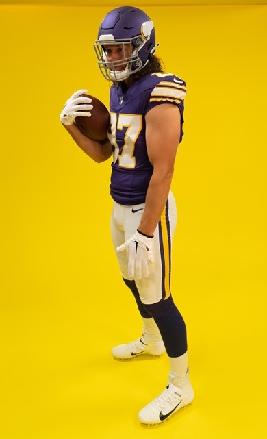

Why, if you are putting so much effort to get the look just right, do you make perfect versions of the jersey & the pants, but then drop the ball on the helmet? And here's the kicker...the Vikings are actually using a second helmet shell of a different color than their regular shade of purple. They had a chance to use the era-accurate glossy dark purple helmet shell. Instead, they opted for a lighter, matte purple than what was called for.


The Fix: If these throwbacks stick around, which I would guess they would, next year's throwback helmet will likely get fixed. I feel safe in that assumption. Why? Because the Vikings have done this before. 


As I stated in discussing Detroit's new helmet, when the Vikings debuted their current uniform set in 2014, the helmet didn't match. It was much too light. And it was highly noticeable on TV, to boot. Unfortunately, it took until 2019 for the Vikes to fix their purple helmets. But the point is, they did. This fix won't take as long. And like Philadelphia, these uniforms absolutely require black shoes, as well.

Grade: A-


#2 - TAMPA BAY BUCCANEERS

Bucco Bruce and the creamsicle orange jerseys have returned. Nike went the extra mile and made these versions a more vibrant shade of orange than their 2012 efforts which were much paler by comparison. Even the red trim really jumps out at you. These were extremely well done and historically accurate.


The Fix: Nothing. But there is one thing to look for as far as being historically accurate. On the back of the helmets where the striping ends, the Bucs have always cut off the bottom corner of the red stripes' outer edges. It's a quirky little detail that I will be looking for. For some reason, the Bucs' reveal didn't include photos of the backs of the helmets.


GRADE: A


#1 - TENNESSEE TITANS

Sorry to disappoint, Bucs fans, but these are just a little bit better. And it's funny but no one will look at these uniforms and call them Titans' throwbacks. These are OILERS uniforms.

Why are they better? Accuracy and attention to detail. The number fonts are a perfect match. The bold red outline goes BANG when you see them. But the best part of all is how they purposely mismatched the blues. Normally, this would be a problem but not here. Historically, these Oilers' blue jersey uniforms were done using two similar, but separate, shades of blue. 


The jersey's blue needs to match the blue pants stripe. It does. The blue of the socks is slightly darker and matches the blue in the helmet logo and stripe. They do. You had to be aware of this ahead of time to plan the outcome the way it needed to be. They did. And it's magnificent.

The Fix: Are you kidding??? One thing, Titans. PLEASE do not have players disrespect one of the greatest uniforms ever by wearing plain white socks instead of, or overtop of, the actual uniform's socks. PLEASE!

Grade: A+


That wraps it up, folks. One thing is certain, in a League dominated by darker colored jerseys, the majority of these throwbacks bring us back to a day when vibrant, colorful uniforms adorned our TVs every Fall weekend. That is a very good thing.


Bill Schaefer


New Uniforms of 2020

In addition to all teams (other than the Bears) reverting to the NFL Shield at the bottoms of their V-collars, seven teams have made 'significant' changes to their uniform for the coming 2020 season.

As the graphics artist for the GUD, I usually have to look at uniform reveals through a different eye. "You mean I gotta draw THAT?!?"

Additionally, where a team has shown what combinations of jersey, pants, and socks they plan on wearing during the season, I like to be prepared.  I assemble every possible combination eliminating the need to miss Sunday football because someone decided to put together a strange new pairing that no one expected and I need to assemble it.

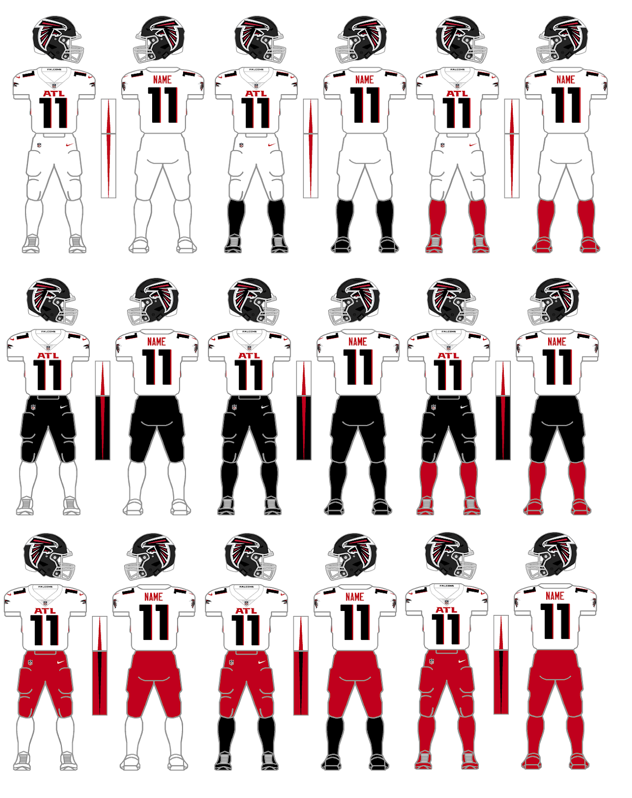
Atlanta Falcons
White Jersey combos
This is a great place to start because this needs to be said and it's best to do it right off the bat. Teams need to stop matching socks and cleats. In their uni-release, only a single red-pants combination was proffered - white jersey, red pants/socks/cleats - found above in the lower right corner. I don't like any of these red pants combinations. The foremost reasons are the fact that the pants stripe and jersey side panel stripe conflict with each other and the red pants completely conflict with the black helmet when having only white in between. I'm not a fan of all-white uniforms either but the black socks and red socks combos with the white jerseys and pants in the top row would work for me as long as the Falcons wore white shoes. I'm not really a fan of any of the black pants combos in the middle row.
Bottom line: Don't match pants, socks, and cleats. Contrast is needed.

Black Jersey combos
As for the black jersey combos, let's start by eliminating all three of the white socks combos down the left side as well as the bottom right corner again with red pants, socks, and cleats. All four of these are simply bad looks.
My favorites are the two black jersey and white pants combos with the colored socks - again assuming the Falcons go with white cleats. The all-black in the center is passable but my favorite is in the middle of the bottom row - black jersey, red pants, black socks and cleats.

We knew that the Falcons were likely keeping their 'throwback' uniform although they were forced to use it with the new matte-black helmet. Not really a big deal.
However, as 'the art talent' here at GUD, let me tell you...there are two things I can't stand - sublimation patterns and gradients. Here is the first "You gotta be kidding me" of the new season. The really bad news is that I kinda like the gradient combo. I just hope that it doesn't create a trend of more teams going with this kind of look.

Overall, I don't mind what Atlanta did. With the exception of the gradient uniform, they really went minimalist and that's OK. The matte black helmet doesn't bother me although I do think the over-sized helmet logo is comically big and after all, isn't just a tip of the cap from the Falcons to their divisional-rival Buccaneers saying "We like what you did with that big flag on your helmet. Take a look at our big bird!" The one thing I really wish they'd correct is the big ATL on the chest. The over-sized numbers would look better if they didn't have to be squeezed into view along with the big, honkin' "ATL."

Cleveland Browns
White Jersey combos
Cleveland ownership listened to their long-suffering fans and got rid of one of the great uniform monstrosities ever perpetuated in the League ranking right their with the 2014-19 Bucs, 2013-17 Jaguars, and the 2002-10 Bills. A little known fact about Browns uniforms is that the Browns tend to match socks with jerseys. However, every once in a while, the Browns would throw a curve ball at us and wear brown socks while wearing white jerseys. It could happen so I planned on being ready. The two combos to the left are likely what we will see for most Cleveland road games this season. One thing I don't care for is that the Brown pants need a white stripe between the two orange stripes. I know these are essentially their Color Rush pants from past seasons. but to be worn as part of a normal rotation with these new uniforms, they need the white stripe.

Brown Jersey combos
I just mentioned the brown pants being last year's Color Rush pants and missing the white middle stripe. To top that off, it appears the Browns kept the all-brown Color Rush combo but removed all stripes. Basically, the Browns said we need two sets of brown pants. The Browns love their brown pants apparently, but does everyone out there remember what Deadpool said about the brown pants? My apologies for the brief, graphic violence but I couldn't resist. Children get your parent's permission first...https://www.youtube.com/watch?v=KKC0jN-GfhA.

After they released their new uniforms, the Browns announced that they got some negative feedback from fans because they did not include options with orange pants. Congrats to the Browns. They gave their fans what they wanted to see with these retro new uniforms. The lack of orange pants was an oversight. The team admitted the error, and stated that they'd find a way to get the orange pants. Kudos. These looks are the Cardiac Kids that I remember from when I was a youngster. There's something just so right about these two looks. I hope we get them frequently this year.

Indianapolis Colts

The most notable change that the Colts are making is the re-shaping of their horseshoe as seen above. Other less notable changes include changing the Nike 'swooshes' on their white jerseys (and likely their white pants, too) from blue to black. Why? The Colts added a logo to the inside of their collars that may or may not have been plagiarized from an Indiana high school team (but I'll let the courts decide that). The Colts also returned to a number font used in their early days. However, because of our use of the number 11, the change won't be noticeable since the ones will be the same for both the new and old number fonts.

Los Angeles Chargers
White Jersey combos
Go ahead, I dare you to find something wrong with these uniforms. Nit-pickers could say something like "There are no TV numbers." Or "the bolts on the pants don't have enough zig-zags." These people need to get a life. I admit that I am getting tired of the italicized number fonts and would have preferred a nice, old-fashioned block font, but I digress. Hmm. I guess I was able to find a 'negative.'

Powder Blue Jersey combos
Personally, I think the Chargers should do something like only wearing the yellow pants either for all of their day games or for all of their night games, some kind of gimmick like that.

Alternate Blues combos

I like the all-royal but it seems superfluous with the all-navy. I really hope the Chargers actually wear white shoes with the all-navy combo. White helmets and white shoes would book-end the uniform nicely. I wonder of the Chargers field-tested the navy uniform with the numbers hollowed-out, as well. Probably made the numbers too difficult to read though.

One other thing...if the NFL ever does do away with the 'One-helmet Rule,' in the words of my daughter, I think this would look 'sick' for night games...

Los Angeles Rams
Bone & Blue jersey combos
The Rams became the last team to unveil their new uniforms. I believe that these blue and bone jersey combos must be evaluated together as one group.

First, let me say that I have no problem with the helmet. Over the years, many fans have been bothered by the fact that the Rams' helmets always had a navy shell that clashed with the royal of the their usual uniforms. That has been corrected with a brilliant, metallic, royal blue shell. The logo is new and different. It's not great. It's just different and I'm sure we'll get used to it. At least they didn't use the gradient coloring on the helmet logo!

Honestly, the jerseys are my biggest problem with these uniforms. The glossy piping of the numbers would have looked better as just regular fabric. This was too big of an attempt to be 'glitzy.' The fold-over-the-back-of-the-collar logo tags are gimmicky. The jerseys would have looked better if they just slapped the logos right on the collar - inside and out. The contrasting look of the tag on the bone jersey is superior to the blue-on-blue tag on the royal jersey. That one would have looked better had it been a yellow tag. The collarbone 'patch' and the peculiar zig-zag stitching limited to just a small portion in the upper right corner is just stupid.

But my biggest peeve for these jerseys is actually the 'sleeves.' The blue jerseys have the Ram horns. The bone jerseys have some kind of wave or shark fin. Why would you not simply put the Ram horns on the bone jerseys also? That makes no sense.

And you already know my feelings about gradients. My question is why not have two blue jerseys. One would have the gradient numbers to be worn with the gradient-striped pants as a Color Rush combo. Another blue jersey without gradient numbers could be worn with the yellow pants. The gradient numbers look unusually out of place when worn with the yellow pants.

New England Patriots
OK. I'm taking bets. I'm willing to bet that this is the last time that an NFL team has a new uniform reveal and only reveals two combinations.

I like what they did. I like the red-blue-red stripes on the white jersey. But at the same time I still agree with those that say its too much red in a blue-oriented jersey. A blue-red-blue stripe pattern probably would have been better.

Like the Browns, the Patriots left the door open to possibly add white or silver pants in the future. I got one for you. What about red pants? Those could be a worthwhile option with the white jerseys.

Tampa Bay Buccaneers
The Bucs pulled a 'Browns' and simply went back to something that works. They never should have moved away from this design in the first place. While keeping a large helmet logo, the Bucs still reduced the logo considerably. Now, instead of being 'freakishly large,' now they have a logo that's just 'big.' The Bucs also ditched the bling-bling chrome grill. Good. Grills are for cars and patios, not football helmets. I would like to see the new Color Rush uniform worn with some red socks and white cleats. 

So who will be getting changes for next season, in 2021? Cardinals? Bengals? Broncos? Eagles? I guess we'll have to wait. Hopefully there will only be two more months before we start thinking about preseason games.

Bill Schaefer
GUD

One-Time 1953 Colts Lid Confirmed


One-Time 1953 Colts Lid Confirmed
by Rob Holecko

Last week in our forum a visitor asked us about our depiction of in the database, the "cross style helmet" worn by the Baltimore Colts in their inaugural season in Baltimore.  In fact, this was their first game in Baltimore ever, as they moved from Dallas and were the Texans in 1952.  The previous "Baltimore Colts" entry in the league, which was absorbed into the NFL from the AAFC in 1950 along with the Cleveland Browns and the San Francisco 49ers, was unrelated to this franchise.

The visitor, identified not by a name, but simply by the moniker "Frizz's All Helmets" asked about the existence of this helmet:

Is there any pictures of the 1953 Baltimore Colts Cross Helmet available. Trying to collect all mini helmets and have not found any evidence of this helmet. I don't want to go through the trouble of making this helmet and it is false.

Our Bill Schaefer responded:

It was worn for Baltimore's (version 2.0) first inaugural game on 9/27/53 when they hosted the Bears during Week 1. After this game the cross stripes were removed for the following 7 weeks that they wore white helmets. Additionally, on 4 occasions during the season, Baltimore wore blue helmets instead of the white ones. Tim uncovered this on one of his research trips to the Library of Congress but was unable to take with him a copy of the photographic evidence.

I am glad to announce that through additional research, we have procured a copy of the photograph of this helmet as it ran in the September 28, 1953 Chicago Tribune.
We are glad to be able to bring this data to you, and also happy to provide FAH with the photographic evidence he requested.

However this brings to light an important question regarding our research.  Everything we have listed in the database is there because Tim Brulia, our historian, certifies it is correct to the best of his knowledge.  As we get further back in time, a lot of our research is by necessity incomplete.  There are some games from the 1920s and 1930s that simply we will never see photographs of.

As Tim generally says, if you have photographic proof that something we have is wrong, we'll change it.  But what about as we go further back and we have to fill in the holes between confirmed data with merely educational guesses?  This is an issue that won't be solved overnight, but calls for a definite spelled-out policy as we begin to tackle the 1921-1932 era.  How will a visitor be able to tell the difference between a graphic that we have confirmed versus one that we are merely presenting as our "best educated guess."  I want the future Frizz's All Helmets that come to our site to know that if they see a graphic as listed as being worn by, for example, the 1925 Pottsville Maroons whether it is something we have confirmed, or merely an "educated" guess that we are going with in absence of more concrete evidence to the contrary.  Surely we can't provide photographic evidence of every single game ever played -- that's what our graphics are for.

If we see pictures from twelve of a teams' thirteen games in 1926 and see the same jersey, sure we can assume that they wore that same jersey for the unseen thirteenth game. But without confirming, we still can't say that they absolutely did wear that jersey. We can be 99.99999% sure that that's probably what they wore, but it's not the same thing as being definite. As we move further back in time, we'll let you know exactly what our policy is and how you will know that a game has been "photographically confirmed" or just an assumption.

This is what the Baseball On The Nines'
says the 1923 AL Washington squad
wore in 1923.  I guess we'll just
have to take their word for it.
I understand Frizz's reluctance to accept a graphic of ours as fact.  In fact I feel the same when I view other uniform databases on the web, such as the Baseball Hall Of Fame's Dressed To The Nines website.  I view things on there with a grain of salt.  I look at a graphic on there and I don't think of it as "that's what the Washington Senators wore in 1923"... I look at it as "that's what the Dressed To The Nines website says the Washington Senators wore in 1923."  There is a slight and subtle difference, but it is what it is.  Without referencing the newspaper photograph, our reputation is the only thing that (before viewing that photograph) that proves that the Colts actually wore that helmet.  For some people that isn't enough.   But until our policy changes, it's the best we can do.

But rest assured at the Gridiron Uniform Database, whatever you see in our database is correct*, whether the proof is transparent and available for you to see, or you're just taking our word for it.  (*-But if it isn't let us know, and we'll change it.)


The Stupor Bowl


The Stupor Bowl
by Rob Holecko

Yesterday we told you about America's Team, the Dallas Cowboys, and how their dynasty began with a Super Bowl VI win over the Dolphins.  Well, they made it to the Super Bowl the year before that as well, losing to the Baltimore Colts in Super Bowl V, forty-one years ago today.

Super Bowl V was the first Super Bowl played after the completion of the AFL-NFL Merger. As per the merger agreement, all 26 AFL and NFL teams were divided into 2 conferences with 13 teams in each of them. The NFL's Colts, the Cleveland Browns, and the Pittsburgh Steelers agreed to join the 10 AFL teams to form the AFC. The remaining 13 NFL teams formed the NFC. This explains why the Colts represented the NFL in Super Bowl III, but not the NFC for Super Bowl V.

Super Bowl V was a sloppy, poorly executed display of football.   The game is sometimes called the "Blunder Bowl" or the "Stupor Bowl" because it was filled with poor play, penalties, turnovers, and officiating miscues. The two teams committed a Super Bowl record 11 combined turnovers in the game, and the Colts' 7 turnovers are currently the most ever committed by a winning team in a Super Bowl. Dallas also set a Super Bowl record with 10 penalties, costing them 133 yards. Bubba Smith refused to wear his Super Bowl V ring because of the "sloppy" play.

It was finally settled with five seconds left when Colts rookie kicker Jim O'Brien kicked a 32-yard field goal. In order to win the game, Baltimore had to overcome a 13–6 deficit at the half, losing their starting quarterback in the second quarter.

It is also the only Super Bowl in which the Most Valuable Player Award was given to a member of the losing team: Cowboys Linebacker Chuck Howley, who intercepted two passes. Sacks and tackles were not yet recorded. It was the first time a QB didn't win the award. Howley refused to accept the award because it was meaningless to him after his team lost.

Even though it is one of the least memorable Super Bowls, in fact it is possibly the Millard Fillmore of Super Bowls, we are still proud to add it to our database of matchups.


The Greatest Game Ever Played


On This Day...

Alan Ameche scored this overtime touchdown in the famed 1958 NFL Championship between the Colts and the Giants.  This game really put the NFL on the national landscape as far as being a televised sport and becoming the most popular sport in America that it is today.  In the 1940's and 1950's baseball and boxing were really the biggest sports in America.  Pro Football trailed in popularity to college football.  Then in this championship game Johnny Unitas, trailing 17-14 with under two minutes to play at their own 14 yard line, drove the Colts down the field to set up a game-tying field goal, and for the first time ever, send an NFL game into sudden-death overtime, where the Colts would prevail.  Here's is Wikipedia's summary of the game:
The 1958 National Football League Championship Game was played on December 28, 1958 at Yankee Stadium in New York City. It was the first ever National Football League (NFL) playoff game to go into sudden death overtime. The final score was Baltimore Colts 23, New York Giants 17. The game has since become widely known as "The Greatest Game Ever Played". The game was the 26th annual NFL championship game.
The game marked the beginning of the NFL's popularity surge, and eventual rise to the top of the United States sports market. A major reason was that the game was televised across the nation by NBC. Baltimore receiver Raymond Berry recorded 12 receptions for 178 yards and a touchdown. His 12 receptions are a championship record that stands to this day.
We our proud to add this game to our database of matchups in the Gridiron Uniform Database.


More from Wikipedia on the game:

An estimated 45 million people watched the game on television in the United States. This audience could have been even greater except that because of NFL restrictions, the game was blacked out in the greater New York City area.  Still, the impact from this game is far reaching. One year later, Texas billionaire Lamar Hunt would form the American Football League, which began play with 8 teams in the 1960 season. The growth of the popularity of the sport, through franchise expansion, the eventual merger with the AFL, and popularity on television, is commonly credited to this game, making it a turning point in the history of football.
The game is, to date, the only NFL championship game ever decided in overtime. The drive by Baltimore at the end of regulation, with Unitas leading the team quickly down the field to set up the game-tying field goal, is often cited as the first instance of a "Two Minute Drill", for which Unitas became famous.
The Baltimore head coach was Weeb Ewbank. He would coach Baltimore to a second straight championship game win over New York the next season. Ewbank would eventually be fired from the Colts, and would take the job of head coach for the New York Jets. Ewbank led the Jets to victory over the Colts in Super Bowl III, also considered a monumental victory in the history of pro football.
The Giants head coach was Jim Lee Howell, and he was aided by two coordinators who went on to greatness themselves. The defensive coordinator was Tom Landry, who left the team in 1960 to take over the then-expansion Dallas Cowboys and led them to two Super Bowl championships. The offensive coordinator was Vince Lombardi, who left the team following the game to take the head coaching position with the Green Bay Packers. Lombardi led the Packers to five championships in the 1960s, including the first two Super Bowls, and had the Super Bowl Trophy named after him after his death.
We'll be back tomorrow with another great "On This Day..." game also involving the Giants, as well as Tim's Week 16 uniform breakdown.

Twitter

Blog Archive

Tags