Showing posts with label concepts. Show all posts

If Now Was Then...(Part 8)

Here we are.

It's been 8 weeks since we began this journey and now we've made it to the last division in our odyssey.  

I now present to you...


The AFC South
HOUSTON – I went with opposite versions of the navy and red jerseys. The white helmet with opposing blue and red stripes works equally well with either combination.

INDIANAPOLIS – Why couldn’t Nike have fixed the Colts?  I mean how hard can it be to construct the over-the-shoulder loop stripes? Well, we’ve got them here.  I almost went with a straight white helmet but sanity took over and I added some blue to it.  Going back to a blog I wrote a year ago about my personal feelings towards mono-white uniforms, I said there is no way to mess up a 2 color uniform when one of the two colors is white. I stand by my comment here.

JACKSONVILLE – Again, black? In Florida? It needed to go so I ditched it. This left me with teal (Ick.) and gold from their current logo. I actually think if these were their jerseys, the Jags would eventually switch to the gold as their primary. The teal tends to look like the poor man's Dolphins.

TENNESSEE –  Ah. The team that started it all. When I first did a Titans jersey here, it ended up looking like the New York Bulldogs. Nobody wants that. Instead, I opted for the 2-tone blue design with navy as the primary. Those were the original Titans jerseys and I still prefer them to the current primary with the reverse pattern. I kept the reverse pattern, however, as the secondary jersey. I adjusted the futuristic number font to something similar but a better fit for the times.
And so, my friends, we come to the end. Without a doubt, if you’d have turned on your HD plasma screen TV back in the 1940s, you’d have seen these combinations every Sunday from September through January.

I'll be debuting a new series of "what if's" next week so tune in!
Bill Schaefer

If Now Was Then...(Part 7)

With one more week remaining next week, I bring to you the penultimate division for your consideration.  The AFC West began with these same four teams back in the inaugural AFL season in 1960 and the teams have remained together ever since. That is heritage. These are rivalries spurred on by decades of blood, sweat, tears, and maybe even a little bit of hatred mixed in.

How would these teams have looked back in the days of long-sleeved jerseys and leather helmets?

You are about to find out...
 
The AFC West
DENVER – When Denver began in 1960, they were blah (except for their socks!). Brown and yellow…er…um…no. Swooshes wouldn’t have been around yet so I went with the opposite color cuff-to-cuff stripes and the current number font. To make the helmet a little more aerodynamic/racy, I went with the striped flying wing helmet model.


KANSAS CITY – Several months ago, Tim asked me to indulge him and create current mono-color images for San Diego (navy), Cleveland (brown), and Kansas City (red). I loved the look of mono-red for KC then and I love it here as well. Even with the overdose of red, the yellow numbers pop off the red jersey. But when I went to do the reverse color scheme for the secondary jersey, the yellow jersey didn’t look right with the red pants so I went with the white one instead.


OAKLAND – Literally no change was needed here. I only added some black to the collars and cuffs of the white secondary jersey because, otherwise, it would just be too much white.


SAN DIEGO – Powder blue instead of navy was an easy call. The lightning bolts would not have been there so I basically added the looped shoulder stripes. The team had its roots in Los Angeles and these combinations scream UCLA.

Well, there you go. Next week, our journey 'back in time' comes to a conclusion as we tackle our final division, the AFC South.
Bill Schaefer

If Now Was Then...(Part 6)

Last week, we broke ground on the re-imagining of the second half of the NFL through the eyes of...well...myself. If, by chance, right now was the age of long-sleeve jerseys and leather helmets, what would the current crop of NFL teams look like on our HD TVs?

We continue today with the second group of AFC teams.

I present to you the current AFC East.

The AFC East
BUFFALO – The navy outlines are gone off of the stripes and numbers. Royal blue and red are used only.  Blue is the primary jersey and I opted for a red alternate of the same design.


MIAMI – I haven’t been a fan of the new Dolphins unis since they began incorporating navy into the mix and all but lost the sleeve stripes.  I went with early Marino-era sleeve stripes and removed their separations. An orange secondary didn’t look right so I stuck with white.


NEW ENGLAND – The primary design is based on the Pat Patriot era. The secondary is simply the reverse color scheme. The red, white, and blue helmet works well with either combination.


NY JETS – When the Jets became the Jets ("We Were The Titans"), they had some fairly unusual sleeve striping largely centered around the TV numbers. Well, no TV numbers here. I wanted to stick with something as different as the Jets’ sleeves were. I went with a design that reminded me of the Minneapolis Marines and the Staten Island Stapletons with the stripes between elbows and wrists. I applied the same stripes to the socks. A green wing on a white helmet and these are the Jets.

It's unfortunate that we are stuck with two teams in this division with essentially the same color schemes. However, with Buffalo being primarily blue and New England being primarily red, it should not cause an issue.  Also, the different models of helmets and sleeve/shoulder stripes would help tell these rivals apart under the soft glow of black-and-white photography.

Next week, we head west for the penultimate division in our concept journey.
Bill Schaefer

If Now Was Then... (Part 5)

Over the past month, I've provided some concept art for your amusement. Under the premise of "What would the current NFL teams look like is today was the era of long-sleeve jerseys and leather helmets," we have looked at the NFC teams and their 'retro' looks.

Today we begin the second half of the story...the AFC.

As I mentioned last week, the recent AFL documentary entitled "Full Color Football" was partially (or even maybe wholly) named for the fact that the AFL teams were clad in uniforms much more colorful and vibrant than their NFL counterparts at the time. I have embraced that line of thinking for the majority of the AFC teams whose heritage traces back to the early days of the American Football League.

With that being said, I present to you...
 
The AFC North
BALTIMORE – Their current jerseys lack sleeve stripes, so I stuck with that. Removing the outlines and drop-shadows on the numbers, I still kept the same font.  A purple helmet with a black flying wing (ravens are black) works well.

CINCINNATI – When I got to the Bengals, I thought “If any team was going to push the boundaries of World War II-era uniforms it would be Cincinnati.” I have a soft spot in my heart for the mono-orange Brooklyn Tigers uniforms so I “Cincy-fied” that combination for the primary. What are Bengals without stripes? Tame by comparison to today’s standards, I made the cuff-to-cuff stripes striped in the non-jersey colors. Black and white stripes on the orange jersey and orange and white stripes on the secondary black jerseys. I didn’t stop there. Drawing on some fine hosiery of the 1930s Bears, I gave the Bengals socks the black-white-orange barber pole effect. A black leather helmet with orange stripes tops this neon-sign of a uniform.

CLEVELAND – Like Chicago 4 weeks ago, this was easy. Brown and orange versions of Cleveland jerseys from the 1940s (AAFC) and 1950s. These ARE Cleveland.
 
PITTSBURGH – Aside for the black and yellow striped helmet, these were the World War II-era Steelers. They look sharp. Oh, and the Steelers NEED to be in block numbers.

Well, there is the AFC North. I'll be back next Tuesday with the AFC East.
(My eyes are still burning from the Cincinnati combos! Ouch!)
Bill Schaefer

If Now Was Then...(Part 4)

Have you ever wondered what it would look like if today's current teams were playing in an era of long-sleeve jerseys and leather helmet? Neither did I until a few months ago during the <yawn> Preseason, so I decided to have some fun.

We have already taken the tours through the NFC North, the NFC East, and the NFC West. Today, finally, the South shall rise again...sort of.

I present to you the "If Now Was Then" versions of the NFC South.

The NFC South

ATLANTA –I basically gave Atlanta the same treatment as Arizona last week. However, with black always having been in the Falcons' color scheme, Atlanta’s secondary jersey is black instead of white. A thin white outline on the cuff-to-cuff stripe highlights the opposite colored stripe. A red helmet with a black flying wing and black stripes tops each combo.


CAROLINA – Carolina blue is now the primary, relegating the black to secondary status. This should please Tim Brulia to no end, along with a few others I know.  I moved the stripes to the arms from the shoulders since the Panthers don’t know how to make the stripes look right in that position. A Carolina blue helmet would be unique in this era.


NEW ORLEANS – I stuck with the same black and gold colors. Similar to the “star” I placed on the Cowboys’ helmets, I created a gold cross on the black helmets because, well, after all, they are the Saints.


TAMPA BAY –  Black in Florida? No way. I kept the pewter/dark grey along with the red. Secondary jersey needed to be white in Florida, not grey. Sleeve stripes are the pattern from the creamcicle days, however. 

TAMPA BAY (Part 2) - Purists might be upset that I didn’t go the orange creamcicle route for the Bucs as I went ‘old-school’ colors for Seattle last week. At Rob’s urging, I threw an orange set together for him. It was extremely difficult to resist the temptation to give this set a plain red helmet – the proverbial cherry on top of the cream-cicle! 

So there we are, exactly how the 16 NFC teams would have appeared on your HD TV back in the 1940s.

I close with a word of warning. Next week we begin looking at the AFC. Most of these teams had their roots in the AFL. The recent AFL documentary "Full Color Football" was given its name in part due to the brightness of the AFL uniforms compared to the mostly dark colors prevalent in the NFL in the 1960s.

MAKE SURE YOU ARE WEARING YOUR SUNGLASSES NEXT TUESDAY!
Bill Schaefer

If Now Was Then...(Part 3)

Over the last 2 weeks, I have been displaying a brainchild that came to me while watching a Titans preseason game month ago. The thought had occurred to me that if this were the era of long-sleeve jerseys and leather helmets, what would each of the current League teams look like as they took the field?

Having already displayed the teams from the NFC North and NFC East, I now turn to the "Left Coast" and...

The NFC West

ARIZONA – After scrapping everything black, I looked at their current design. With the colors tapering around the sleeve area, it looked to me that they deserved the cuff-to-cuff sleeve and shoulder stripe treatment. I kept the same font for the numbers, minus the unnecessary black outlines. With a bird as their logo, I went with the red flying wing logo on a white helmet. A reverse scheme white secondary version was added as well.


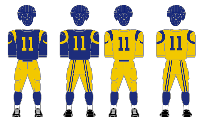
ST. LOUIS – I just couldn’t resist putting ram-horn 'stripes' on the shoulders and reverting to the royal blue and yellow. In the late-1940s, mono-yellow was the look for the Rams. These are easily identifiable as no other team.


SAN FRANCISCO – These are pretty much a set of AAFC-style Niners. I like this flavor of gold better than today’s khaki.


SEATTLE – The original color scheme of Seattle would have never been removed. I made the sleeve stripes to mimic the bi-color pattern of the original Seahawks' logo but made the stripes a single color only and reversed the entire color scheme for the green secondary jersey.

Within this division, it is obvious that the secondary jerseys are quite the necessity. Possessing two teams who have red primary jerseys as well as two teams with blue primaries, the secondary jerseys would get worn every year. Such is the life in the "If Now Was Then" NFC West.

Next week, we wrap up the NFC as we turn to the South...
Bill Schaefer

If Now Was Then...(Part 2)

Last week, I set off on a journey hypothesizing if each of the current teams were playing, right now, in the era of long sleeve jerseys and leather helmets. After establishing some ground rules guidelines that I'd follow during the process, I began by displaying the teams of the NFC North.

This week, as promised, I present my renditions of the NFC East.

The NFC EAST
DALLAS – This was one of my favorites to do, mainly because of my frustrations with Dallas’ current combos and their inconsistencies.  When Dallas first began they were royal blue and white. I went with that but added silver/grey pants to make them less Colts-like. I used the same stripe pattern from their current home white jerseys minus the useless black outlines. Large 1-color block numbers work now and would work then. Then an epiphany struck. What if Jerry Jones was the owner back then? He would have made a way for his team to stand out. Therefore, I made Dallas the only team to sport logos. I put a small star in the middle of each sleeve stripe. I went a bit further after that. If you’ll notice the helmet, I added 5 white stripes to the blue helmet. When seen from above, this would appear as a 5-pointed asterisk (*) or star. Dallas may have become one of those teams (like the Eagles of the 40s) that bounced back and forth between the two jerseys all season.


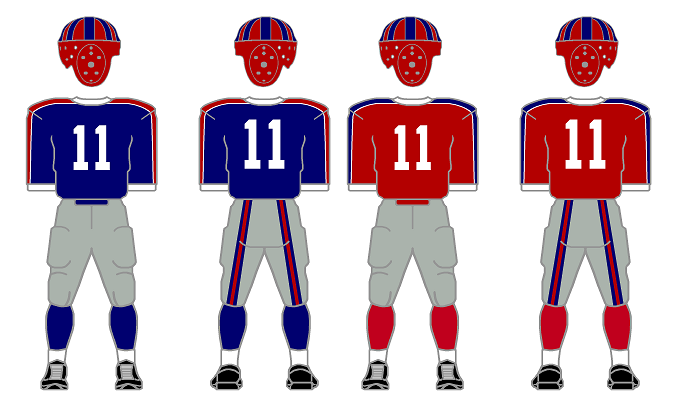
NY GIANTS – Grey pants? Check. Blue and red versions of the same jersey? Check and Check. Red and blue helmet to go with both combinations? Check.


PHILADELPHIA – The silver wing and stripes on the green helmet reminds me of the era’s 2-tone helmets. My favorite Eagles design has always been the late-70s to the early-80s design with the sleeve stripes.  Having full sleeves was the perfect canvas to recreate those awesome stripes. Nobody did sleeve stripes like Philly did.


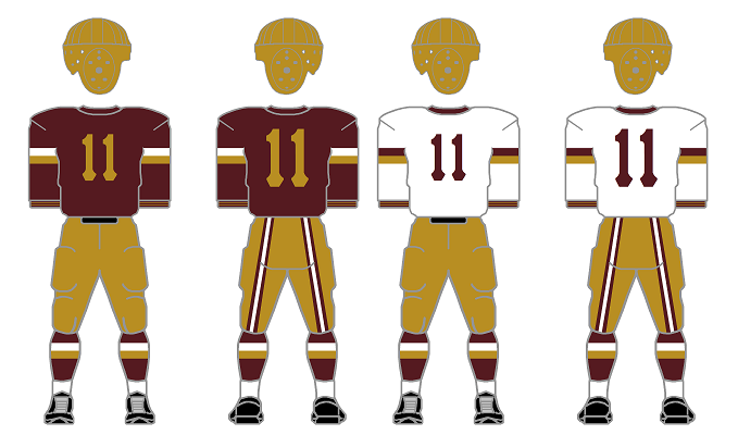
WASHINGTON – If Minnesota was my favorite, these come in a close second. I like the look of the darker burgundy paired with the Vegas-gold from the late 40s through the 60s. The sleeve and sock stripes are the 80s style but in the new/old colors. I loved the thin stripes in the cuffs from the mid-30s and added them here. I dig the Pittsburgh Pirates number font the Skins wore from the late-40s to the early-50s. A very cool look. 
 
Next week, I will continue with the NFC West.  Stay Tuned...
Bill Schaefer

If Now Was Then...(Part 1)


I was watching a bit of a Tennessee Titans game early in the Preseason and a thought occurred to me. If the Titans were playing back in the 1940s era, what would the jerseys look like? The colored shoulder area likely would have extended all the way to the wrists, I imagined.  

Having recently completed graphical images for the 1920-1932 era over the summer, I decided to broaden my scope and have a bit of fun.  All work and no play, etc, etc. What would EACH current team look like if they were playing back in the times of the leather helmets and long sleeves? I made my first attempts at re-envisioning current uniforms of the Dolphins and Jaguars last year. But this was a horse of a different color.

Intrigued by the prospects, I started to lay some ground rules. But, in the words of Captain Barbossa, these rules are “more what you’d call guidelines than rules.”

White jerseys were not overly frequent so I tried to keep them to a minimum. (In fact, I was able to make due without white jerseys for more than half of all current teams.)

No logos (other than very early Redskins and Pirates/Steelers) ever appeared on jerseys.

Stripes around socks and sleeves tended to be without thin little border stripes and either had no separation or a large amount of separation between them.

One pair of pants allowed per team.

Stripes on pants are located on the backs of the legs…’butt-stripes’ if you will.  I used the model of the 1936 Giants who had 3 color strips in each stripe.

I only used 3 models of helmets – the basic leather, the flying wing with stripes, and the flying wing without stripes.

If the team already existed back in the 30s, 40s, and/or 50s, its design then could be used as a model but I was not putting any limitation on myself saying I HAD to use that exact design.

Unless black is one of the teams’ main ‘colors,’ it does not get used (i.e. Detroit, Philadelphia, & Arizona).

No chromatic limitations. Back in the day, could a manufacturer have made golden jerseys (not yellow – real gold) for a team? Hard to say.

No TV numbers or nameplates.

It’s important to keep in mind that ‘color vs. color’ match-ups were frequent at the time including Green Bay in navy playing Chicago in navy. When teams had secondary uniforms at the time, they saw little action, sometimes never more the two or three Sundays per season. Other teams, like Philadelphia, wore both jerseys interchangeably throughout the season both home and away.

That said, for the next 8 weeks, I will be bringing you these constructs division by division.  The first division to be presented is the ‘grandfather’ of them all, the NFC North…

The NFC North
CHICAGO – Boy, was this difficult! <sarcasm included> Aside from changing the numbers on the navy jersey to orange (as they were back then) and adding a reverse orange secondary combo that was routinely worn throughout the 30s, this IS the Bears.


DETROIT – As with Chicago (and later with Cleveland), I had little choice with Detroit. This is who they are. I removed the highlighting outlines from the northwestern stripes and the numbers and all is good. A grey jersey was not an option.

 GREEN BAY – With the Packers I had a little leeway. Their current design wasn’t established until the 1960s. I decided on using their current stripe pattern as opposed to that of the 60s with the 5 stripes. I eliminated the separation stripes. I opted for their secondary jersey to be yellow. Green Bay actually utilized a mono-yellow look in the late-40s and 1950.

 MINNESOTA – As a Bears fan, it pains me to say this but, for some reason, the Vikings models I put together are my favorites when you compare them to the current versions. I used the original darker purple for the base as opposed to the current "Barney" purple. When they were founded, they featured northwestern stripes on their sleeves and added them to the socks in subsequent years. Removing the yellow outlines and sticking with straight purple and white made for one BAD combination. I went with a white flying wing on a purple helmet that resembles their current design bearing the Viking horns.


Next week, I will continue with the NFC East.  Stay Tuned...
Bill Schaefer

Twitter

Blog Archive

Tags