Week 15 Uniform Matchup Rankings
My apologies for the lengthy delay. Had some Christmas commitments to tend to. But, better late than never!
16) Bills-Jaguars: BUF in white/white, JAX in black/black. All that white, all that black. Not enough blue, not enough teal, makes for a real blah bash.
15) Saints-Rams: NO in white/gold, STL in navy/navy. The wrong team wore the dark pants in this battle. The Saints in washed out gold pants going against the all navy Rams just doesn't cut it in these eyes. Saints in black trou and the Rams in white slacks? Now that's better (sorry, Wendy). But not the case. Count this one out.
14) Texans-Colts: HOU in white/navy, IND in blue/white. Nothing out of sorts, just the blues, with a little battle red on the numbers (Texans). I can't really say this one blows, but it is a lot of blue and not quite enough red.
13) 49ers-Buccaneers: SF in white/gold, TB in red/pewter. Normally I give good marks for the use of metals, but there's also a load of red here. That doesn't help the cause, so maybe a bust out of the Bucs dormant white pants would have spruced up this matchup. But as it is, a little heavy on the alloys and the scarlets.
12) Patriots-Dolphins: NE in navy/silver, MIA in white/white. After a lip smacking debut of the newaqua pants from the Dolphins for 2013, we see the return to the meh all white from the Fins. That means the Pats have to carry the load with their navy and silver with hints of red. It helps, but this one stays in the lower eight.
11) Cardinals-Titans: ARZ in white/white, TEN in columbia blue/white. After ignoring this combo before this season, the Titans rock these colors for the second time in 2013. OK, I can buy that. But then the Cardinals blow it by going back to the white pants instead of going with the red pants, which would have been a really sweet and colorful matchup. Disappointing.
10) Ravens-Lions: BAL in white/black, DET in honolulu blue/silver. Last week, the Lion in winter. This week, the Lion in doors. And while the Ravens did right by rocking black pants, and the Lions always a plus in the honolulu shade of azure, I can't get worked up about this one. The colors are great, blue, black, silver, and purple. But well, maybe it's me.
9) Eagles-Vikings: PHI in white/white, MIN in purple/white. One of these teams should have worn dark pants, and no, it should not have been the Vikings, but the Eagles. And the Eagles decide to shun the green pants yet again. Must be a Chip Kelly thing, certainly not a Timmy B thing!!
8) Seahawks-Giants: SEA in white/navy, NYG in blue/gray. The Seahawks have such an array of uni color at their disposal, and in this encounter, they went with the right choice, navy pants. Works very well and actually compliments the Giants in traditional blue and gray. Modern Nike versus traditional Nike, and it's a soothing blend.
7) Bengals-Steelers: CIN in white/white, PIT in black/yellow. Bengals are doing something this season they should have done years ago. Wearing orange socks with the all whites! Makes so much sense and looks so good, especially against such a rival like the Steelers, who always look smart in black over yellow. Good stuff, this.
6) Bears-Browns: CHI in white/navy, CLE in brown/white. Browns do well to avoid the tootsie roll look, paired against the Bears in classic white over navy, it's a really good looking game. I like it.
5) Chiefs-Raiders: KC in white/red, OAK in black/silver. So very traditional and so welcome to see. When these two are paired in this particular matchup, it does seem to bring out the best in each uniform, with large doses of black, red, a good helping of silver and some essence of yellow. Classic.
4) Chargers-Broncos: SD in white/navy, DEN in orange/white. The last Thursday nighter for 2013,and this is a beauty. If this had been a late 90's-early 00's matchup, it would have been navy overload. No more, a little more white and a lot more orange makes this a great way to see off TNF.
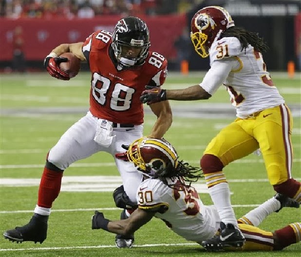
3) Redskins-Falcons: WSH in white/yellow, ATL in red/white. Two teams in tri-colors, and it works very nicely. A bunch of red, but a good helping of yellow and black trim between the two squads. One of the better matchups for Week 15.
2) Packers-Cowboys: GB in green/yellow, DAL in white/mint. Back in 2007, the Packers wore white in Dallas while the Cowboys wore their dark blue and white throwbacks. Not real appealing. But this matchup is glorious. The Pack always look like kings in the green over yellow, and the Cowboys WAH may wear thin because we see it all of the time, but this is the only combo they can wear when they suit up against the Packers.
1) Jets-Panthers: NYJ in white/green, CAR in black/black. Well now, see what a difference pants makes?? If these guys had gone with the "normal" look, it would have been a sleeper. But add some dark colors below the waist, and for good measure, add electric blue socks to the Panthers, and this gives me eye pleasure!! Note to the Jets: Please do not wait until Week 14 in 2014 to crack open your green pants!!
See you next time and Happy Holidays!!
Once Again, Hockey Leads the Way
Before I begin, I'd be remiss if I didn't remind you to check out Tim Brulia's Week 14 Uniform Matchup Rankings posted to this blog a short time before this article, itself, was posted. Tim and I have been stepping on each other's toes with our blogs for the last few weeks. Unfortunately, quality material sometimes just can't wait.
Honestly, I was a hockey fan before I began following football. Growing up in northwest Pennsylvania, I can remember from a very early age my Dad hooking up the 'rabbit-ear' antennas to our television so that we could dial in on CHCH, CKCO, or CFPL out of Hamilton, Kitchener, and London, Ontario, respectively from across the shores of Lake Erie and watch "Hockey Night in Canada." I learned the words to the Canadian National Anthem before I knew that it wasn't the American Anthem. If I close my eyes (or tune in to youtube) I can still hear Roger "Rogie" Doucet singing in the Forum in Montreal.
In the early 1980s, when I was in middle school, I'd turn on my boom-box at 830PM and dial in to WBBM AM out of Chicago so that I could listen to Pat Foley yell out "BAAANNNNERMAAAAN!" as I was lying in bed. This was how it was in a time before the Internet, youngsters. I've been a Blackhawks fan for even longer than I've been a Bears fan. Needless to say that for the last few years, "It's good to be a 'Hawks fan." The Bears, not so much. But I digress.
The point is, that while a large portion of the sports universe looks down its nose at hockey, every once in a while, hockey does something really wise. A few years ago, the NHL created the Department of Player Safety. Run by its well-respected, Hockey Hall of Famer Brendan Shanahan, it scrutinizes on-ice incidents both of the variety that game officials catch and don't catch. Each infraction brought to Director Shanahan's attention follows a clear-cut series of guidelines. Infractions are analyzed, suspensions or fines are determined and levied by a former player who toiled in the NHL for 22 years. Video explanations are attached to the NHL's website for all fans to watch and receive an articulate explanation of what happened, why the action necessitated further discipline, and what the terms of any additional penalties would be.
During his career, Shanahan scored 656 regular season goals along with another 60 in playoff action. He was an 8-time All-Star and 3-time Stanley Cup Champion. Goal scoring was not his only forte. Seventeen times Shanahan accumulated more than 100 penalty minutes in a season. He was never afraid to get his gloves dirty. It is my belief that this unique combination of toughness and goal-scoring prowess made the choice of Shanahan for this position an easy one.
With all of the current angst being aimed by fans at the current NFL
Due to the fact that each team plays only 20 games in the preseason and regular season combined, suspensions of any length can affect the likelihood of a team making the playoffs. In an 82-game season, and with the ability to 'call up' skilled replacements from teams' minor league affiliates, it is easier for an NHL team to get by in a player's absence. NFL suspensions, whatever their length, have a greater impact on a team's overall success than in any other league with the possible rare exception of a season-long suspension.
In hockey, players are responsible for both their team's offense and defense. If the NFL organized a DPS with a single director, there would likely be instances where that player's background as either a defensive or offensive player might create a perceived slant in their opinion of an on-field incident. For this reason, a minimum of 2 individuals would be needed - both a retired offensive and defensive player - for each circumstance.
Another aspect to be considered would be the team (or teams) for which the retired players played. NFL players are famous for continuing to represent their former team in an ambassadorial capacity or simply as a fan well beyond the end of their playing career. Others are known to carry a grudge of animosity towards a particular team, including one they may have played for. Would a Baltimore Raven want their fine or suspension overseen by a retired Steeler like Hines Ward? I think not.
That is why my idea would call for a "Council of Elders" of sorts. Thirty-two retired players, one from each team, equally split between offense and defense, and then the tie-breaking vote (if needed) would fall upon the shoulders of the previous NFL Commissioner, Paul Tagliabue, (or the current Head of Officiating) keeping Roger Goodell's hands clean of these matters.
An incident involving two NFC teams would require the judgement of the sixteen AFC representatives (8 offense and 8 defense) and vice versa for an incident involving AFC teams. In the event that the incident involves an interconference game, the two teams in question receive no say and the remaining thirty representatives decide the matter, again with someone like "Tags" settling any split decisions should they occur.
These former players would be much better equipped to discern the intent of an incident, much like Shanahan's analysis of the Shawn Thornton incident, and their judgement would be much more respected than that which currently occurs from the office of the Commissioner who, himself, never enjoyed a career in the sport he oversees.
I'm sure that the process could continue to be fine-tuned beyond what I've already laid out above, however, the groundwork is there. Otherwise, the NFL will likely continue down a slippery slope towards something none of us want to see. A wise man once commented...
Bill Schaefer
Tags:
Bill Schaefer
Week 14 Uniform Matchup Rankings
Week 14 featured a load of dark-dark combos, a few surprises and lots of snow. And so far, I think the best week of matchups this season.
16) Panthers-Saints: CAR in white/white, NO in black/black. All white and all black on a late season Sunday night. Meh. Saints would have done well to have gone with gold pants. Panthers might have the one to try the rarely worn black pants, but both teams stay in their boxes for this scrum. Not sure I agree.

15) Colts-Bengals: IND in white/white, CIN in black/white. I'm a little torn here. Should the Bengals have worn all black for this one to cancel out the all white Colts? Or was it better to go with the Bengals did and wear white pants? I tend to go with the latter, simply because there were a load of all dark combos being worn this week. Nice pairing.
13) Falcons-Packers: ATL in white/white, GB in green/yellow. The Packers, who sport one of the best looks in the NFL when in dark, go against the Falcons, who rock a rather blah white combo. And while the Packers greens lift this matchup, as it does any matchup, it doesn't do enough to push this game to the heights.
12) Giants-Chargers: NYG in white/gray, SD in navy/white. Expected looks by these two. Blue is the main color, but it is adequately complimented by gray, red, yellow and a touch of powder blue. Actually, the red trim on the NY white jersey does square off smoothly with the deep blue Chargers jersey.
11) Chiefs-Redskins: KC in white/red, WSH in burgundy/yellow. A lot of red, a lot of yellow and a dash of snow. While the fiery colors dominate, I think all of the right color combos were worn. Both teams said nay to white pants, which might not have made a huge load of difference to the Skins, but would have been a major loss in the standings had the Chiefs gone mono white. They didn't and that made this one a success, uni-wise.
10) Texans-Jaguars: HOU in white/navy, JAX in black/black. A lot of darkness in this one. And I happen to like it. It's still a bit jarring to see the Jags in all black as this uni can't seem to figure out the primary trim. Is it teal? Is it white? Maybe the gold on the helmets?? Regardless, it does seem to pair well with the Texans' white jerseys and navy accessories, with nice red numbers.
9) Raiders-Jets: OAK in white/silver, NYJ in green/green. Was ready to put this matchup in the basement until...bingo...the Jets get the green pants out of mothballs just in time for 2013. And just like that, the Jets finally wear a combo that I can sink my teeth into. It also helps the Raiders cause as well, cuz their white combo does little for me. But when paired with the green Jets, they look a bit better.
4) Lions-Eagles: DET in white/silver. PHI in green/white. Normally, a rather routine uni matchup. BUT add in a healthy dose of snow and presto! it looks soooo much better. The Lions silver lids seem to glow against the snow and the Eagles green look like a small forest of evergreens. Thanks, Mother Nature.
3) Rams-Cardinals: STL in white/navy, ARZ in red/red. Glory be! Had this matchup occurred in say Week 5, I think this would have been a really dull matchup, dominated by white everywhere. But in Week 14, the Cardinals slap out the red pants and the Rams counter with the navy trou. White is kept to the Rams jerseys and the Cardinals helmets. Some gold and black round out the color schematic, and this is boffo.
2) Dolphins-Steelers: MIA in white/aqua, PIT in black/yellow. Thank you, thank you, thank you Dolphins for rocking the aqua pants. Really, does anyone think that the Fins in all white really look better than in white and aqua?? No. Whether the swirling snow in Heinz Field had any bearing on the choice doesn't matter. With the white and aqua going against the always reliable black and yellow look of the Steelers, the matchup zips up the food chain.
1) Bills-Buccaneers: BUF in white/blue, TB in red/pewter. Now this one is way better than the two teams' W-L records. Just a gorgeous matchup. The white of the Bills, with perfect mixes of red and blue. The Bucs' red with dollups of pewter, black and essence of orange. This just gives me goosebumps of glory.
Heading for the homestretch, fans. Keep it right here!!

14) Seahawks-49ers: SEA in white/white, SF in red/gold. No complaints with the Niner red and gold, but a bit of anguish with the Seahawks in all white. Of the three color pant choices for the Seahawks, white works the worst here. Hard to pick between gray or navy, but either would have been preferred. So, sorry Niners, this falls in the lower echelon.
12) Giants-Chargers: NYG in white/gray, SD in navy/white. Expected looks by these two. Blue is the main color, but it is adequately complimented by gray, red, yellow and a touch of powder blue. Actually, the red trim on the NY white jersey does square off smoothly with the deep blue Chargers jersey.
9) Raiders-Jets: OAK in white/silver, NYJ in green/green. Was ready to put this matchup in the basement until...bingo...the Jets get the green pants out of mothballs just in time for 2013. And just like that, the Jets finally wear a combo that I can sink my teeth into. It also helps the Raiders cause as well, cuz their white combo does little for me. But when paired with the green Jets, they look a bit better.
8) Browns-Patriots: CLE in white/brown, NE in navy/silver. The more I see this, the more I like. Since we'll likely never see the Pats go all navy in the near or distant future, the Browns pick up the slack on a routine outing by going with brown pants. And it does add a little visual variety, even if it is a rather unpopular color like brown.
7) Vikings-Ravens: MIN in white/purple, BAL in purple/black. Purple grape jam in effect here, with a helping of snow flakes. This is almost as much purple as one will see in the NFL. And the Ravens chose to go with the two toned dark look in the NFL. I like this one. Maybe more black than I would prefer, but it is certainly still more on the + side than the - side.
6) Cowboys-Bears: DAL in white/mint, CHI in navy/white. After the Cowboys rocked the uni world by wearing normal blue jerseys at home in North Texas for the first time in 50 years, things revert to normal in frigid Chicago. Cowboys in the familiar whites and the Bears in standard navy and white. And it is goodness. Nice helping of silvery blue and mint, blues in royal and navy, as well as orange for a good mixture of color.
5) Titans-Broncos: TEN in white/navy, DEN in orange/white. Broncos in the very beautiful orange jerseys and like the Packers green and Steelers black, a rather can't miss combo. So, even though the Titans would have been much better served in columbia blue pants than in the navys, this matchup is still better than most.
3) Rams-Cardinals: STL in white/navy, ARZ in red/red. Glory be! Had this matchup occurred in say Week 5, I think this would have been a really dull matchup, dominated by white everywhere. But in Week 14, the Cardinals slap out the red pants and the Rams counter with the navy trou. White is kept to the Rams jerseys and the Cardinals helmets. Some gold and black round out the color schematic, and this is boffo.
1) Bills-Buccaneers: BUF in white/blue, TB in red/pewter. Now this one is way better than the two teams' W-L records. Just a gorgeous matchup. The white of the Bills, with perfect mixes of red and blue. The Bucs' red with dollups of pewter, black and essence of orange. This just gives me goosebumps of glory.
Heading for the homestretch, fans. Keep it right here!!
Week 13 Uniform Matchup Rankings
Football's longest week has come and gone. Here are the rankings:
16) Dolphins-Jets: MIA in white/white, NYJ in green/white. Blah. A ton of white. A load of boredom. Almost nothing excites me about this one. Had either/both side(s) slapped on a pair of dark pants, I think I could have worked up a little excitement for this matchup. At least the Jets wore green socks.
15) Cardinals-Eagles: ARZ in white/white, PHI in black/white. After the red pants reappeared last week to much joy from this reporter, I was a wee disappointed that the Cardinals didn't pair the reds with the white jersey for this game. And with the Eagles deciding to go with black jerseys, it was a meh matchup. While I don't find the Eagles black tops as gratuitous as much as the...Cardinals in black, I still think it's unnecessary. So, this matchup goes down several pegs.
14) Buccaneers-Panthers: TB in white/pewter, CAR in black/silver. Mixture of metals (silver/pewter), and a good dose of black, but it is off-set by sharp trim colors of light blue, red, and a sniff of orange. Panthers may be running out of time to cue the all blacks, and it might have played well here, but not necessarily needed.
13) Steelers-Ravens: PIT in white/yellow, BAL in black/black. Capping off Thanksgiving were these bitter rivals. Ravens decide to go jet black for the occasion, and I'm not too thrilled. I much prefer the Ravens in the purple/black combo, or even the black/white combo. The all black is just too much, even for the Steelers in the neat white/yellow.
12) Giants-Redskins: NYG in white/gray, WSH in burgundy/yellow. Just a bit much on the red tones here. The Giants blue brain holders and the Redskins yellow slacks do just enough to keep this from a ho-hummer. I did a visual in my mind of the Giants in white pants and the Skins in white pants also, and that would not have helped.. So, this is not that bad after all.
11) Saints-Seahawks: NO in white/black, SEA in navy/navy. Well, I'm a bit disappointed. The one time I'd have like to seen the Saints in gold trou, they go black. The Seahawks in all navy is a look that has grown on me and keeps doing so. But not enough to overcome the Saints in black pants.
10) Rams-49ers: STL in white/white, SF in red/white. Maybe I'm getting fogeyish as I am well in middle age, but this week, the Rams all whites going up against the Niners beautiful red and gold blend is a really boffo one from these eyes. It lets the home team hog the goodness without getting completely lost. Nothing at all against the navy pants of the Rams, but I think this week, the white pants were a good selection.
9) Jaguars-Browns: JAX in white/black, CLE in brown/white. For once, I think the Jags look works. Paired up with the Browns in a more traditional uni (brown tops and white bottoms), and wearing their black pants, even the Jags' goofy helmet works in this one. I find this one palatable.
8) Patriots-Texans: NE in white/navy, HOU in navy/white. A good, though not great, pairing. These are good looks by both teams, nearly classic, unchanged for over a decade. And they work well when paired up. Any complaints might be the navy heavyness, but sleek uni designs and color placements belp the cause.
7) Falcons-Bills: ATL in white/white, BUF in blue/white. Coming atcha from Toronto, and while I normally slam on the Falcons mundane all white combo, it actually seems to work when paired with the Bills rather nifty blue and white look. Still a lot more white than I'd like, but the black domes of the Falcons match with the white Bills helmets and not to mention the great blue jerseys, this is actually appealing to me.
6) Broncos-Chiefs: DEN in white/white, KC in red/white. Not a stunner, but a good show nonetheless. Navy and red dominate, but enough orange and yellow to accessorize with much appeal. A uni matchup seen many times since 1997, and it really never gets old.
5) Packers-Lions: GB in white/yellow, DET in honolulu blue/silver. Typical Turkey Day fare, with no throwbacks, as in recent memory when these two hook up for this occasion. Still, it is a classic matchup, with the silvers, yellow, unique blues and greens. Pack with the white and Lions with the blues, looks quite good.
4) Raiders-Cowboys: OAK in white/silver, DAL in blue/silver. Well, when the Cowboys announced that they would wear their normal blue jerseys for a genuine home game, it generated immense buzz in the uni geek world. As it should, for the Cowboys hadn't worn regular blue jerseys at home since December, 1963. And it look good. The blues are underrated and underused. A lot of silver on both squads to be sure, but the smart look by the Cowboys will hopefully bring out the darks at home a little more in coming seasons.
3) Bears-Vikings: CHI in white/navy, MIN in purple/white. Boy, something about those NFC North teams and their unis that are just smashing. This is a great example. Navy, purple, orange, yellow, in the right fashion. Not too much of anything here. Well worn, well trimmed and well played. Nice on the eyes, guys.
2) Titans-Colts: TEN in white/navy, IND in blue/white. A few weeks ago when last these teams met, the Titans wore the last possible combo in their closet, and I sorta panned it. This week against the same Colts, the Titans wear a more common combo, the white jersey and navy pants, and I really think this is their best combo when the Colts wear traditional blue. Blue dominates, but with tones that range from light to medium to dark, it's winning.
1) Bengals-Chargers: CIN in white/white, SD in alternate powder blue/white. Yay-yuh! Powder power! When the Chargers rock the powder blues, a uni seemingly loved by everyone...BUT the owners, the GUD rankings looks favorably on the game automatically moves up the ladder. No exception here as the Bengals offer their whites plus orange socks to compliment. For sure, a plus for me.
Till next time, take care and remember, you can never watch too much football!
16) Dolphins-Jets: MIA in white/white, NYJ in green/white. Blah. A ton of white. A load of boredom. Almost nothing excites me about this one. Had either/both side(s) slapped on a pair of dark pants, I think I could have worked up a little excitement for this matchup. At least the Jets wore green socks.
| Yawn. |
15) Cardinals-Eagles: ARZ in white/white, PHI in black/white. After the red pants reappeared last week to much joy from this reporter, I was a wee disappointed that the Cardinals didn't pair the reds with the white jersey for this game. And with the Eagles deciding to go with black jerseys, it was a meh matchup. While I don't find the Eagles black tops as gratuitous as much as the...Cardinals in black, I still think it's unnecessary. So, this matchup goes down several pegs.
14) Buccaneers-Panthers: TB in white/pewter, CAR in black/silver. Mixture of metals (silver/pewter), and a good dose of black, but it is off-set by sharp trim colors of light blue, red, and a sniff of orange. Panthers may be running out of time to cue the all blacks, and it might have played well here, but not necessarily needed.
13) Steelers-Ravens: PIT in white/yellow, BAL in black/black. Capping off Thanksgiving were these bitter rivals. Ravens decide to go jet black for the occasion, and I'm not too thrilled. I much prefer the Ravens in the purple/black combo, or even the black/white combo. The all black is just too much, even for the Steelers in the neat white/yellow.
12) Giants-Redskins: NYG in white/gray, WSH in burgundy/yellow. Just a bit much on the red tones here. The Giants blue brain holders and the Redskins yellow slacks do just enough to keep this from a ho-hummer. I did a visual in my mind of the Giants in white pants and the Skins in white pants also, and that would not have helped.. So, this is not that bad after all.
11) Saints-Seahawks: NO in white/black, SEA in navy/navy. Well, I'm a bit disappointed. The one time I'd have like to seen the Saints in gold trou, they go black. The Seahawks in all navy is a look that has grown on me and keeps doing so. But not enough to overcome the Saints in black pants.
10) Rams-49ers: STL in white/white, SF in red/white. Maybe I'm getting fogeyish as I am well in middle age, but this week, the Rams all whites going up against the Niners beautiful red and gold blend is a really boffo one from these eyes. It lets the home team hog the goodness without getting completely lost. Nothing at all against the navy pants of the Rams, but I think this week, the white pants were a good selection.
9) Jaguars-Browns: JAX in white/black, CLE in brown/white. For once, I think the Jags look works. Paired up with the Browns in a more traditional uni (brown tops and white bottoms), and wearing their black pants, even the Jags' goofy helmet works in this one. I find this one palatable.
8) Patriots-Texans: NE in white/navy, HOU in navy/white. A good, though not great, pairing. These are good looks by both teams, nearly classic, unchanged for over a decade. And they work well when paired up. Any complaints might be the navy heavyness, but sleek uni designs and color placements belp the cause.
7) Falcons-Bills: ATL in white/white, BUF in blue/white. Coming atcha from Toronto, and while I normally slam on the Falcons mundane all white combo, it actually seems to work when paired with the Bills rather nifty blue and white look. Still a lot more white than I'd like, but the black domes of the Falcons match with the white Bills helmets and not to mention the great blue jerseys, this is actually appealing to me.
6) Broncos-Chiefs: DEN in white/white, KC in red/white. Not a stunner, but a good show nonetheless. Navy and red dominate, but enough orange and yellow to accessorize with much appeal. A uni matchup seen many times since 1997, and it really never gets old.
5) Packers-Lions: GB in white/yellow, DET in honolulu blue/silver. Typical Turkey Day fare, with no throwbacks, as in recent memory when these two hook up for this occasion. Still, it is a classic matchup, with the silvers, yellow, unique blues and greens. Pack with the white and Lions with the blues, looks quite good.
4) Raiders-Cowboys: OAK in white/silver, DAL in blue/silver. Well, when the Cowboys announced that they would wear their normal blue jerseys for a genuine home game, it generated immense buzz in the uni geek world. As it should, for the Cowboys hadn't worn regular blue jerseys at home since December, 1963. And it look good. The blues are underrated and underused. A lot of silver on both squads to be sure, but the smart look by the Cowboys will hopefully bring out the darks at home a little more in coming seasons.
3) Bears-Vikings: CHI in white/navy, MIN in purple/white. Boy, something about those NFC North teams and their unis that are just smashing. This is a great example. Navy, purple, orange, yellow, in the right fashion. Not too much of anything here. Well worn, well trimmed and well played. Nice on the eyes, guys.
2) Titans-Colts: TEN in white/navy, IND in blue/white. A few weeks ago when last these teams met, the Titans wore the last possible combo in their closet, and I sorta panned it. This week against the same Colts, the Titans wear a more common combo, the white jersey and navy pants, and I really think this is their best combo when the Colts wear traditional blue. Blue dominates, but with tones that range from light to medium to dark, it's winning.
1) Bengals-Chargers: CIN in white/white, SD in alternate powder blue/white. Yay-yuh! Powder power! When the Chargers rock the powder blues, a uni seemingly loved by everyone...BUT the owners, the GUD rankings looks favorably on the game automatically moves up the ladder. No exception here as the Bengals offer their whites plus orange socks to compliment. For sure, a plus for me.
Till next time, take care and remember, you can never watch too much football!
More on the 1961 Time-Life Magazine Photo of NFL Starting Quarterbacks
Recently in Uni Watch, they have been discussing the picture that TIME-LIFE Magazine managed to get of all fourteen of the NFL's starting quarterbacks in 1961. Here's a little more detail on the quarterbacks in that photo.


Week 12 Uniform Matchup Rankings
Before I get going, Bill just posted a GREAT blog on what the Cowboys have in store this year's Thanksgiving game, please check it out!
14) Panthers-Dolphins: CAR in black/silver, MIA in white/white. You don't want to see the Panthers suffer in all black, so this usual combo at Miami is proper. And the Dolphins surprise absolutely no one in all white. It is a rather so-so encounter.
13) Broncos-Patriots: DEN in white/white, NE in navy/silver. Though these two are perennial contenders, this matchup is not really giving me the excitement. Lot of navy, slivers of orange and red, and a dose of silver. Patriots had the chance to pull a coup and go all navy, but that - alas - was a pipe dream. So is this matchup.
12) Bears-Rams: CHI in white/navy, STL in navy/navy. A little much on the navy. A case of nice unis separately, but together, too much darkness. Rams in white pants would have bumped this matchup some. It is still pretty good as I see it, though.
11) Jaguars-Texans: JAX in white/black, HOU in navy/navy. Another freakishly dark matchup. At least the Jags goofy helmet breaks the dark monotony. I like the Texans rare all navy look, but it could have been helped if the Jaguars had gone all white for this one.
10) Steelers-Browns: PIT in white/yellow, CLE in brown/brown. A new wrinkle in this 60+ year old rivalry. Browns go all chocolate for the second time this season and do it against their nemesis, who wear their usual whites and yellows. Not nearly as excited as when the Browns wore the all brown look earlier, but it does drop a log on the fire against their close neighbors.
9) Buccaneers-Lions: TB in white/pewter, DET in honolulu blue/silver. A lot of metal, but the pewter mixes well with the silver. And the red and black trim blends well with that magnificent Lions blue and a touch of black.
8) Jets-Ravens: NYJ in white/white, BAL in purple/black. The Ravens carry the load in this pairing. I am pleased to see the Ravens break out the purple and black, which is definitely the best look for them against the Jets head to toe whiteness. Had the Jets at least considered either green pants and or even green socks, could have been better.
7) Saints-Falcons: NO in white/black, ATL in red/white. Long time rivals usually look good when playing each other, and this game is no exception. While there's plenty of black to go around, there's a lot of red and gold to trim. Sharp matchup.
6) Cowboys-Giants: DAL in white/mint, NYG in blue/white. The Giants know when to wear their new white pants. This was and is a good opportunity. The white pants save the game from gray/minty overkill, and it does seem to make the blue jerseys pop a little and really works well off the Cowboy normals. A-OK matchup.
5) Chargers-Chiefs: SD in white/navy, KC in red/white. Nothing out of the ordinary in this traditional matchup, but it is a good one. Chargers look good with the white jerseys and navy pants, trimmed neatly in yellow when matched up with the Chiefs red and yellows. I'm fond of this one.
4) 49ers-Redskins: SF in white/gold, WSH in burgundy/yellow. Reds and golds. In various tones. Niners wear the rather generic whites, but the bright red numbers and trim go well. The Redskins in burgundy, with helpings of yellow. I like how this one works. Not too much of the reds, golds, and even whites, but a perfect blend of the shades. Good one.
3) Titans-Raiders: TEN in white/navy, OAK in black/silver. For whatever reason, I think this is winner. Not too much of any good thing here. Raider sleek in silver and black, Titans looking good in the white and navy combo with columbia blue on the sleeves. I enjoy this one.
2) Vikings-Packers: MIN in white/purple, GB in green/yellow. Classic look in my eyes when I see the Vikes in delicious purple (pants wise) while the Pack go in the sweet green and yellow combo. Very colorful, not too much darkness or white. Rather sweet, I think.
1) Colts-Cardinals: IND in white/white, ARZ in red/red. After a year's absence, the Cardinals red slacks return, and they picked the perfect opponent to do so, the white-white Colts. The Cardinals go all red and it contrasts sharply and perfectly against the stark white, and the Colts slight blue trim. Good move.
We at the Gridiron Uniform Database would like to wish all of you a very Happy Thanksgiving!
14) Panthers-Dolphins: CAR in black/silver, MIA in white/white. You don't want to see the Panthers suffer in all black, so this usual combo at Miami is proper. And the Dolphins surprise absolutely no one in all white. It is a rather so-so encounter.
13) Broncos-Patriots: DEN in white/white, NE in navy/silver. Though these two are perennial contenders, this matchup is not really giving me the excitement. Lot of navy, slivers of orange and red, and a dose of silver. Patriots had the chance to pull a coup and go all navy, but that - alas - was a pipe dream. So is this matchup.
12) Bears-Rams: CHI in white/navy, STL in navy/navy. A little much on the navy. A case of nice unis separately, but together, too much darkness. Rams in white pants would have bumped this matchup some. It is still pretty good as I see it, though.
11) Jaguars-Texans: JAX in white/black, HOU in navy/navy. Another freakishly dark matchup. At least the Jags goofy helmet breaks the dark monotony. I like the Texans rare all navy look, but it could have been helped if the Jaguars had gone all white for this one.
10) Steelers-Browns: PIT in white/yellow, CLE in brown/brown. A new wrinkle in this 60+ year old rivalry. Browns go all chocolate for the second time this season and do it against their nemesis, who wear their usual whites and yellows. Not nearly as excited as when the Browns wore the all brown look earlier, but it does drop a log on the fire against their close neighbors.
9) Buccaneers-Lions: TB in white/pewter, DET in honolulu blue/silver. A lot of metal, but the pewter mixes well with the silver. And the red and black trim blends well with that magnificent Lions blue and a touch of black.
8) Jets-Ravens: NYJ in white/white, BAL in purple/black. The Ravens carry the load in this pairing. I am pleased to see the Ravens break out the purple and black, which is definitely the best look for them against the Jets head to toe whiteness. Had the Jets at least considered either green pants and or even green socks, could have been better.
7) Saints-Falcons: NO in white/black, ATL in red/white. Long time rivals usually look good when playing each other, and this game is no exception. While there's plenty of black to go around, there's a lot of red and gold to trim. Sharp matchup.
6) Cowboys-Giants: DAL in white/mint, NYG in blue/white. The Giants know when to wear their new white pants. This was and is a good opportunity. The white pants save the game from gray/minty overkill, and it does seem to make the blue jerseys pop a little and really works well off the Cowboy normals. A-OK matchup.
5) Chargers-Chiefs: SD in white/navy, KC in red/white. Nothing out of the ordinary in this traditional matchup, but it is a good one. Chargers look good with the white jerseys and navy pants, trimmed neatly in yellow when matched up with the Chiefs red and yellows. I'm fond of this one.
4) 49ers-Redskins: SF in white/gold, WSH in burgundy/yellow. Reds and golds. In various tones. Niners wear the rather generic whites, but the bright red numbers and trim go well. The Redskins in burgundy, with helpings of yellow. I like how this one works. Not too much of the reds, golds, and even whites, but a perfect blend of the shades. Good one.
3) Titans-Raiders: TEN in white/navy, OAK in black/silver. For whatever reason, I think this is winner. Not too much of any good thing here. Raider sleek in silver and black, Titans looking good in the white and navy combo with columbia blue on the sleeves. I enjoy this one.
2) Vikings-Packers: MIN in white/purple, GB in green/yellow. Classic look in my eyes when I see the Vikes in delicious purple (pants wise) while the Pack go in the sweet green and yellow combo. Very colorful, not too much darkness or white. Rather sweet, I think.
1) Colts-Cardinals: IND in white/white, ARZ in red/red. After a year's absence, the Cardinals red slacks return, and they picked the perfect opponent to do so, the white-white Colts. The Cardinals go all red and it contrasts sharply and perfectly against the stark white, and the Colts slight blue trim. Good move.
We at the Gridiron Uniform Database would like to wish all of you a very Happy Thanksgiving!
What's Longer Than 'Once in a Blue Moon?' - UPDATE
Our friend at Uni Watch, Phil Hecken, posted some breaking news earlier.
On Thanksgiving Day the Dallas Cowboys will not wear white jerseys at home.
On Thanksgiving Day the Dallas Cowboys will not wear their fauxback navy jerseys at home.
Instead, they will wear their beautiful, navy jerseys that...wait for it....wait for it...MATCH!
For the first time, they will wear their regular road navy (the road jerseys didn't actually become navy until 1981 and were basically royal blue before that) jerseys at home. The regular blue/navy jersey has not been worn at home since 1963 when they last wore their standard royal blue home jersey - their original uniform.
![]() |
| 10/13/1963 - Detroit at Dallas - courtesy of Getty Images |
![]() |
| 11/21/1993 - NFL's first throwback uniform - courtesy of Getty Images |
During the NFL's 75th Anniversary Season in 1994, teams began the trend of wearing what would become known as throwback jerseys/uniforms. The New York Jets actually wore a throwback uniform the previous year in honor of their Super Bowl III triumph, however, they wore their regular green helmets instead of a white throwback design. In 1994, the Cowboys assembled a fairly accurate throwback to their early 1960s design, except they chose to wear the normal silver helmet instead of using a white one. They only wore the combination once for a Monday Night game against Detroit.
![]() |
| 9/19/1994 - Detroit at Dallas |
From 2004-2012 the Cowboys utilized a different 'fauxback' uniform. This one was basically a navy version of the Cowboys' first uniforms worn from 1960-63 replacing the royal blue that was used back then.
Anyways, I got to thinking about how infrequently the Cowboys actually use their gorgeous navy jerseys - rarely more than once or twice per year in recent years. Then I began to wonder...how many teams are there in the League that have never faced the Cowboys in their navy jerseys?
Since the end of the 1963 season, the Cowboys have essentially had the same home and road white and blue combos, with the aforementioned change from royal to navy in 1981. We are talking about 50 years of Dallas Cowboys football!
Here's what I found for teams making the Cowboys wear the regular, non-throwback, non-fauxback, blue jerseys...
Washington (29) - 1964, 1981-94, 1996-2000, 2002-09
* - twice in 1982 including NFC Championship Game
St.Louis/Phoenix/Arizona Cardinals (26) - 1964-66, 1970-83, 1989-94, 1997, 2000, 2002
Philadelphia (16) - 1971, 1973, 1980, 1983, 1985-89, 1992-93, 1996, 1999, 2001, 2006-07
* - 1980 was the NFC Championship Game
Cleveland (10) - 1964-70, 1979, 1988, 2008
New York Giants (7) - 1980-81, 1983-87
Carolina (5) - 1996, 2000, 2003, 2005, 2012
* - both 1996 and 2003 were playoff games
Los Angeles/St.Louis Rams (4) - 1969, 1978, 2008
* - twice in 1978 including NFC Championship Game
Miami (3) - 1978, 1996, 2007
New Orleans (3) - 1967-68, 1971
Pittsburgh (3) - 1966-67, 1969
San Diego (3) - 1983, 1986, 2013
Tampa Bay (3) - 1990, 2003, 2009
Baltimore/Indianapolis Colts (2) - 1970, 1981
* - 1970 was Super Bowl V
New England (2) - 2003, 2011
Houston Oilers/Tennessee Titans (2) - 1974, 1982
Atlanta (1) - 1989
Buffalo (1) - 1984
Denver (1) - 1980
Houston (1) - 2002
Jacksonville (1) - 2006
New York Jets (1) - 1987
San Francisco (1) - 1979
That's 123 times in about 50 years, averaging a little more than twice per year. This also means that there are nine teams that have never faced the vaunted, navy jerseys. That list will drop to eight should the Cowboys follow through and wear the navy jerseys this Thursday against the Raiders. Baltimore, Chicago, Cincinnati, Detroit, Green Bay, Kansas City, Minnesota, and Seattle would remain.
This list could remain intact for a while as most of these teams are not known for wearing white jerseys at home too often. The most likely to do so would probably be Baltimore or maybe Cincinnati. The others, not so likely.
The most the navy/blue jerseys have been worn in a single season is five times in 1983. They have been worn on four occassions in a season ten times (1966, 1978, 1980-82, 1986-87, 1989, 1996, & 2003).
It's odd. Watching Cowboy games in Dallas, when the cameras pan the audience, I usually see a lot more navy jerseys than white. (I actually see the same thing viewing Dolphin home games, too, with their fans opting for the aqua jerseys. Look for it!)
One thing is certain, if it happens, the uniform match-up Thursday afternoon will be a pairing never before seen in the history of regular or post-season NFL games. Who knows. Maybe wearing these navy jerseys at home will bring the team luck and may start a trend of Dallas wearing them more often at home next year. One can only dream.
Bill Schaefer
***UPDATE***
It seems I beat our Timmy B. to the punch as he was in the middle of organizing the same type of article. He passed on to me the following photo of the last time the Cowboys wore their regular blue jerseys for a home game...December 8, 1963, at the Cotton Bowl, against the Pittsburgh Steelers.
Tags:
Bill Schaefer,
Cowboys
Week 11 Uniform Matchup Rankings
Here they come, for the 11th time.
15) Falcons-Buccaneers: ATL in white/white, TB in red/pewter. More of the bland, I'm afraid. Red in acceptable doses, and black and pewter compliment well, but placed together, these two sets just simply come up short.
14) Jets-Bills: NYJ in white/white, BUF in blue/white. Lots of white for all. Jets continue to eschew (who "eschews" anyway??) any semblance of green, like pants and/or socks, when wearing white shirts this season, and even with the Bills in blue, it cannot help.
13) Cardinals-Jaguars: ARZ in white/white, JAX in black/black. Bummer. Cardinals could have worn red pants, Jags could have worn teal jerseys. Stark contrast here. But, the red-heavy white jerseys of the Cardinals does play somewhat well off the Jags teal sleeves. Not one of my faves for the week.
12) Raiders-Texans: OAK in white/silver, HOU in navy/white. Another mundane matchup. Raiders with their somewhat generic look in white and the Texans in a good set of navy and white. So, not a visually appealing game from here, though some may certainly dffer.
11) Colts-Titans: IND in white/white, TEN in columbia blue/white. The Titans, since they formed their current identity in 1999, have worn a possible 8 out of 9 uni combos. At last, they wore the ninth and final combo, light blue jerseys and white pants. And it would have worked against virtually any other team but the Colts. Just a lot - a lot - of blue, and plenty of white. While I commend the Titans for breaking out this unique combo, it just comes up short against the Colts in the all whites.
10) Redskins-Eagles: WSH in white/yellow, PHI in green/white. I know that the burgundy pants have been mothballed, but I think sporting them here would have a bit of dash for this encounter. Eagles greens make this palatable.
9) Chargers-Dolphins: SD in navy/white, MIA in white/white. With the Dolphins in hopeless all whites, it's up to the Chargers to hold the fort, and surprisingly...they do. As I eyed clips from this game, it's actually a pretty good matchup. Add a pinch of powder blue, yellow and orange, it's enough to overcome some serious whiteness.
8) Patriots-Panthers: NE in white/navy, CAR in black/silver. Aw, I was so hoping to see the Panthers in that all black look with the carolina blue socks. Tonight wasn't the night for that, but it wasn't bad. A spinkling of red and carolina blue accessorized well. A moderate dose of silver, certainly not overkill.
7) Packers-Giants: GB in white/yellow, NYG in blue/gray. Predictable, but palatable. Yellow, green, blue, gray and a sprig of red makes this a better than normal matchup. Not much else to add.
6) Ravens-Bears: BAL in white/black, CHI in throwback navy/white. This game will be remembered more for the lengthy weather delay than the unis worn. But the Bears in the dull but powerful 40's throwback with not a speck of white on the navy jerseys and the Ravens with sleek black slacks make this matchup a rather eye appealer to me.
5) 49ers-Saints: SF in white/gold, NO in black/black. So so glad the Saints went all black for this one. It just would have been way too goldy for me had the Saints went with the metallic pants. The all blacks swing nicely off the gold, white and red trimmed Niners. A top half matcher.
4) Browns-Bengals: CLE in white/brown, CIN in alternate orange/white. I know this game created UGH's cuz the Browns rocked the ugly brown pants, but actually, this detail really pumped this matchup very well. With the Bengals dressed in orange, it was a plus for a good display of color, even if it was a little jarring to others.
3) Chiefs-Broncos: KC in white/red, DEN in orange/white. Aaaah, so nice. I think I've found my second favorite uni, the Broncos in orange. What's my favorite? I think if you read these installments enough, you'll be able to tell, but I digress. With the Chiefs in the dynamic white/red combo, this is a sweet visual for me.
2) Lions-Steelers: DET in white/silver, PIT in throwback yellow-black/khaki. Sorry, Lions, but almost all of the attention is focused on the Steelers in the "1934" (but as we all know they're actually 1933) throwbacks. For the third (and hopefully NOT the last) time in two years, the Steelers wear what many call the bumblebee jerseys and they are so far outside the box, that they work wonderfully. If the Lions would have petitioned the NFL to wear their honolulu blue tops, WOW. They didn't, but it's still a visual thrill.
1) Vikings-Seahawks: MIN in white/purple, SEA in navy/navy. So pleased with the Vikes to use the purple pants so liberally this season and when going against the Seahawks in all navy, I get all happy. The trim colors go so smoothly as well. A dandy matchup.
We shall return...next week!!
15) Falcons-Buccaneers: ATL in white/white, TB in red/pewter. More of the bland, I'm afraid. Red in acceptable doses, and black and pewter compliment well, but placed together, these two sets just simply come up short.
14) Jets-Bills: NYJ in white/white, BUF in blue/white. Lots of white for all. Jets continue to eschew (who "eschews" anyway??) any semblance of green, like pants and/or socks, when wearing white shirts this season, and even with the Bills in blue, it cannot help.
13) Cardinals-Jaguars: ARZ in white/white, JAX in black/black. Bummer. Cardinals could have worn red pants, Jags could have worn teal jerseys. Stark contrast here. But, the red-heavy white jerseys of the Cardinals does play somewhat well off the Jags teal sleeves. Not one of my faves for the week.
12) Raiders-Texans: OAK in white/silver, HOU in navy/white. Another mundane matchup. Raiders with their somewhat generic look in white and the Texans in a good set of navy and white. So, not a visually appealing game from here, though some may certainly dffer.
11) Colts-Titans: IND in white/white, TEN in columbia blue/white. The Titans, since they formed their current identity in 1999, have worn a possible 8 out of 9 uni combos. At last, they wore the ninth and final combo, light blue jerseys and white pants. And it would have worked against virtually any other team but the Colts. Just a lot - a lot - of blue, and plenty of white. While I commend the Titans for breaking out this unique combo, it just comes up short against the Colts in the all whites.
10) Redskins-Eagles: WSH in white/yellow, PHI in green/white. I know that the burgundy pants have been mothballed, but I think sporting them here would have a bit of dash for this encounter. Eagles greens make this palatable.
9) Chargers-Dolphins: SD in navy/white, MIA in white/white. With the Dolphins in hopeless all whites, it's up to the Chargers to hold the fort, and surprisingly...they do. As I eyed clips from this game, it's actually a pretty good matchup. Add a pinch of powder blue, yellow and orange, it's enough to overcome some serious whiteness.
8) Patriots-Panthers: NE in white/navy, CAR in black/silver. Aw, I was so hoping to see the Panthers in that all black look with the carolina blue socks. Tonight wasn't the night for that, but it wasn't bad. A spinkling of red and carolina blue accessorized well. A moderate dose of silver, certainly not overkill.
7) Packers-Giants: GB in white/yellow, NYG in blue/gray. Predictable, but palatable. Yellow, green, blue, gray and a sprig of red makes this a better than normal matchup. Not much else to add.
6) Ravens-Bears: BAL in white/black, CHI in throwback navy/white. This game will be remembered more for the lengthy weather delay than the unis worn. But the Bears in the dull but powerful 40's throwback with not a speck of white on the navy jerseys and the Ravens with sleek black slacks make this matchup a rather eye appealer to me.
5) 49ers-Saints: SF in white/gold, NO in black/black. So so glad the Saints went all black for this one. It just would have been way too goldy for me had the Saints went with the metallic pants. The all blacks swing nicely off the gold, white and red trimmed Niners. A top half matcher.
4) Browns-Bengals: CLE in white/brown, CIN in alternate orange/white. I know this game created UGH's cuz the Browns rocked the ugly brown pants, but actually, this detail really pumped this matchup very well. With the Bengals dressed in orange, it was a plus for a good display of color, even if it was a little jarring to others.
3) Chiefs-Broncos: KC in white/red, DEN in orange/white. Aaaah, so nice. I think I've found my second favorite uni, the Broncos in orange. What's my favorite? I think if you read these installments enough, you'll be able to tell, but I digress. With the Chiefs in the dynamic white/red combo, this is a sweet visual for me.
2) Lions-Steelers: DET in white/silver, PIT in throwback yellow-black/khaki. Sorry, Lions, but almost all of the attention is focused on the Steelers in the "1934" (but as we all know they're actually 1933) throwbacks. For the third (and hopefully NOT the last) time in two years, the Steelers wear what many call the bumblebee jerseys and they are so far outside the box, that they work wonderfully. If the Lions would have petitioned the NFL to wear their honolulu blue tops, WOW. They didn't, but it's still a visual thrill.
1) Vikings-Seahawks: MIN in white/purple, SEA in navy/navy. So pleased with the Vikes to use the purple pants so liberally this season and when going against the Seahawks in all navy, I get all happy. The trim colors go so smoothly as well. A dandy matchup.
We shall return...next week!!
"Silver and Gold, Silver and Gold..."
Just a couple lines from an animated Christmas presentation from my childhood. Maybe "Rudolph the Red-Nosed Reindeer" or "Santa Claus Is Coming To Town." Not sure which. Pretty sure it was Burl Ives singing as a stop-motion snowman, though.
Back on Thursday, this photo was posted on Uni Watch showing the Lions in their dugout at Tiger (Briggs) Stadium. It clearly shows 3 Lions players wearing the golden helmets worn in 1953.
We know that, in 1953, the Lions broke with tradition and wore gold helmets for all but 1 game (They wore royal blue helmets for a night game against the Colts). We have come across several photos of the gold helmets. Most, if not all, photos of these golden helmets show unusual splotches of green. This characteristic is evident in photos of Bobby Layne's gold helmet as well as Doak Walker's gold helmet on display in the HOF.

We would like your assistance. Can anyone out there inform us how far beyond the 1953 season these 'gold' helmets were still being worn?
It is my belief that during the next three seasons, 1954-56, some players may simply have told the equipment manager "Don't paint mine silver. Keep it gold." This would explain why all of the silver helmets are nicely painted and completely silver while others still remained golden. We think the dugout photo above is most likely from 1956 - as evidenced by the presence of the TV numbers on the sleeves (Thanks, Tim!). * - As a side note, isn't that an absolutely remarkable shade of blue on those jerseys?
The only problem with this logic is that most of these helmets were reportedly painted on the inside of a clear plastic outer shell. Notice inside both helmets above that the inside of the shell is, at the very least, grey in color. It is this 'silver' paint inside the helmet that is possibly the culprit here that has purportedly 'degraded' into gold. If this is the case, it would have likely been impossible for an equipment manager to strip this 'silver-paint-gone-bad' out from the inside of the helmet and repaint it on the inner shell with a fresh coat of silver. To me, this indicates that the dugout photo must have players mainly in NEW silver helmets with a few players opting to keep their (possibly) more comfortable, broken-in 'gold' helmets from the 1953 season.
A May 2009 UW lead article also includes one other important snippet of information that I think has been largely overlooked...
"Another issue, which needs edification, is the 'amateurish' greenish splotches [that] adorn the helmet’s shell. One might think that a professional football helmet would never have such discoloration. While that assumption is probably correct even for the 1950s, there is a plausible explanation. The gold paint used during this period was not pure; it was a blend of yellow, golds, and copper. The copper pigments had a tendency to degrade and turn green." The effect of which we still see today on pennies that develop a greenish residue over time. Captions for photos of these helmets have referenced this fact that the gold paint of the era included copper in it. Over time, the copper oxidized and produced green splotches on the helmets
If the helmets were painted on the inside with silver paint and they 'degraded' to the gold color we see, why then are the green splotches - evidence of copper found in 1950s gold paint - present? In addition to my duties as this site's graphic engineer, I make my living teaching high school math, not chemistry or metallurgy. Unless 60-year-old silver paint also contained characteristic amounts of copper like the gold paint is supposed to have, why did the green form at all? Just because the appearance 'turned from silver to gold,' that doesn't mean the chemical composition of the silver paint turned into gold paint. If they were truly painted with silver paint, no green splotches should have ever formed.
Another theory has also been uncovered. On the Helmet Hut website, a question was asked about these very same gold helmets. The response claims that it is not the silver paint that transformed to gold but rather the interior of the clear plastic shell, itself.
This is a great question and our answer may be challenged by readers who believe differently. It is our humble opinion that although some pictures of 1950s Lion's helmets seem to indicate otherwise we believe that the team never wore gold colored helmets on the field. Some fans believe the Lions wore gold helmets to commemorate the multiple NFL championships the team won in the 1950s.
The Lions have primarily used Riddell helmets since the late 1940s. Up until the late 1950s the Riddell helmet shell was made from a clear or see through soft plastic material trademarked "Tenite" by the company. This helmet was referred to as the "RT" or "Riddell Tenite" model. (In the early 1960s Riddell changed their helmet model name to "RK" or "Riddell Kralite" when they switched to a non clear harder plastic material they trademarked "Kralite.") The earlier 1950s clear plastic "Tenite" shells were painted at the Riddell factory on the inside surface of the shell prior to installing the interior suspension. It is interesting to note here that Riddell used clear shells painted on the inside surface long before helmet companies such as Macgregor, Kelly or Maxpro featured the same technique.
The clear soft "Tenite" plastic shell would yellow as it aged. After years of aging the original brilliant silver luster Lion's helmet appeared to turn gold when the highly reflective silver paint was viewed through its yellowing but still translucent plastic shell. If you look at the center ridge of a 1950s Lions helmet it will still appear silver compared to the remainder of the helmet which has seemingly turned gold. Regardless of aging the center ridge retains its original silver appearance because it was originally a separate strip of non clear plastic that was painted silver on its exterior surface. Riddell used this plastic strip as a trim piece to cover the joint where the two halves of the helmet shell were glued together.
Here is some interesting additional information regarding the 1950s Lion's helmets. In the early 1950s NFL teams played several night games and a white colored football was used. The league barred the Lion's from wearing their silver helmets for night games because they felt the white ball when viewed under stadium lighting was too easily camouflaged by the Lion's silver helmets. To comply with the league ruling the Lions painted their helmets blue for night games and then repainted them silver for daytime games until 1955 when the white colored night football was replaced by the conventional brown leather football for all games.
In February 2012, a thread was created in our own Forum.
In it, a gentleman posted an email he received from the Lions saying that the 1950s helmets had blue stripes (we posted photos showing they did not) and were never intended to be gold. As we were able to prove that the blue stripe never existed, that pretty much calls into question the accuracy of the Lions' recent statement regarding the lack of an intention to 'go to gold helmets.' But another part of this email is even more interesting.
"For night games, they had to paint their helmets blue because the they too closely resembled the white ball under the lights."
If my bachelor's degree grasp of the English language is still functional, I take this to mean that each player had one helmet. For night games, they were painted blue. Whether this painting was applied to the inside or outside of the helmet makes little difference. The team had the ability to change the color of the helmet. These helmets had to have, at one point, been made gold in color and thereby displaying the tell-tale green residue from the copper used in gold paint. Perhaps some element of gold paint prohibited the team from being able to strip the gold paint from the inside of the shell despite efforts to change its appearance - visible by the grey interiors shown above.
True or not, both the email from the Lions' and the Helmet Hut information still claim that the team was able to paint the helmets blue for night games so why did they not feel the need to change they 'goldening' helmets to the silver they should be unless they wanted them to be gold? Since the helmets were gold for the entire season, it is not likely that on the morning of Week 1 of the 1953 season, the Lions' equipment manager arrived for the game and magically all of the helmets had turned golden overnight. This process had to have taken place over time meaning the team could have changed them if they wanted to - just like wanting to paint them blue for night games.
The other question then is, if the majority of the players had nice silver helmets, why did some retain the 'golden' ones? Sure the reason could be as simply as personal comfort as stated above. But maybe something more devious was at hand.
We already know that back in the 1940s the Lions experimented with wearing 2 different colored helmets - one color for linemen and one color for 'skill' players. It was thought this was done to help the quarterback identify targets downfield. Could these players be wearing the gold helmets amongst the rest of the team's silver ones for some alternative purpose similar to this?
Our lead photo above clearly shows that the majority of the team pictured had pristine silver helmets while a few are of the 'gold' variety. The dugout photo is NOT from 1953 (ie. the TV numbers).
Whether or not these helmets were INTENDED to be gold or not, it doesn't change the fact that they WERE gold. A modern day comparison, of sorts, would be this year's Minnesota Vikings helmets. The team states that the intention is to match the purples of the helmets with the purple of the rest of the uniform. Clearly the matte purple on the helmets does not match the rest of the uniform and we at GUD depict that.

What the Lions' dugout photo does is confirm that these gold helmets existed and were clearly different from the standard silver versions.
Different theories can exist as to why they ended up the color they were. Did they start silver and turn to gold? Did they start as gold and later develop the characteristic green splotches due to the presence of copper in gold paint? We may never know the 'why.'
The only thing needing clarified remains...If this photo is, indeed, from the 1956 season, it likely indicates that the gold helmets must still have been in use for 1954 and 1955, as well. Just how long after 1953-56 were some Lions still wearing these 'gold' helmets?
Bill Schaefer
Back on Thursday, this photo was posted on Uni Watch showing the Lions in their dugout at Tiger (Briggs) Stadium. It clearly shows 3 Lions players wearing the golden helmets worn in 1953.
We know that, in 1953, the Lions broke with tradition and wore gold helmets for all but 1 game (They wore royal blue helmets for a night game against the Colts). We have come across several photos of the gold helmets. Most, if not all, photos of these golden helmets show unusual splotches of green. This characteristic is evident in photos of Bobby Layne's gold helmet as well as Doak Walker's gold helmet on display in the HOF.

We would like your assistance. Can anyone out there inform us how far beyond the 1953 season these 'gold' helmets were still being worn?
It is my belief that during the next three seasons, 1954-56, some players may simply have told the equipment manager "Don't paint mine silver. Keep it gold." This would explain why all of the silver helmets are nicely painted and completely silver while others still remained golden. We think the dugout photo above is most likely from 1956 - as evidenced by the presence of the TV numbers on the sleeves (Thanks, Tim!). * - As a side note, isn't that an absolutely remarkable shade of blue on those jerseys?
The only problem with this logic is that most of these helmets were reportedly painted on the inside of a clear plastic outer shell. Notice inside both helmets above that the inside of the shell is, at the very least, grey in color. It is this 'silver' paint inside the helmet that is possibly the culprit here that has purportedly 'degraded' into gold. If this is the case, it would have likely been impossible for an equipment manager to strip this 'silver-paint-gone-bad' out from the inside of the helmet and repaint it on the inner shell with a fresh coat of silver. To me, this indicates that the dugout photo must have players mainly in NEW silver helmets with a few players opting to keep their (possibly) more comfortable, broken-in 'gold' helmets from the 1953 season.
A May 2009 UW lead article also includes one other important snippet of information that I think has been largely overlooked...
"Another issue, which needs edification, is the 'amateurish' greenish splotches [that] adorn the helmet’s shell. One might think that a professional football helmet would never have such discoloration. While that assumption is probably correct even for the 1950s, there is a plausible explanation. The gold paint used during this period was not pure; it was a blend of yellow, golds, and copper. The copper pigments had a tendency to degrade and turn green." The effect of which we still see today on pennies that develop a greenish residue over time. Captions for photos of these helmets have referenced this fact that the gold paint of the era included copper in it. Over time, the copper oxidized and produced green splotches on the helmets
If the helmets were painted on the inside with silver paint and they 'degraded' to the gold color we see, why then are the green splotches - evidence of copper found in 1950s gold paint - present? In addition to my duties as this site's graphic engineer, I make my living teaching high school math, not chemistry or metallurgy. Unless 60-year-old silver paint also contained characteristic amounts of copper like the gold paint is supposed to have, why did the green form at all? Just because the appearance 'turned from silver to gold,' that doesn't mean the chemical composition of the silver paint turned into gold paint. If they were truly painted with silver paint, no green splotches should have ever formed.
Another theory has also been uncovered. On the Helmet Hut website, a question was asked about these very same gold helmets. The response claims that it is not the silver paint that transformed to gold but rather the interior of the clear plastic shell, itself.
This is a great question and our answer may be challenged by readers who believe differently. It is our humble opinion that although some pictures of 1950s Lion's helmets seem to indicate otherwise we believe that the team never wore gold colored helmets on the field. Some fans believe the Lions wore gold helmets to commemorate the multiple NFL championships the team won in the 1950s.
The Lions have primarily used Riddell helmets since the late 1940s. Up until the late 1950s the Riddell helmet shell was made from a clear or see through soft plastic material trademarked "Tenite" by the company. This helmet was referred to as the "RT" or "Riddell Tenite" model. (In the early 1960s Riddell changed their helmet model name to "RK" or "Riddell Kralite" when they switched to a non clear harder plastic material they trademarked "Kralite.") The earlier 1950s clear plastic "Tenite" shells were painted at the Riddell factory on the inside surface of the shell prior to installing the interior suspension. It is interesting to note here that Riddell used clear shells painted on the inside surface long before helmet companies such as Macgregor, Kelly or Maxpro featured the same technique.
The clear soft "Tenite" plastic shell would yellow as it aged. After years of aging the original brilliant silver luster Lion's helmet appeared to turn gold when the highly reflective silver paint was viewed through its yellowing but still translucent plastic shell. If you look at the center ridge of a 1950s Lions helmet it will still appear silver compared to the remainder of the helmet which has seemingly turned gold. Regardless of aging the center ridge retains its original silver appearance because it was originally a separate strip of non clear plastic that was painted silver on its exterior surface. Riddell used this plastic strip as a trim piece to cover the joint where the two halves of the helmet shell were glued together.
Here is some interesting additional information regarding the 1950s Lion's helmets. In the early 1950s NFL teams played several night games and a white colored football was used. The league barred the Lion's from wearing their silver helmets for night games because they felt the white ball when viewed under stadium lighting was too easily camouflaged by the Lion's silver helmets. To comply with the league ruling the Lions painted their helmets blue for night games and then repainted them silver for daytime games until 1955 when the white colored night football was replaced by the conventional brown leather football for all games.
In February 2012, a thread was created in our own Forum.
In it, a gentleman posted an email he received from the Lions saying that the 1950s helmets had blue stripes (we posted photos showing they did not) and were never intended to be gold. As we were able to prove that the blue stripe never existed, that pretty much calls into question the accuracy of the Lions' recent statement regarding the lack of an intention to 'go to gold helmets.' But another part of this email is even more interesting.
"For night games, they had to paint their helmets blue because the they too closely resembled the white ball under the lights."
If my bachelor's degree grasp of the English language is still functional, I take this to mean that each player had one helmet. For night games, they were painted blue. Whether this painting was applied to the inside or outside of the helmet makes little difference. The team had the ability to change the color of the helmet. These helmets had to have, at one point, been made gold in color and thereby displaying the tell-tale green residue from the copper used in gold paint. Perhaps some element of gold paint prohibited the team from being able to strip the gold paint from the inside of the shell despite efforts to change its appearance - visible by the grey interiors shown above.
True or not, both the email from the Lions' and the Helmet Hut information still claim that the team was able to paint the helmets blue for night games so why did they not feel the need to change they 'goldening' helmets to the silver they should be unless they wanted them to be gold? Since the helmets were gold for the entire season, it is not likely that on the morning of Week 1 of the 1953 season, the Lions' equipment manager arrived for the game and magically all of the helmets had turned golden overnight. This process had to have taken place over time meaning the team could have changed them if they wanted to - just like wanting to paint them blue for night games.
The other question then is, if the majority of the players had nice silver helmets, why did some retain the 'golden' ones? Sure the reason could be as simply as personal comfort as stated above. But maybe something more devious was at hand.
We already know that back in the 1940s the Lions experimented with wearing 2 different colored helmets - one color for linemen and one color for 'skill' players. It was thought this was done to help the quarterback identify targets downfield. Could these players be wearing the gold helmets amongst the rest of the team's silver ones for some alternative purpose similar to this?
Our lead photo above clearly shows that the majority of the team pictured had pristine silver helmets while a few are of the 'gold' variety. The dugout photo is NOT from 1953 (ie. the TV numbers).
Whether or not these helmets were INTENDED to be gold or not, it doesn't change the fact that they WERE gold. A modern day comparison, of sorts, would be this year's Minnesota Vikings helmets. The team states that the intention is to match the purples of the helmets with the purple of the rest of the uniform. Clearly the matte purple on the helmets does not match the rest of the uniform and we at GUD depict that.

What the Lions' dugout photo does is confirm that these gold helmets existed and were clearly different from the standard silver versions.
Different theories can exist as to why they ended up the color they were. Did they start silver and turn to gold? Did they start as gold and later develop the characteristic green splotches due to the presence of copper in gold paint? We may never know the 'why.'
The only thing needing clarified remains...If this photo is, indeed, from the 1956 season, it likely indicates that the gold helmets must still have been in use for 1954 and 1955, as well. Just how long after 1953-56 were some Lions still wearing these 'gold' helmets?
Bill Schaefer
Tags:
Bill Schaefer,
Lions
Week10 Uniform Matchup Rankings
Just a reminder to visit our newest addition to the GUD, the uniform history of the dearly departed College All-Star Game, which you can find here: http://www.gridiron-uniforms.com/CASGs.html and also the uniform history of the deceased United States Football League: http://usfl.uniformdatabases.com/. Enjoy.
Onto the countdown.
14) Texans-Cardinals: HOU in white/navy, ARZ in alternate black/white. As good as the Texans look is here in this game, it is more than canceled by what may be my least favorite uni of all, the Cardinals in black. The team once known as "Big Red" is reduced to micro red trim and the head of the cardinal on the helmet. Bottom feeder, this.
13) Rams-Colts: STL in white/white, IND in blue/white. Plenty o'white since the Rams chose to go vanilla below the waist. Plenty o'blue, too, and a touch of gold. But, really, it isn't that bad. There was a time when these two played twice annually and all they had was blue and white between the two of them.
12) Dolphins-Buccaneers: MIA in white/white, TB in red/pewter. Well, it looks like another year of very drab all white for the 'Fins, which is so very disappointing. At least the Bucs cover this mess with the unique and strong look of the red jerseys and pewter pants. Saved from disaster, but not from the bottom half of the rankings.
11) Broncos-Chargers: DEN in white/white, SD in navy/white. Seems like lots of navy at the expense of good trim colors that take a deep back seat (orange, yellow and a pinch of powder blue). So, I guess it's just a rather ho-hummer from me this week.
10) Bengals-Ravens: CIN in white/black, BAL in purple/black. Waaay back when, there was a tune called "Black Slacks" http://www.youtube.com/watch?v=ZQKxketbUDg and that suits this game. Black pants, black socks and one black helmet. Too much black? You betcha! Ravens shoulda wore white pants and the Bengals coulda worn orange socks. Woulda been loads better.
9) Eagles-Packers: PHI in white/white, GB in green/yellow. Well, here's the dilemma...was very disappointed that the green birds went with an all white look as I so like the white/green Eagles combo, but when paired against the Packers' fab green/yellow, it's probably better because that keeps this from being all greeny. OK, I'll reluctantly push this up the scale a notch or two.
8) Lions-Bears: DET in white/silver, CHI in navy/white. Ancient rivals in ancient tones. It's a good one, not a great one. Not as good as when the Bears visit Ford Field. But this still has navy, silver, and honolulu blue is reduced to a trim color and the orange trim still brighten things up.
7) Jaguars-Titans: JAX in white/white, TEN in navy/navy. Titans, after a couple of years of drabbish combos, have let loose once again and rock the all navys for the first time in five years. Yay! Off-sets that goofy Jags look.
6) Panthers-49ers: CAR in white/white, SF in red/gold. No surprises, and it's just the right touch of metals (gold lids and pants, silver helmets), black letters and numbers trimmed in carolina blue, and those smackin' good Niner red jerseys. Smart matchup.
5) Raiders-Giants: OAK in white/silver, NYG in blue/white. For the first time since 1999, the Giants rock white pants in a game. The twist is that the stripe combo on the pants keep the gray elements. Strange, but it kinda works. The choice to go with white trou is solid as it more than off-sets the Raiders normal silver. Pleasing matchup.
4) Seahawks-Falcons: SEA in white/navy, ATL in red/white. I like this one. Red, white, some black, navy, neon green, make for a wide variety of color, and well versed. Have always enjoyed the Falcons red jerseys and going against the Seahawks modern whites, this smells like goodness.
3) Redskins-Vikings: WAS in white/yellow, MIN in purple/white. Good mix and match colors at play here. No grape juice, just some grapes for the Vikings and the Redskins continue with their burgundy/white/yellow and striped burgundy socks. This be a goody.
2) Cowboys-Saints: DAL in white/mint, NO in black/black. Saints always take the time to treat us to an all black look a couple of times a season, something that annoys the heck out of many, but not me. They know how to make it work. Paired against the Cowboys white and mint, this fits perfectly.
1) Bills-Steelers: BUF in white/blue, PIT in black/yellow. Boy, do I like this color-cade. Bills in the swe-e-e-t blue pants with bright red trim and the Steelers in the always boffo black/yellow combo. The best for Week 10.
More to come next week. Be there!!
Subscribe to:
Posts (Atom)
Blog Archive
-
►
2025
(1)
- ► Jul 6 - Jul 13 (1)
-
►
2023
(1)
- ► Jul 30 - Aug 6 (1)
-
►
2022
(2)
- ► Apr 17 - Apr 24 (1)
- ► Feb 27 - Mar 6 (1)
-
►
2021
(3)
- ► May 9 - May 16 (1)
- ► May 2 - May 9 (1)
- ► Jan 24 - Jan 31 (1)
-
►
2020
(6)
- ► Nov 1 - Nov 8 (1)
- ► Jul 12 - Jul 19 (1)
- ► Jun 7 - Jun 14 (1)
- ► May 10 - May 17 (2)
- ► May 3 - May 10 (1)
-
►
2019
(3)
- ► Aug 4 - Aug 11 (1)
- ► Feb 10 - Feb 17 (2)
-
►
2018
(3)
- ► May 6 - May 13 (1)
- ► Apr 22 - Apr 29 (1)
- ► Mar 11 - Mar 18 (1)
-
►
2017
(4)
- ► Sep 3 - Sep 10 (1)
- ► May 7 - May 14 (1)
- ► Mar 26 - Apr 2 (1)
- ► Mar 5 - Mar 12 (1)
-
►
2016
(5)
- ► Dec 25 - Jan 1 (1)
- ► Jun 12 - Jun 19 (1)
- ► Feb 21 - Feb 28 (1)
- ► Jan 10 - Jan 17 (1)
- ► Jan 3 - Jan 10 (1)
-
►
2015
(32)
- ► Dec 27 - Jan 3 (1)
- ► Dec 20 - Dec 27 (2)
- ► Dec 6 - Dec 13 (1)
- ► Nov 29 - Dec 6 (1)
- ► Nov 22 - Nov 29 (1)
- ► Nov 15 - Nov 22 (1)
- ► Nov 8 - Nov 15 (1)
- ► Nov 1 - Nov 8 (2)
- ► Oct 25 - Nov 1 (2)
- ► Oct 11 - Oct 18 (1)
- ► Oct 4 - Oct 11 (1)
- ► Sep 27 - Oct 4 (1)
- ► Sep 20 - Sep 27 (1)
- ► Sep 13 - Sep 20 (1)
- ► Sep 6 - Sep 13 (3)
- ► Aug 9 - Aug 16 (1)
- ► Jun 21 - Jun 28 (1)
- ► May 31 - Jun 7 (1)
- ► Apr 12 - Apr 19 (2)
- ► Mar 22 - Mar 29 (1)
- ► Feb 1 - Feb 8 (1)
- ► Jan 25 - Feb 1 (1)
- ► Jan 18 - Jan 25 (2)
- ► Jan 11 - Jan 18 (1)
- ► Jan 4 - Jan 11 (1)
-
►
2014
(38)
- ► Dec 28 - Jan 4 (3)
- ► Dec 14 - Dec 21 (1)
- ► Dec 7 - Dec 14 (1)
- ► Nov 30 - Dec 7 (1)
- ► Nov 23 - Nov 30 (1)
- ► Nov 16 - Nov 23 (1)
- ► Nov 9 - Nov 16 (1)
- ► Nov 2 - Nov 9 (1)
- ► Oct 26 - Nov 2 (1)
- ► Oct 19 - Oct 26 (1)
- ► Oct 12 - Oct 19 (2)
- ► Oct 5 - Oct 12 (1)
- ► Sep 28 - Oct 5 (1)
- ► Sep 21 - Sep 28 (1)
- ► Sep 14 - Sep 21 (1)
- ► Sep 7 - Sep 14 (2)
- ► Aug 31 - Sep 7 (1)
- ► Aug 10 - Aug 17 (1)
- ► Jul 27 - Aug 3 (1)
- ► Jul 20 - Jul 27 (1)
- ► Jul 6 - Jul 13 (1)
- ► Jun 29 - Jul 6 (1)
- ► Jun 8 - Jun 15 (2)
- ► May 25 - Jun 1 (2)
- ► May 18 - May 25 (1)
- ► Apr 13 - Apr 20 (1)
- ► Mar 2 - Mar 9 (1)
- ► Feb 16 - Feb 23 (1)
- ► Feb 2 - Feb 9 (1)
- ► Jan 12 - Jan 19 (2)
- ► Jan 5 - Jan 12 (1)
-
►
2013
(42)
- ► Dec 29 - Jan 5 (1)
- ► Dec 22 - Dec 29 (2)
- ► Dec 15 - Dec 22 (1)
- ► Dec 8 - Dec 15 (2)
- ► Dec 1 - Dec 8 (2)
- ► Nov 24 - Dec 1 (2)
- ► Nov 17 - Nov 24 (1)
- ► Nov 10 - Nov 17 (2)
- ► Nov 3 - Nov 10 (3)
- ► Oct 27 - Nov 3 (2)
- ► Oct 20 - Oct 27 (1)
- ► Oct 13 - Oct 20 (1)
- ► Oct 6 - Oct 13 (2)
- ► Sep 29 - Oct 6 (2)
- ► Sep 22 - Sep 29 (1)
- ► Sep 15 - Sep 22 (1)
- ► Sep 8 - Sep 15 (1)
- ► Aug 4 - Aug 11 (1)
- ► Jul 28 - Aug 4 (1)
- ► Jul 21 - Jul 28 (1)
- ► Jun 9 - Jun 16 (1)
- ► May 19 - May 26 (1)
- ► Mar 10 - Mar 17 (1)
- ► Mar 3 - Mar 10 (1)
- ► Jan 27 - Feb 3 (2)
- ► Jan 20 - Jan 27 (1)
- ► Jan 13 - Jan 20 (3)
- ► Jan 6 - Jan 13 (2)
-
►
2012
(95)
- ► Dec 30 - Jan 6 (2)
- ► Dec 23 - Dec 30 (3)
- ► Dec 16 - Dec 23 (4)
- ► Dec 9 - Dec 16 (2)
- ► Dec 2 - Dec 9 (2)
- ► Nov 25 - Dec 2 (4)
- ► Nov 18 - Nov 25 (2)
- ► Nov 11 - Nov 18 (2)
- ► Nov 4 - Nov 11 (2)
- ► Oct 28 - Nov 4 (4)
- ► Oct 21 - Oct 28 (3)
- ► Oct 14 - Oct 21 (2)
- ► Oct 7 - Oct 14 (4)
- ► Sep 30 - Oct 7 (3)
- ► Sep 23 - Sep 30 (2)
- ► Sep 16 - Sep 23 (3)
- ► Sep 9 - Sep 16 (2)
- ► Aug 26 - Sep 2 (2)
- ► Aug 19 - Aug 26 (1)
- ► Aug 5 - Aug 12 (1)
- ► Jul 22 - Jul 29 (1)
- ► Jul 15 - Jul 22 (1)
- ► Jul 1 - Jul 8 (1)
- ► Jun 17 - Jun 24 (2)
- ► Jun 10 - Jun 17 (2)
- ► May 20 - May 27 (2)
- ► May 13 - May 20 (1)
- ► Apr 29 - May 6 (1)
- ► Apr 22 - Apr 29 (1)
- ► Apr 15 - Apr 22 (2)
- ► Apr 1 - Apr 8 (2)
- ► Mar 18 - Mar 25 (1)
- ► Mar 11 - Mar 18 (1)
- ► Mar 4 - Mar 11 (1)
- ► Feb 26 - Mar 4 (1)
- ► Feb 19 - Feb 26 (1)
- ► Feb 12 - Feb 19 (2)
- ► Feb 5 - Feb 12 (2)
- ► Jan 29 - Feb 5 (2)
- ► Jan 22 - Jan 29 (6)
- ► Jan 15 - Jan 22 (5)
- ► Jan 8 - Jan 15 (4)
- ► Jan 1 - Jan 8 (3)
-
►
2011
(82)
- ► Dec 25 - Jan 1 (8)
- ► Dec 18 - Dec 25 (4)
- ► Dec 11 - Dec 18 (2)
- ► Dec 4 - Dec 11 (2)
- ► Nov 20 - Nov 27 (2)
- ► Nov 6 - Nov 13 (4)
- ► Oct 23 - Oct 30 (1)
- ► Oct 16 - Oct 23 (1)
- ► Oct 9 - Oct 16 (1)
- ► Oct 2 - Oct 9 (1)
- ► Sep 25 - Oct 2 (1)
- ► Aug 28 - Sep 4 (1)
- ► Aug 14 - Aug 21 (1)
- ► Aug 7 - Aug 14 (1)
- ► Jul 31 - Aug 7 (1)
- ► Jul 24 - Jul 31 (3)
- ► Jul 17 - Jul 24 (2)
- ► Jul 10 - Jul 17 (6)
- ► Jul 3 - Jul 10 (5)
- ► Jun 26 - Jul 3 (5)
- ► Jun 19 - Jun 26 (6)
- ► Jun 12 - Jun 19 (8)
- ► Jun 5 - Jun 12 (7)
- ► May 29 - Jun 5 (7)
- ► May 8 - May 15 (2)
Tags
- Bill Schaefer (40)
- Tim Brulia (32)
- On This Day (29)
- Super Bowls (25)
- Larry Schmitt (19)
- Giants (16)
- Steelers (11)
- Cowboys (10)
- Dolphins (10)
- Eagles (10)
- Weekly Rankings (10)
- 49ers (9)
- Bills (8)
- If Now Was Then (8)
- Patriots (8)
- concepts (8)
- Raiders (7)
- Vikings (7)
- Broncos (6)
- Browns (6)
- Chargers (6)
- Chiefs (6)
- Colts (6)
- Bears (5)
- Best Uniform Contest (5)
- Buccaneers (5)
- Lions (5)
- Rams (5)
- Bucs (4)
- Oilers (4)
- Packers (4)
- Panthers (4)
- Redskins (4)
- Bengals (3)
- Falcons (3)
- Jets (3)
- Saints (3)
- Uni Watch (3)
- Christmas (2)
- Hall of Fame (2)
- Jaguars (2)
- Ravens (2)
- Seahawks (2)
- website (2)
- 1930 (1)
- 1931 (1)
- 1932 (1)
- 1953 (1)
- 1965 (1)
- 1976 (1)
- 2023 (1)
- AFL (1)
- AFL 1926 (1)
- Arizona Cardinals (1)
- Bum Phillips (1)
- Dodgers (1)
- GUD (1)
- London (1)
- Mark Young (1)
- Phil Hecken (1)
- Portsmouth Spartans (1)
- Rob Holecko (1)
- Ronald Reagan (1)
- St. Louis Cardinals (1)
- Texans (1)
- Titans (1)
- WFL (1)
- anniversary (1)
- helmet (1)
- helmet prototype (1)
- jersey (1)
- new (1)
- pants (1)
- patch (1)
- stripes (1)
- time (1)


.jpg)
.jpg)


