

As mentioned in Part I, Philadelphia, Carolina, San Francisco, Arizona, and Seattle each already have their 3 jerseys - white and two colors.
Dallas is the lone candidate from the NFC to join the Colts, Jets, and Raiders without a clash jersey. Why, you ask? They already possess a navy jersey and a white jersey. What are they going to do? Invent some new shade of blue or silver that again manages not to match any existing shade of either that they already use? No, navy and white are enough.
The rest of the NFC? Well, here we go.
GIANTS:
Reaching back into their history and pulling out the red jerseys again in their second reincarnation since they were reintroduced back back in 2004-07.

EAGLES:
As with the Ravens, I'm not sure how much contrast benefit the black jerseys provide versus the midnight green jerseys, but here they are anyways. Perhaps a silver (or is it 'charcoal'?) version instead?

REDSKINS:
Am I the only person in the universe who a) dislikes the Redskins' yellow pants? b) links those yellow pants to the decline of the Redskins' performance? and c) really misses the burgundy pants and white socks? I had to revive the latter to pair with this clash jersey.

BEARS:
A ready-made clash jersey in orange for the Monsters of the Midway.

LIONS:
Black was not an option as a clash jersey as it would be an omnipresent reminder to all Lions fans of the Millen Era. Instead we go with a silver jersey and bring back the blue pants from 1998. The stripes on those pants needed to be re-ordered to keep grey always bordering the black stripes. I originally planned to do away with the black altogether but the intent of the project is not to make a radical alteration to the entire uniform scheme, so the black remained.

PACKERS:
As a Bears fan, it pains me to say this but of all of the clash jersey combos I've assembled, I think this Packers combo is the best. I started with the white jersey template and simply reverse the yellow and white. I removed the middle sleeve stripe leaving only the two outer green stripes. Doing so made this jersey into a fine replica of the early 1950s. Reversing the yellow and green in the pants and adding a contrasting yellow belt accentuates the look. In order to break up the green a bit I changed the socks to yellow and added 2 green stripes identical to those on the sleeves. Why do those green pants look so good?

VIKINGS:
Another yellow clash jersey. Nothing remarkable here. Just a yellow version of the white jersey.

FALCONS:
Atlanta reclaims the black version of their red primary off of the scrap heap.

PANTHERS:
A ready-made triumvirate.

SAINTS:
The gold jersey returns!
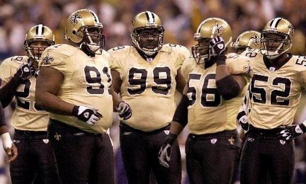

Fixing this hot mess was not the goal. Creating a usable clash jersey was.

CARDINALS:
Not the most original or sensible clash jersey but it does the job.

RAMS:
Whether the team stays in the Gateway City or bolts for the City of Angels, this clash will contrast well with either the current modern set if the team stays or with a throwback look the team may opt for upon its return to California. This clash has us feeling like its 1956!

49ERS:
While the jury is still out on this concoction, you cannot dispute that clash it does. I do admit that I like the gold swooshes on the black background, though.

SEAHAWKS:
Could have been worse. There could have been an 'action green' jersey thrown into the mix instead.

Hope you enjoy folks!
The season starts for real this week!
Bill Schaefer
Don't know if you're the only one who dislikes the WAS yellow pants, but I for one am happy they went back to them. That was my image of them when I first followed the NFL as a young child.
ReplyDeleteI could do with that Packers clash myself.
ReplyDeleteI don't think the Cowboys need a clash jersey, the choices are a white version of the Navy uniforms, and the Blue version of their classic White uniforms.
ReplyDelete