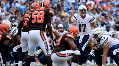
15) Chargers-Browns: SD in white/navy, CLE in brown/white. Again with the nearly unreadable orange numbers on the brown jerseys! Chargers looking good in white over navy, but the Browns, maybe in orange socks, could have done this one a little justice.
14) Ravens-Steelers: BAL in white/white, PIT in black/yellow. The Ravens choose to go all white with the Steelers in customary black over yellow. Not very often do I like the Ravens in all white, but in this case, it's a good choice. Steers away from too much black here.
13) Chiefs-Bengals: KC in white/red, CIN in alternate orange/white. Not the best game for the Bengals to wear orange in. One simple change would have perked this one up a bit: black socks on the Bengals. Would have lessened the impact of too much of a warm color thing.
12) Raiders-Bears: This is good, but not thrilling. Silver, navy, black and orange are nice colors to play with, but at times, it can be a little dull. And that's what I feel here. I know, I know, traditional based unis that have lasted for decades, but my bones are stiff on this encounter.
11) Panthers-Buccaneers: CAR in alternate carolina blue/silver, TB in white/white. I think the Bucs could've better off with the pewter pants. As it is, the Panthers always look sharp in those pale blue tops.
10) Lions-Seahawks: DET in white/silver, SEA in navy/navy. This is a good matchup, Shades of blue work nicely together, along with silver and gray and touches of neon green and black. But something is missing for me and I can't put a finger on it.
9) Cowboys-Saints: DAL in blue/silver, NO in white/gold. Cowboys in the better but seldom worn combo in their arsenal. Playing off the white over gold look of the Saints and the Saints would have better here had they worn black pants to steer slightly clear of the metallic fringe. The Cowboys in dark does score a few rungs higher.
8) Rams-Cardinals: STL in white/navy, ARI in alternate black/white. This one - for some reason - resonates with me, and it really should do nothing of the sort. The Cardinals truly are dressed in BFBS (black for black's sake) tops, but somehow, I feel they really look good when paired with the Rams in white over dark blue. I'm not going to try and explain this one away, but I happen to like it!
7) Jaguars-Colts: JAX in white/black, IND in blue/white. A nice matchup with traditional and post-modern. Colts blue blends real well against the white over black with teal and gold highlights. Thumbs up,
6) Packers-49ers: GB in white/yellow, SF in red/gold. Very pleasant, the difference between yellow and gold is displayed here in perfect fashion. Add brilliant red jerseys and white jerseys with the perfect mix of green and yellow trim and you have yourself a football game dressed right.
5) Texans-Falcons: HOU in white/navy, ATL in red/white. Falcons in the always smart red over white and gets a little boost from the Texans in the white over navy with red numbers. Modern day apparel and colors done right.
4) Giants-Bills: NYG in white/gray, BUF in blue/white. When you have two teams wearing virtually identical colors, this is where design plays a vital role. And the Giants gray pants act as a vital buffer. Plus minimal blue trim on the white based get-up against the blue jerseyed Bills and this is a pleasant view for the eyes.
3) Vikings-Broncos: MIN in white/purple, DEN in orange/white. Purple pants vs. orange jerseys is the look for me. Not so trendy colors on a football uniform and done the right wa make for a smartly-dressed matchup. One of this week's better ones.
2) Jets-Dolphins: NYJ in white/green, MIA in aqua/white. The first London affair this season and the two white lidded squads do well with the color selection. Dolphins going with aqua as the home side with the Jets choosing green trousers. Brilliant!. One thing, though. The TV cameras give off the palest hue of aqua for the jerseys, at least it seems that way to me!
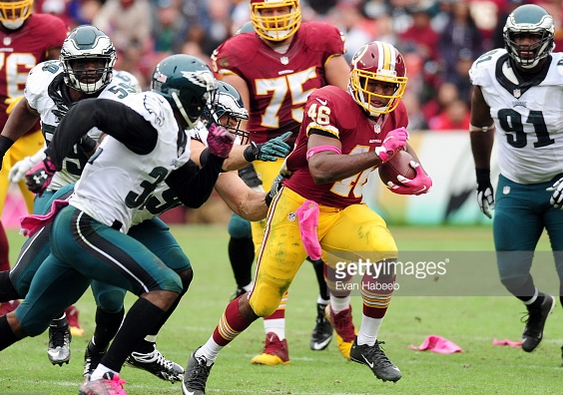
1) Eagles-Redskins: PHI in white/green, WSH in burgundy/yellow. Oh, so nice to see the Eagles break out the green pants for the first time in 2015. And against a perfect color foil in the burgundy clad Redskins! Just a beautiful sight, green, burgundy, black, yellow and silver combining for a perfect fall uni encounter.
That'll do er for Week 4. Be back next week. Ctach you then!


My turn:
ReplyDeleteFirst that awful white substance a lot of people like on their baked potatoes:
PHI-WAS: had the Eagles gone white-on-white, this game would have medaled. One more thing I want to clarify. I love Washington's burgundy and gold color scheme they use presently. But I detest the logo and nickname. It needs to change. I won't belabor that point though.
MIN-DEN: Sorry, can't do the Vikes purple pants.
CAR-TB: these two teams meet at Raymond James too early in the season too often, thus denying what would otherwise be a great uni matchup
STL-ARI: Now I just wish the Rams would move back to LA. Maybe that will prompt a permanent return to gold pants.
NYJ-MIA: I was looking forward to the Jets wearing white on white against the Dolphins white-aqua-white, and they ruin it yet again.
KC-CIN: three chances for these two teams to get it right in the Queen City. In '08, just as last Sunday, the Bengals went with orange jerseys. In '09, the Chefs (yes, I said Chefs, just like the painter in the old Snickers commercial) went white-on-white.
CLE-SD: Chargers WAH in a non-Cowboys game, and the Browns in the one road uni I could tolerate from their current wardrobe.
JAX-IND: all the Jags needed to do was wear white pants
That leaves 7 games that are eligible for ranking.
7. OAK-CHI: the first meeting between these two off the shores of Lake Michigan in a dozen years. Every time these two met in Chicago, it's been done right. Even though that playing surface is obsolete and the worst to players' health, when these two met in Chicago previously, their uniforms looked better on the old astroturf surface at Soldier Field. That's just the way I see it.
6. DET-SEA: The Lions light blue and silver contrasted decently against the Seahawks - the one team whose monochromatic look I like. I just liked 5 others better this week.
5. GB-SF: great color contrast, but this is one of those instances where bright sunshine doesn't do the matchup justice. It looks better in prime time or under a cloudy sky.
4. HOU-ATL: it looks just as good this year as in Week 4 of '07. Beautiful contrast.
3. NYG-BUF: both have red white and blue, but as Tim pointed out, the Giants gray pants gives it the right touch. And these two teams' colors, although pretty much the same, contrast the right way in upstate NY.
2. BAL-PIT: ranked 2nd because the Ravens used this as one of the times to go with my preference of all white on the road. This uni matchup would look better in the daytime. But overall, I enjoyed it.
1. DAL-NO: this is the first time since 10/17/71 that the Cowboys wore their regular blue jerseys against the Saints. NOLA brought the pants I prefer (gold). I'm glad this game was in Week 4 so I could finally see this uni matchup.