Not Quite So Color-ful Rush

So I was reading the main blog on UniWatch from December 28, 2016.

A contributor had decided to re-imagine this season's Thursday Night Color Rush games as throwback games instead. A fine idea. However, a misguided one. Here's why.

The concept behind Color Rush, besides making money for the League by selling new jerseys, was to have teams playing in colorful uniforms at the same time. But as one of my middle-school art teachers told us, "White isn't a color. It's a shade."

Out of the 15 games that were promoted as "Color Rush" games, only two featured both teams in color. Jacksonville & Tennessee played in an exact rematch of a game from last year while Denver and San Diego played in the best looking game of the year. That's it. Two games. The other 13 games? Not Color Rush. Aside from new uniforms, what was worthwhile? A team in a colored jersey against a team in a white jersey? Where have we seen that before besides 99.99% of all NFL games since 1957?

If you are going to hype games as Color Rush, shouldn't you actually have that live up to it's billing?

Now some may argue "But that is not the League's fault that the teams scheduled to play each other on Thursday nights have Color Rush uniforms that are chromatically 'too close' to each other. One team had to wear white to provide contrast."

I give you October 4, 1952.

Because of the use of white footballs for night games, teams were not allowed to wear light colored jersey as it made spotting the ball difficult. So what we see here is the Steelers in black jerseys hosting the Browns in brown jerseys. Even with what we in the 21st century would probably consider sub-standard lighting at Forbes Field, the teams had no problem discerning brown from black. Do you know how we know this? This was the second such meeting. On October 7, 1950, Cleveland and Pittsburgh played featuring the exact same uniform match-up under the exact same night-game circumstances.

Are we going to pretend that human vision was that much better 60+ years ago that viewers and players can no longer discern black from brown?

Other examples exist that are even more drastic.

For most of the 1930s and 1940s (and a good portion of the 1950s) both the Bears and Packers primarily wore navy jerseys. The only real difference between the uniforms were Green Bay's yellow helmets compared to Chicago's navy ones and the yellow shoulder yokes on the Packers' jerseys. Basically this would be like the Cardinals and 49ers paying while both were wearing their own shades of red jerseys. And the Bears and Packers did this twice each year.

Here are the Bears and Packers playing in the December 14, 1941 Western Division Playoff game in Wrigley Field.


Yes. A playoff game featuring both teams wearing navy jerseys.

Imagine a Houston vs New England playoff game in a few weeks with the Texans trotting out into Gillette Stadium wearing navy jerseys to play the host Patriots in navy jerseys.

So what's my point?

The NFL is making a big deal about these Color Rush games. They make the schedule to determine who plays who on Thursday nights. They pit teams like Arizona (black Color Rush uniform) against San Francisco (black Color Rush uniform). Clearly we can't have both teams wearing black. But rather than have Arizona wear their normal red jerseys and pants for a red vs black match-up, we get boring all-black vs boring all-white. How is this interesting?

What the League needs to take away from this season's Thursday Night Color Rush games simply is this...when done right, these games can look good.

When not done right, why bother? Denver and San Diego can play orange vs blue but four weeks later Cleveland goes all-white instead of all-orange in Baltimore against an all-purple Ravens? Wasted opportunities.

C'mon, NFL. Just get it right.

Bill Schaefer

Five Years of the GUD

by Larry Schmitt


It’s been a while since I’ve written for the blog, and the Gridiron Uniform Database’s fifth anniversary seemed like a good occasion to come back.

I still remember the GUD’s debut on Sunday June 11, 2011 when it was featured on the front page of Uniwatch.


Having been a fan of football history and uniforms since my teens, this was exactly the kind of site I’d hoped would surface one day. I happily clicked away, browsed and explored for hours that Sunday morning, savoring every visual treat.

Of course, much has changed since then.

Originally the site only went back as far as 1933. The years 1920 – 1932 were added incrementally over the summer of 2012, and many of the templates were empty, as photos for that era, especially for the small town teams, are scarce.


According to the sidebar on Bill’s Update page there have been 1,260 updates to the database’s content since a running count was initiated in January 2012. While many were new discoveries, the vast majority represent a collection of adjustments, refinements, tweaks and in some cases, major overhauls that resulted from the relentless and continuous research to provide the most comprehensive and accurate visual library possible.

While there may be times the GUD appears dormant, nothing can be further from the truth.

Most visitors to the GUD are familiar with the names Tim Brulia (historian & researcher), Rob Holecko (webmaster) and Bill Schaefer (graphic artist & researcher), the official owners of the GUD. There also is a network of GUD frequenters who volunteer their time and assist in large-scale projects and/or forward the occasional historical nugget that might lead to a correction.

You can visit the GUD Forum where some of this takes place. The Forum goes all the way back to the GUD’s second day, June 12, 2011. It serves as a quasi-time capsule to many of the early activities, and you can see some of the source material for what is now represented in the database.
My first contribution to the GUD was offering a color photo of the Giants Charlie Conerly in 1948, which led to a correction of New York’s leather helmets for that season.


That turned out to be the first of many for me. I often spend my free hours perusing the internet for pro football history, whether it’s statistics, player biographies or old photos. Whenever I came across something I thought was interesting I’d forward it to Bill and Tim for their consideration. Over time, they tutored me on developing a sharper eye for researching, a major part of which was identifying mis-dated photos (you’d be surprised how many exist in the Getty and AP catalogs), as well as discerning the subtleties of interpreting colors from black-and-white photos.

  
Why does blue sometimes appear darker than red, and other times red appear darker than blue? The best answer I can offer is: it depends on who took the picture, what type of equipment was used, if filters were involved, the type of film and how it was developed.

In March of 2013 I was invited (and possibly may have even been the stimulus for) my first large scale GUD project, which we termed “The Great Belt Overhaul.” What simply began as a casual surfing of old Earl Campbell photos during my lunch hour at work dovetailed into the correction of at least a dozen teams belt colors, most of which spanned the 1960’s through the 1980’s.

At the time the GUD commonly showed teams with black belts as a sort of default. While discovering that the Houston Oilers belts were white with white pants and blue with blue pants, we noticed that the Pittsburgh Steelers varied yellow and black belts for a similar period. While researching the Steelers we found similar evidence for the New Orleans Saints, and while researching the Saints we found that...well, you get the gist of it. One of our inside saying that we still use came from this endeavor...”While looking for one thing, I found something else...”

It was also at this time that most of my efforts were transferred to email, rather than the forum. I do occasionally add to a thread in the General Comments section of the forum, just for the fun of it. It’s been going for about three-and-a-half years now.


Since that time, some of the other large scale projects undertaken have been the addition of the USFL database in November 2013, the addition of officials’ uniforms in the May of 2014, 2015’s deep-dive project into newspaper archives that resulted in the GUD having a nearly complete photographic record of preseason games dating back to 1950, and the debut of AFL II earlier this year.

You’ll also notice that the ongoing endeavor to represent every regular and post season game on a weekly basis currently goes back to 1937, save for a small handful of games from the 1940’s where we haven’t discovered a photo yet.


My conservative estimation is that the GUD currently displays 14,320 weekly matchups in full color – where else are you going to find information like that? And you the reader can be confident that what is displayed is accurate, as no stone had been left unturned while researching libraries and newspaper archives. If a photo cannot be found to back it up, then the templates are left blank. Guesstimations are not good enough.

To that end, while most of us conduct our research online through newspaper archives and libraries, Tim has taken several sojourns to the Library of Congress in Washington DC and the Pro Football Hall of Fame in Canton, Ohio.

While I most enjoy researching the first three decades of pro football – essentially the leather helmet era – I have one modern era project that I remember fondly. 
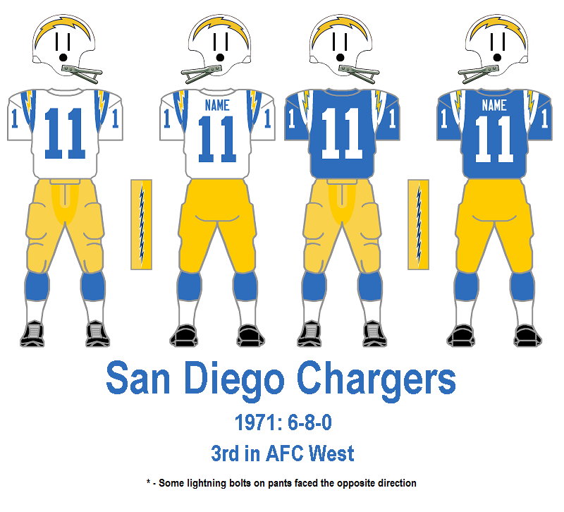
One weekend morning in April 2014, while casually looking over photos of the Dan Fouts-era Chargers, I noticed some irregularities in the orientation of San Diego’s lightning bolts on their pants.


I broadened my search to include the 1960’s and found that not only were they facing multiple directions – they could be forward or backward and upward or downward – but over the years the bolts themselves changes shape and size.


I began saving photos in files broken down by era, and while the bolt placements was often erratic, I was able to nail down the style of the bolts definitively. Did you know from 1961-65 the bolts on San Diego’s pants contained eight points on each side, while all other years through 1987 they had seven?


Or that the only year with uniform bolt orientation was 1984?


I’m not sure if Bill recalls this project as fondly as I do. Initially frustrated at the challenging work, he diligently forged a system - over the course of a full year - to accurately present what you see in the San Diego database today. His ultimate balance of persistence and patience paid off in a big way.

Bill himself handled the 1992-present day Chargers bolts research, and along the way picked up on number font variations.


I guarantee you won’t get this attention to detail anywhere else.

So, what’s next? I don’t want to give away too much, but sometime in the near future, the weekly matchups are likely to extend back a few seasons further, and the other AFL’s will ultimately take their rightful place to complete the presentation of every major professional football league over the past 96 years.

There also has been a recent boon in discoveries of missing teams from the 1920’s. Many of the templates that appear blank today will be replaced by full color representations of what these pioneers of the game we all love today wore on the gridiron in near anonymity over 85 years ago

Ongoing corrections and enhancements are always taking place. Recently, many teams have had their catalogues refined with what we call the two-tone effect on their pants (the result of two differing materials, usually with the front being a shiny, satin-like quality). 


There also has been a recent emphasis on fine-tuning jersey number fonts and sizes as well as leather helmet styles. Some of these differences can be seen in places like the weekly matchups as gifs when multiple styles were worn concurrently.


The research section also is updated regularly. Among the information readily available is a log of every instance of and NFL team wearing white at home since 1957 and what is believed to be the most comprehensive representation of helmet decals anywhere.


Rest assured, all of these will be updated continually as the 2016 NFL season proceeds.

Earlier this year, Rob gave the GUD itself a face lift. The front page has been reorganized to better display the content that is available. Several of the pages inside are now sortable, making navigation easier.


He also added some new features that highlight historical facts and firsts.


All that great information aside, what I appreciate most about the GUD is that it is a community. Right from the very beginning Tim, Rob and Bill welcomed all visitors not only to enjoy the content that was presented, but take part in the collaborative journey that is the GUD. They allowed an obsessive fan like myself to feel like a part of the group.

I'm looking forward to the next five years and all the discoveries that await us!

We're still here!

by Tim Brulia


Yes, folks. The Gridiron Uniform Database is still very much alive.

Sorry we have not been blogging as much recently, but we are still quite active. If you go here, you can see all of the recent updates that are made to the GUD. This will detail all of the changes that have been made to the GUD, including the before and after visuals as well as the documentation that made the revision(s) possible.

Please also note that we continue to post a daily uniform matchup from the past on our Facebook and Twitter pages.

Here's a sample:

Don't worry. We've never really gone away. And yes, we do anticipate some additions to the site as the winter passes into spring, and the spring passes into summer and then the 2016 NFL Season!

Rest assured, the GUD will be here for you all year long!


Wild Card Weekend 2015 uniform rankings

by Tim Brulia


4) Chiefs-Texans: KC in white/white, HOU in navy/navy. Not my choice for the colors chosen by either team, but something we have to deal with. Chiefs apparently going with good mojo by sticking to the all white look. Again, not my favorite look with the white jerseys, but at least KC is staying away from the white socks with this set. As for the Texans, I do like the all navy look, and with the Chiefs staying all white, maybe it swayed the Texans way of thinking from wearing white pants. All in all, a so-so pairing, not as good as its potential.

3) Seahawks-Vikings: SEA in white/navy, MIN in purple/white. Quite a frigid game in the Twin Cities. And this match was cool, too. Seahawks with a variety of pant colors to accompany the white jerseys made the second best choice by going with the navy pants. I don't think the navy bottoms are quite as good as the gray ones, but the navys expose the neon green trim moreso than either the gray or white trunks. The Vikings in purple over white is the safe choice over all purple, and also the wise pick. All purple would have jarring for a playoff game. As such, this pairing is really good. Good colors!

2) Packers-Redskins: GB in white/yellow, WSH in burgundy/yellow. These are good unis, but the pairing of them just gives off a little too much yellow. Packer helmets and pants, Redskin pants and a good dollop of yellow trim on the helmets, jerseys (though kept to a minimum) and on the burgundy based socks. On their own, these unis are natty. The Packers carry off the yellow in a good way. It overrides the green as the dominant color when wearing white tops. The Redskins burgundy is sleek both on the helmets and jerseys. Though the striping patterns on all four quadrants of the uni is haphazard to a fault, the colors override the flaws. But merged into combat, the yellows just are a bit much.

1) Steelers-Bengals: PIT in white/black, CIN in black/white. While the game was mean and nasty, the unis were not. Both sides in triple color, the Steelers in black/white/yellow, the Bengals in orange/black/white. The Steelers in white somehow to me makes the yellow striping and nameplates really bright. Black is just the numbers and feather striping on the yellow based sleeve stripes. put on the familiar yellow pants with the thick black side stripes and it's a sharp set. The Bengals match up quite well with the black and orange tiger striping. Going all black would have slogged this matchup a bit, so staying white trousered was a common sense move. A good pairing,


Four more games to check out next week. See ya then!

Week 17 2015 Weekly Uniform Rankings

by Tim Brulia


16) Titans-Colts: TEN in white/white, IND in blue/white. Three words: Too. Much. White. That is all.

15) Ravens-Bengals: BAL in white/black, CIN in black/black. Three words: Too. Much. Black. That is all,

14) Steelers-Browns: PIT in white/yellow, CLE in brown/white. It's decent, but until the Browns do something about the near unreadable orange numbers on brown jerseys, this will continue to drag all others into the rabbit hole.

13) Jaguars-Texans: JAX in white/black, HOU in navy/white. A modern matchup that leaves me a little empty. Mind you, these aren't bad combos, but something gets lost when they're paired up.

12) Raiders-Chiefs: OAK in white/silver, KC in red/white. A lot - likely most - of my peers think this one is dandy. Not me. I just find the Raiders white jerseys really dull. The Chiefs in red? Sweet, of course, but the more I see this matchup, the more my senses dull.

11) Seahawks-Cardinals: SEA in alternate gray/gray, ARI in red/white. I'm still not sure about the all gray of the Seahawks. Personally, I'd kinda like to see the gray tops mixed with either the white pants or the navys, just for a bit of variety. Cardinals? um, yeah, red over white.

10) Saints-Falcons: NO in white/gold, ATL in red/white. It's a good one. Not so great. The Falcons have a sharp color combo (though the swirly trim leave a lot to be desired) when in red. The Saints look swell in white over gold. Together. I'm not too thrilled.

9) Buccaneers-Panthers: TB in white/pewter, CAR in black/silver. Dullish, but the spark of the bright trim colors on both sides (red, silver, orange, light blue) keeps this one from the nether reaches. Better than I would normally expect.

8) Lions-Bears: DET in white/silver, CHI in navy/white. Sharp, but not quite the same as if the colors were reversed. But, it's NFC North and that's half the battle.

7) Eagles-Giants: PHI in white/green, NYG in blue/gray. Thanks, Eagles, for the green pants. Sets up well with the Giants blue over gray set. Make this one a better than average battle.

6) Redskins-Cowboys: WSH in burgundy/yellow, DAL in white/mint, We saw this one earlier. It's a great one, but I wish a slight tweak would be in order to ease the potential of monotony. Such as the Cowboys in the color rush white britches, or the 'Skins in their "throwback" white trousers?

5) Rams-49ers: STL in white over navy, SF in red/gold. Smart of the Rams to go with the navy pants. Offers sharp contrast and lets the colors flow brilliantly. Keeps the onus of the gold on the Niners,w here it belongs. Pushes the navys and reds to the forefront and that's a boost.

4) Chargers-Broncos: SD in white/navy, DEN in orange/white. On a combo I like, like the Broncos in orange, it takes a near disaster or something that just doesn't work right by the opponent to downgrade (see last week against the Bengals). The Chargers white over navy, while not high on my food chain, seems to add the right amount of spice to this uni dish. So, it's a winner.

3) Vikings-Packers: MIN in white/purple, GB in green/yellow. Like this one, almost love it. Very similar matchup style when the Bears invade the Frozen Tundra. But I feel navy and orange blend better than purple and yellow do against green and yellow. Still, as long as the Vikes go with purple pants, this will always score big on my watch.

2) Jets-Bills: NYJ in white/green, BUF in blue/blue. Remember earlier in the season when the NFL begat Color Rush with these two? Well, we got ¾ color rush here. white over green and all blue and frankly, this looks a lot better. Some might prefer the Bills in blue over white, but the more color the better. And not contrived, either.

1) Patriots-Dolphins: NE in white/navy, MIA in aqua/aqua. Well, it took the better part of an entire season, but the Dolphins finally showed their potential. Instead of the dreadful all whites, the Dolphins make the most of their unique shade of darkness with full on aqua. Just so much better and it really accentuated the Patriots white over navy and breathes some life into that predictable set. Koo-does!!


Thanks for putting up with my thoughts for the season. I'll continue with the Wild card games next week. See ya then!

Twitter

Blog Archive