

16) Ravens-Dolphins: BAL in purple/white, MIA in white/white. While the blah Dolphins all white get up scores zero points with me, it does brighten up the Ravens in purple over white.

15) Bengals-Browns: CIN in white/black, CLE in brown/white. Possibly the best combo we could have for this encounter. Good to see the Bengals in white over black, Except for the Browns nasty orange numbers on the brown jersey. That alone lowers the boom on this one.
14) Eagles-Patriots: PHI in white/white, NE in navy/silver. Not a good choice by the Eagles to go all white. Not at all. The green pants would have made this matchup a ton better. So, the Pats navy over silver has to carry the day, and unfortunately, I don't think it can.
13) Broncos-Chargers: DEN in white/white, SD in navy/white. There are teams who look so dynamic in one combo and yet so yawn-inducing in another. Hello, Broncos. Just not excited in this garb. Chargers look pretty fair in the navy over white, but can't pull up the Broncos from the heap on their own.
12) Jaguars-Titans: JAX in white/black, TEN in navy/navy. The all navy look of the Titans seems to be winning the day in Nashville this season. OK, but then the Jags carry it jut a little too far with the black pants.

11) Colts-Steelers: IND in white/white, PIT in black/yellow. The Colts rather plain, generic all white duds somehow, just somehow, bounce surprisingly well off the bright yellow and stark blackness of the Steelers' gear. Not sure how, but this get together pleases me.
10) Chiefs-Raiders: KC in white/white, OAK in black/silver. OK, KC. It was a nice change to see you in the all white look with the red socks, but it's time to go back to what you do best, and that's wear the red pants with your white shirts. Raiders, I know you'll never change the black over silver, and you shouldn't.
9) Panthers-Saints: CAR in white/white, NO in black/black. Sorta fence-sitting on this one. I, for one (maybe the only one?), like the Saints in all black. And I think the matchup overall looks good with the Panthers in their all whites. Maybe the light blue socks on the Panthers salvage this. I'll keep it here.
8) 49ers-Bears: SF in white/gold, CHI in throwback navy/orange. Conservative, yet tasteful. The Bears, in the throwbacks, should teach the Niners a lesson on how to carry out triple sleeve stripes without having to cut off the striping due to the sleeve length, or lack thereof. While I complain about number legibility on the Browns brown jerseys and the Niners horrid all black alternates, it doesn't seem to be a factor on the Bears alternates, at least to me.

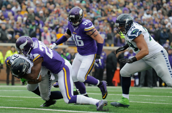
7) Seahawks-Vikings: SEA in white/gray, MIN in purple/white. Nice and yet, disappointing. Not from the standard Viking gear at all, but the Seahawks attire. It is welcome to see the Seahawks rock the gray pants for a change, but the gray is really light. Lighter than normal. Here's hoping next season the gray get a little more gray for the Seahawks.
6) Falcons-Buccaneers: ATL in white/white, TB in red/pewter. The Bucs red jerseys are growing on me. Sure, there's a lot of unnecessary baggage on the jerseys, but the brilliant red hue more than makes up for that rot. It even makes the Falcons bland all white set not so bad.
5) Cardinals-Rams: ARI in white/white, STL in throwback blue/yellow. As always the Rams look tough in the bright blue over yellow set. The Cardinals, though, seem to be keeping the red pants in the closet this season. Which is a shame, because if the Cards had busted out the red trousers, this game would likely have been in the medal round.
4) Packers-Lions: GB in white/yellow, DET in honolulu blue/silver. Color rush takes a break after a three week flourish. Instead we see two teams in uniforms that span decades - more or less. And as with most NFC North matchups, they deliver. The Packers bright yellows and the Lions sharp honolulus look good against other.
3) Texans-Bills: HOU in white/navy, BUF in blue/white. Red is just a trim color on both squads, yet it highlights the shades of blue very well. The game carries a rather muted color palette with great execution in terms of logos, striping and pattern.

2) Cowboys-Redskins: DAL in white/mint, WSH in burgundy/yellow. There are long standing games, where, even one as predictable as this one, it still is a reassuring blessing. The Cowboys in standard white over mint looks mighty fine against the Redskins unique burgundy over yellow. Yeah, both uniforms are a cacophony of mixed up hues and striping and piping, but the color schemes are a sweet blend.

1) Jets-Giants: NYJ in white/green, NYG in blue/gray. Oh, yeah. This is the way the intra-New York matchup should look. When the Jets go white over green, it's a snazzy set. Paired up with their Giants brethren in blue over gray and you have yourself a dandy looking game!

Bye for now!