Showing posts with label Bucs. Show all posts

New Uniforms for 2023: An Impartial Ranking

 As we approach kickoff for the 2023 Hall of Fame Game in Canton and the official start to the 2023 Preseason, let us take a few moments to review the new uniforms and helmets that we will be seeing throughout the season.

I have ranked the 13 new uniform additions by team, whether it be a single new helmet or a completely new uniform. Additions that were used last year like the Pat Patriot throwback helmet/uniform in New England or the return of the red helmet in Atlanta are not included.

Here we go.

#13 - INDIANAPOLIS COLTS


Nothing about what the Colts did makes sense. They have a regular blue jersey. They have a blue throwback jersey. Why do they need a third blue jersey? From a distance, the pattern in the new blue jerseys will likely be hard to detect. The black outlines around the white numbers will be hard to notice due to being against the aforementioned blue. And this doesn't even take into account how ridiculous these jerseys will look if the Colts also add 'Captain' patches onto the other side opposite the alternate logo placed on the left collarbone.


As for the black helmet, we likely should have seen this coming as a few years ago the Colts changed the color of the Nike swooshes on their white jerseys from blue to 'anvil black.' So does that mean anvil black is now a Colts color?

The Fix: The Colts should have just kept it simple and only added a dark-royal-bordering-on-navy helmet to pair with the blue throwbacks. When you overthink, this is what happens.

Grade: F


#11 (tie) - DENVER BRONCOS

There's a tie for the  #11/#12 spots. Denver comes first alphabetically so I'll explain them first.

A white helmet. That's it. To be paired with Color Rush / Throwback-styled orange jersey and orange pants. 


Why? What does Denver gain from this? They aren't going to have lucrative merchandising increase for a new helmet. The Color Rush costume hasn't changed (the helmet logo has minutely) since it came to be in 2016.

What's worse? In the reveal video, one Bronco is wearing the all-orange costume with orange socks, too. A second Bronco is wearing white socks paired with the all-orange. It doesn't seem like the team even knows what it's going to do with them.

The Fix: Denver has had the same Color Rush uniform since 2016. Alter it by replacing the navy blue with light royal blue trim. Add a light royal blue helmet in the same style. Add appropriate stripes to the socks. Boom.

Grade: D+


#11 (tie) - DETROIT LIONS

A new blue helmet is added for the sole purpose of pairing it with the awful all-grey Color Rush uniform.


I'll ask again...Why? The short answer is that the all-grey uniform didn't match with the normal Detroit silver helmet. I can understand that. But then you create a blue helmet to rectify that one problem and you don't even bother to correctly match the blues of the helmet and jersey? At least it matches the blue of the anniversary patch the Lions will be wearing this year.

The Fix: Detroit's heart was in the right place and their intentions were good. Fix the helmet's shade of blue to match. This oversight reminds me of when the Vikings brought out their current look and their helmets bore a shade of purple that looked like the paint guy at Home Depot put in a little too much red and way too much white when trying to match colors resulting in a lighter, redder shade of purple. It's an easy fix. Admit it. Fix it. Boom.

Grade: D+ (can go to a C if they fix the blue)


#10 - HOUSTON TEXANS

This change may well have slipped under the radar. Select teams are not only adopting Nike's new FUSE template for their jerseys this season, but a small percentage are also using a modified version of the FUSE that has a straight seam across the upper chest rather than the more visible V-shaped seam. Houston is one of those teams. Incorporating that modified FUSE has enabled Houston to 'flip their horns.' Since their inception, the Texans' shoulder stripes (horns) have narrowed to a point directed away from the body. These new horns curl ever so slightly towards the center of the torso instead.


Was this change needed? No. Will it change how we view the Texans' uniforms in a bubble? No.

The Fix: This was a change that wasn't needed. For good or for bad, there's nothing to really fix. It's just...different.

Garde: C-


#9 - CAROLINA PANTHERS

The Panthers' changes were two-fold. 

They altered the hoop-stripes. The only problem is that there are still going to be variations of how those stripes look due to the tailoring of jerseys for players of different positions. This is the same problem Carolina has had for a while.


The second change was in tweaking the shade of blue. Honestly, if no announcement had been made, you'd have been hard pressed to find someone in Bank of America Stadium that said "Gee. Their blue sure looks different this year."

So they altered the hoop-stripes but still have wide variations in how they will look. They changed the shade of blue and almost no one will notice.

The Fix: Find a way to tailor these stripes so that they appear the same on all player positions. Worse comes to worse, change them to look the same as the Colts' hoop stripes. Vary the width of the stripes rather than having all three the same as the Colts do.

Grade: C


#8 - ARIZONA CARDINALS

The uniforms that the Cardinals have worn for the past 18 seasons were dated and bad. Not a good combination. This is a change that needed to happen sooner rather than later and that's why I have them rated one notch above Carolina.

Is there something that will make your eyes pop out of your head and go WOW!?! No.


An overdone uniform was replaced by a minimalist uniform. It's addition by subtraction. They're not great by any stretch, but they're an improvement. I think we all can agree on that.

The Fix: Remove the obnoxiously large wordmark on the chest of the red jersey or simply replace it with 'CARDINALS' in smaller type similar to what is on the sleeves of the other two jerseys. 

I still maintain that Arizona missed the boat by using silver instead of copper. Arizona is the Copper State and a dark copper would have made for a much better trim color. The silver that is used will be hard to see against the white next to it. 

The other fix will be to mix-and-match within reason. The reveal only included mono-everything: white, red, and black. Hopefully, like Washington who did the same thing at their reveal a year ago, they won't be afraid to mix things up.

Grade: C (C+ if they mix-and-match)


#7 - CLEVELAND BROWNS

Two years ago, the Browns celebrated their 75th Anniversary by introducing an all-white throwback to their very first season - 1946. However, due to the One-Helmet Rule, the Browns had to use their regular orange helmets with modified features to pair with them. Now, with the OHR discontinued, Cleveland introduces a white helmet to pair with the throwbacks.


While the 1946 leather helmet was plain white, the Browns have added stripes and a browns facemask. Despite the stripes, the white helmet is a wonderful nod to the team's history despite technically not being totally accurate.


The Fix: Honestly the stripes shouldn't be there if the Browns were attempting to construct honest throwbacks to 1946. But someone probably had to be THAT GUY in the room that said "I know its supposed to be plain white but it's just TOO plain. Add some stripes." These are the Browns. The 'No-Logo-On-The-Helmet' Browns. Plain is in their DNA and they love it. Lose the stripes.

Grade: B


#6 - NEW YORK JETS

The Jets surprised the football world by unveiling throwback uniforms from the 1980s. The correct helmet logo is placed on the current metallic green helmet. No biggie. The uniform is a great representation of the look the throwback is mimicking. Jets fans will like it. 


The Fix: The only question I have is why is this franchise all of a sudden so averse to wearing green jerseys or pants? After the 2022 Preseason last year, the Jets wore green jerseys and pants together once and green pants below white jerseys once. That's it. Two games. Every other game was a combination of white or black pants and jerseys. I get that in the first half of the 1980s, the Jets wore white at home most of that time. However, with an infusion of green desperately needed, why not use the green throwback jersey instead?

Grade: B


#5 - SEATTLE SEAHAWKS

These throwbacks look phenomenal. The blue pops. The green is bright. The silver helmets sparkle. So why are the Seahawks only #5 for me?

It really isn't their fault. Due to modern jersey tailoring, sleeves nowadays probably only have about 40% of the area to work with compared to the jerseys they are trying to duplicate. For me, part of the appeal for the Seahawks' jerseys were how the stripes exiting behind the bird-head logo, continued all the way around the sleeve, and back around to the beak again. It was a brilliant effect, but, due to the minimal amount of space to work with, the current design can't offer that. 


The same can be said with the helmet logo. Due to modern helmets and their design, the facemask and chinstrap snaps force many helmet logos onto the back half of the helmet for several teams. This is one of those cases. One Twitter follower said he thought he was looking at a 1970s football card of DK Metcalf because he was positioned facing the camera (below) and the logo could not be seen. He honestly thought they had forgotten to add the logo to DK's helmet or that, as in cards from the 1970s, it had been airbrushed off. The result is that the amount of helmet logo that can be applied to this throwback's helmet is greatly reduced.


The Fix: Unfortunately, there isn't one. We are limited by the times. That incudes Nike's inability to reproduce the shiny silver pants that we should be getting with these uniforms. The Seahawks did well with what they had. They did a great job replicating a classic look that fans all over will love. No one will say "That's a terrible looking uniform."

Grade: B+


#4 - PHILADELPHIA EAGLES

Finally, kelly green has come back to Philadelphia. The thing I like the most about these uniforms is how the Eagles didn't have to use some sort of gimmick to get the correct logo to fit onto the sleeves. No abbreviated stripes. No reduced size. Just right.


The pants have the correct striping and are pretty close to the shade of grey/silver. The only regret here is that Nike could not replicate the sheen of those original pants (See "Big Jerome" below). It also seems like the helmet is lighter green than the jersey instead of being darker than the jersey. The helmet is significantly lighter overall compared to its predecessor. The sock stripes also appear to have thinned somewhat.


The Fix: The only thing I'd tamper with here is to darken the green of the helmets. Unfortunately, it's highly unlikely that Nike is capable of fixing the pants otherwise they'd have already done it for the reveal. Oh, and where the heck are the black shoes? Black shoes are a must for these.

Grade: A-


#3 - MINNESOTA VIKINGS

Let me start by saying that I'm not a Vikings fan. Their new throwback uniform goes back to their original look from 1961 and the first half of that decade, which is new ground for a Vikings throwback. Truthfully, everything about this uniform is 'spot-on.' Except for one detail. The helmet.
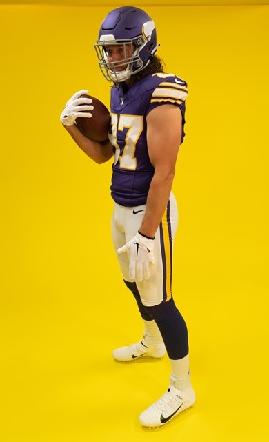

Why, if you are putting so much effort to get the look just right, do you make perfect versions of the jersey & the pants, but then drop the ball on the helmet? And here's the kicker...the Vikings are actually using a second helmet shell of a different color than their regular shade of purple. They had a chance to use the era-accurate glossy dark purple helmet shell. Instead, they opted for a lighter, matte purple than what was called for.


The Fix: If these throwbacks stick around, which I would guess they would, next year's throwback helmet will likely get fixed. I feel safe in that assumption. Why? Because the Vikings have done this before. 


As I stated in discussing Detroit's new helmet, when the Vikings debuted their current uniform set in 2014, the helmet didn't match. It was much too light. And it was highly noticeable on TV, to boot. Unfortunately, it took until 2019 for the Vikes to fix their purple helmets. But the point is, they did. This fix won't take as long. And like Philadelphia, these uniforms absolutely require black shoes, as well.

Grade: A-


#2 - TAMPA BAY BUCCANEERS

Bucco Bruce and the creamsicle orange jerseys have returned. Nike went the extra mile and made these versions a more vibrant shade of orange than their 2012 efforts which were much paler by comparison. Even the red trim really jumps out at you. These were extremely well done and historically accurate.


The Fix: Nothing. But there is one thing to look for as far as being historically accurate. On the back of the helmets where the striping ends, the Bucs have always cut off the bottom corner of the red stripes' outer edges. It's a quirky little detail that I will be looking for. For some reason, the Bucs' reveal didn't include photos of the backs of the helmets.


GRADE: A


#1 - TENNESSEE TITANS

Sorry to disappoint, Bucs fans, but these are just a little bit better. And it's funny but no one will look at these uniforms and call them Titans' throwbacks. These are OILERS uniforms.

Why are they better? Accuracy and attention to detail. The number fonts are a perfect match. The bold red outline goes BANG when you see them. But the best part of all is how they purposely mismatched the blues. Normally, this would be a problem but not here. Historically, these Oilers' blue jersey uniforms were done using two similar, but separate, shades of blue. 


The jersey's blue needs to match the blue pants stripe. It does. The blue of the socks is slightly darker and matches the blue in the helmet logo and stripe. They do. You had to be aware of this ahead of time to plan the outcome the way it needed to be. They did. And it's magnificent.

The Fix: Are you kidding??? One thing, Titans. PLEASE do not have players disrespect one of the greatest uniforms ever by wearing plain white socks instead of, or overtop of, the actual uniform's socks. PLEASE!

Grade: A+


That wraps it up, folks. One thing is certain, in a League dominated by darker colored jerseys, the majority of these throwbacks bring us back to a day when vibrant, colorful uniforms adorned our TVs every Fall weekend. That is a very good thing.


Bill Schaefer


Back When A Bucs' Primetime Game Was Exciting

For those of you who watched the Bucs dismal performance on NFL Network against the Cowboys last night (not talking to those of you who have Time Warner or Bright House) it may seem like a long time since the Bucs played an exciting primetime game.  Earlier this year the Bucs beat the Colts on Monday Night Football, and while a win is a win (and was much better for Buccaneers' fans than the historical 2003 MNF collapse to the same Colts) it was a boring game.  But if we go back eleven years to a Monday Night game between the Bucs and the Rams, you will recall one of the most exciting primetime games in recent memory, as we go... "On This Day..." back to 2000:


"On This Day..."
On December 18, 2000, the Bucs and Rams played a thrilling Monday Night game, so good in fact, the fact that Dennis Miller was announcing it didn't even detract from it.  In the crowded NFC playoff chase, the two teams from the previous year's NFC Championship met in a game they both needed.  The winner would clinch a spot, while the loser would be in danger of missing the playoffs altogether.   Trailing 35-31, with under 2:00 to play, RB Warrick Dunn caught a screen pass and was wrapped up fifteen yards behind the line of scrimmage on a key third down and it seemed like the Bucs hopes were dwindling.  Just before being whistled down, however, Dunn lateralled the ball back to QB Shaun King who improbably ran thirty yards for a first down, and the Bucs drove down the field for the winning score.

The Bucs went on to miss a field goal on Christmas Eve at Lambeau Field the following week and had to settle for a wild card, where they lost to the Eagles, and the Rams beat the Saints the next week and made the playoffs anyway, but then lost to the Saints in the first round.  The Rams made it back to the Super Bowl the next year, losing to the Patriots, while the Bucs (after another wild card loss to the Eagles after the 2001 season, fired Tony Dungy and hired Jon Gruden and got their Lombardi trophy the following year.)  But for one exciting December night in 2000, these two teams played an epic MNF battle.

To read a complete recap of the game, click here.


We are proud to add this historic Monday Night football game from eleven years ago today to our matchup database.
~ ~ ~

Speaking of yesterday's dismal Bucs-Cowboys game (well, dismal if you are a Bucs' fan anyway), what was up with the bias on the NFL Network's coverage?  While this was the fourth consecutive year that the Cowboys have been on NFLN's Saturday Night special broadcast, this was the first time the Bucs have ever been on NFL Network, I believe.  It would have been a perfect time for them to showcase the Bucs.  I know they are playing awful -- in the midst of a seven-game (now eight-game) losing streak, but that was no excuse for the bias-ness of the NFL Network's coverage.  Yesterday on their network they aired, leading up to the game: "America's Game: 1992 Cowboys", "America's Game: 1995 Cowboys", a replay of the Cowboys-49ers game from earlier this year, "Tom Landry: A Football Life", and Top Ten Dallas Cowboys of All-Time.   C'mon, is this a national network, or am I watching a local Dallas-Fort Worth station?  They could have at least mixed in an "America's Game: 2002 Buccaneers" instead of 10 straight hours of this Cowboys-love fest.  The game was all-Cowboys, at least they could have shown the Bucs a little love during the programming all day leading up to it.  Even FOX News thinks that violates equal time guidelines!  Even ESPN is less biased when showing a Red Sox-Yankees game!

And then to top it all off, they rubbed salt in the wound at halftime, the Bucs were trailing 28-0, and they put the Bucs' score not just as "0", but "00":


What, one "zero" wasn't enough?

Week 14 Uniform Rankings


While there are still three weeks left in the NFL regular season (which is unfortunate if you are a Buccaneers fan like some of us around here) we have reached the end of the academic year, which for me at least, means I will have more time to devote to the Gridiron Uniform Database.  So check back more often to this blog, as we may, for the time being return to the "daily update" format that was so popular and successful during the summer.  Hopefully in the coming weeks, we'll be able to make a huge dent in the past years head-to-head matchups.  If you have any particular past year matchups you'd like to see, like for instance this one, post a reply or in post it in the forum and we'll add it.  In the meantime, we'd also like to debut a new feature today called "On This Day..."   Every day, from now through the Super Bowl, we'll be featuring a past NFL matchup that occurred on this calendar day.

On This Day...
Today, in the first of this series, we'd like to feature the December 16, 1979 matchup between the Tampa Bay Buccaneers and the Kansas City Chiefs.  This was the Bucs' Cinderella season, after going 0-14, 2-12, and 5-11 in their first three seasons of existence, the Bucs started out 5-0 behind the play of second-year QB Doug Williams, RB Ricky Bell and a great defense led by Lee Roy Selmon and Richard Wood.  After 12 games they were 9-3 and needed one more win to clinch their first ever playoff spot.   With three straight losses, however, to Minnesota, Chicago and the 1-13 San Francisco 49ers, the Bucs' playoff hopes came down to this final game.  A win would mean the NFC Central title, a loss would mean the Bears would take the division and the Bucs wouldn't even make the playoffs.  A torrential downpour caused a sloppy game and a defensive battle against the Chiefs.  One Neil O'Donoghue field goal was the only scoring, and the Bucs prevailed 3-0.
This game was featured on NFL Networks' Top 10 Bad Weather Games of all time, and you can watch the segment on this game here.

We'll be back tomorrow with a great game from a past December 17, and now here's Tim with this week's uniform rankings:
 ~ ~ ~


Week 14 Uniform Rankings
by Tim Brulia
Welcome to the blog for Week 14. No less than 8 games involving all white in the mix:

Browns-Steelers: Browns in looks like a run of the table in white/white this season. Steelers with their second and last game in the black/white throwbacks. Picture yourself at Forbes Field in the 1960-1962 era. Jim Brown and Ernie Stautner. Kind of the same feeling in 2011.

Chiefs-Jets: Chiefs rocking all white for the second straight week while the Jets go green/white. Somewhat of a Holiday feel, but the Chiefs would look so much better in red pants here.

Buccaneers-Jaguars: Battle of Upper Florida. Bucs go white pewter and the Jags with the teal/white. This one I like because the Jags go teal and the Bucs bless us everyone with pewter pants. Thumbs up to these two.

Patriots-Redskins: Pats go white/navy and the Skins, apparently ditching yellow pants for good this season, go burgundy/white. Lotsa color here; silver, red, burgundy, yellow, navy. Like this one a lot.

Falcons-Panthers: Falcons all white and the Panthers go black/silver. The nicest colors, red and Carolina blue, are merely trim colors in this matchup. Alas, a few knockdowns on the list for that.

Colts-Ravens: Colts return to their onetime home in all white and the current Charm City residents go purple/white. A normal but not that exciting matchup.

Eagles-Dolphins: Eagles in the green/white and the Fish in the all white. Again, I am not that worked up over this uni matchup.

Vikings-Lions: Vikes are another team going all white with the Lions in standard Honolulu blue/silver. The purple and yellow trim save this game from being a rather meh affair. Lions still looking good.

Saints-Titans: NO back in the gold pants complimenting the white jersey while the Titans roll with the columbia blue/navy blue look. I happen to think this matchup works well.

Texans-Bengals: The Tex rocking white/navy and the home Bengals go with the black/white get-up. Another combo that fits rather well.

Bears-Broncos: Bears in the white/navy standard and the Broncos show off the all blue look again. Oddly, a little too much dark blue for me. Broncs should've gone with white pants here. Intriguing nonetheless.

49ers-Cardinals: Niners go with standard white/gold and the Cardinals, after keeping the red pants on the shelves all season long suddenly get a case a scarlet fever two weeks in a row. And, the red pants would gone so well earlier, now pose too much red in this matchup. Should've stuck with white pants here.

Bills-Chargers: Bills do the all white thing, but it looks like the white socks are out for the season as they keep with the blue socks. Chargers with their navy/white look. Just once, I'd love to see the Bolts go all navy. Here, it would have been fantastic.

Raiders-Packers: Classic, yet - well - classic. Raiders in white/silver, Packers in green/yellow. Very nice, lads.

Giants-Cowboys: Giants in the blue/gray and the Cowboys in white/quasi-silver. BUT, these are not your normal Giants' blue/grays. They are the G-Men's blue/AWAY grays, where the side stripes are separated and a wee bit thinner than the HOME gray pants, with the blue/red/blue stripes. A nice occasional kink to the standard fare.

Rams-Seahawks: Rams in all-white and the Seahawks, who have never stained a home game in their entire history with a white jersey, go the usual all Seahawks blue. For the horned sheep, I think the gold pants would have been the way to go here. But white - to me - goes better than blue pants for this occasion.


So the Week 14 lineup goes as follows:

16) Eagles-Dolphins
15) Colts-Ravens
14) Chiefs-Jets
13) Bills-Chargers
12) Falcons-Panthers
11) Vikings-Lions
10) 49ers-Cardinals
9) Rams-Seahawks
8) Browns-Steelers
7) Bears-Broncos
6) Buccaneers-Jaguars
5) Giants-Cowboys
4) Saints-Titans
3) Raiders-Packers
2) Patriots-Redskins
1) Texans-Bengals

~ ~ ~


Tim will be back next week with the Week 15 sartorial review, and we'll see you tomorrow with another "On This Day..."

Digging Up More Dirt

September 19, 1971 San Francisco at Atlanta
     Yesterday here at The Gridiron Uniform Database, we were continuing our discussion of the pants that the 1964-69 San Francisco 49ers wore.  These pants were made of two separate materials, easily visible in this picture to the left.  (Okay, it's not so visible.)  But this picture was taken opening day 1971, against the Falcons.  We know they wore these definitely from 1964 to 1969, and some of the time, apparently, during both 1970 and 1971 seasons.
     In yesterday's article we were assuming that the pants were definitely worn through the first ten games of 1971, and then not after that point.  We based this on a picture showing John Brodie wearing the two-toned pants, which was from the Week 10 (11/21/71) game at Los Angeles.  We discussed yesterday how this was from the game between the two teams in Los Angeles, and not the earlier game in San Francisco.  But how did we know conclusively that the game was from 1971, and not from 1970?  Here's how Gridiron Uniform Database historian Tim Brulia explains it:

"While I am pretty certain that's a 1971 shot of Brodie and the Niners at L.A. and the shot clearly shows the Rams numerals as shiny (which they definitely were in 1971), there IS a possibility that it could be from 1970. The number fonts used by the Rams on the white jerseys were distinctly different in the two years. The number font used in '70 was very similar to what the Packers use today. The font used in '71 was not as blocky, nor was there a serif on the bottom of the 1's. Likewise the NOB's are cropped off of the pic. The NOB's on the Rams 1970 jerseys were immense. The NOB's on the '71 white were rather normal. Since I can't tell 100% the Rams number fonts nor the NOB font, I am going by the caption that was used with the USPresswire site of 11/21/71."
 Tim then followed up with even more confirmation:
"The Brodie vs LA pic is absolutely from 11/21/1971. The Ram in the pic is #85 Jack Youngblood. He was a rookie in 1971. In 1970, there was NO Ram who wore 85 per pro-football-reference.com."
Okay, so we know that on 11/21/1971 they were still wearing the two-toned pants.  Yesterday we also stated that they absolutely were not wearing the two-toned pants the following week against the Jets.  After analyzing that game again, available here on Hulu, we were more of the opinion that in the Jets game the pants were in fact (left) still the two-toned ones. (More pics from that game here.)  Although we seem to be in agreement that they probably were wearing the new pants for the season finale against the Lions, we aren't certain when they stopped wearing them.  We haven't been able to locate any pictures from the Dec. 6 Monday Night game against Kansas City or the December 12 game against Atlanta.  Or perhaps we're wrong about the Detroit game, maybe they were wearing the two-toned pants for the entire 1971 season, as our Bill Schaefer points out:
The pic from the Lions game (12/19/71)
     I'm looking at the 2 Niners pics (vs Jets & vs Lions) and I think you could legitimately argue that they are both wearing the 2-tone pants.

     In the Jets picture, the Niner laying on the ground definitely has darker material on his hamstring than on his thigh. One would think the surface exposed to the light would be brighter. I think this is definitely the 2-tones working here.

     Now, the Lions pic (right), I could easily get convinced either way. The runner's hammy is darker than his thigh but his 'butt' appears to be the same shade of khaki as his thigh.  Due to the blurry quality of the pic I'd have to go 'inconclusive.'
     But perhaps it wasn't a case of them simply wearing one set of pants until a specific game and then switching to the other.  Maybe they did go "back-and-forth", as Tom, who left a comment on yesterday's entry suggests:

"I wonder if the Brodie vs. Rams photo is a case of the Niners using more lightweight pants because they were playing in L.A. The circa 1968-73 period does have the occasional team wearing a presumably lightweight jersey with no sleeve stripes to beat the heat -- examples that come to mind are the Lions in the '68 opener at Dallas, the 49ers (and surely other teams) at the Dolphins in the '73 opener, the Vikings in a purple jersey with no sleeves early in the '70 season. Maybe the 49ers' shiny pants are a product of the same thinking."
This picture is from Week 7
1970 vs Green Bay -- are these the
two-toned pants or not?
     So there it is.  They definitely wore the two-toned pants from 1964 to 1969, and they also wore them some of the time in 1970 and 1971.  The hardest part of this research is that it isn't always clear, even in color pictures, which pants the players are wearing.  I'd say we still have someways to go to determine exactly which games during those two years were played in which pants.

~ ~ ~

     To those of you who have been following along, tomorrow is our official website launch.  We've been trying to get everything ready, but like we said before this website will remain an on-going project, and it will never completely be done.  There shouldn't be any broken links, and we have all of the team yearly graphics in.  You can click on either teams on the right or years on the left and see every NFL (and AFL and AAFC) uniform since 1933.  We will slowly be adding each team's game-by-game head to head matchup page, beginning with the 2010 teams.  We had hoped to have all of the 2010 team season pages done by tomorrow, but that simply won't be possible.  The Steelers and Packers were already in, and on Friday we added the Bears, Vikings and Lions 2010 team pages to complete the NFC North, and we will be rolling out other teams in the coming days.

~ ~ ~
     Database Corrections.  Like yesterday's minor adjustment to the 1967 Broncos of depicting the preseason only variations on the bottom of the graphic, rather than the top, we found others that required that adjustment as well, the 1960 Patriots (previous), the 1969 and 1970 Jets ('69, '70 previous) and the 1970 Dolphins (previous).  Another minor change, the 1993 Buccaneers sleeve patch honoring the passing of Bucs' owner Hugh Culverhouse, was only depicted in detail in the white version, and we have added the detail to both versions.  
     Culverhouse was so disliked that they honored his death the year before he died.  Just kidding, although he did die in 1994, the patch was merely to commemorate his life.  He had lung cancer and I guess they just wanted to say thanks for all the years of wonderful team ownership...like not paying Doug Williams money to stay in 1983 and being such a general all-around cheapskate that the Bucs, when they honored Culverhouse with the sleeve patch, were completing their eleventh of fourteen straight losing seasons.   As Joy Culverhouse, his widow, said during the ugly legal fight with trustees for control of his estate when Culverhouse's many extramarital affairs were revealed: "I'd like to dig him up just so I could shoot him."


Twitter

Blog Archive

Tags